Excel 2016
Change the decimal point to a comma or vice versa
When you import data into Excel spreadsheets from Internet pages or CSV files, Excel fails to
recognize some numbers and converts them to the default text type. Temporarily changing Excel
settings helps to reduce the amount of manual work and the number of errors on replacing comma
to point, dot to comma, semicolon to comma, etc. Also, you need to change decimal delimiter
settings for printing or exporting data for international users.
Creating Pie of Pie and Bar of Pie charts
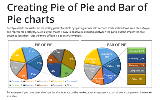
Excel pie charts are useful to display fractions of a whole by splitting a circle into
sections. Each section looks like a slice of a pie and represents a category. Such
a layout makes it easy to observe relationships between parts, but the smaller becomes
the slice (less than 10%) – the harder becomes to estimate it visually.
How to add labels to the Mosaic plot
This is the third and last part of the tip
How to create a Mosaic plot in
Excel
(the second part is
How to create a
step Area chart for the Mosaic plot in Excel).
The step area chart created in the previous part has invalid labels for both axes and
no data labels:
How to create a step Area chart for the Mosaic plot in Excel
This is a second part of the tip How to create a mosaic plot in Excel. The first part describes how to prepare the data for the step Area chart created in this part.
How to create a Mosaic plot in Excel
Pie and bar charts greatly simplify the understanding of percentages distribution for
one categorical variable but fail to build a meaningful representation of two and more
variables. A quite recent innovation in data visualization real is the Mosaic plot,
which helps to grasp the correlations within marketing, sales, and other financial data.
You will not find this chart among Excel standard charts, but you can build one.
How to add labels to the Marimekko chart
This is the third, last part of the tip How to create a Marimekko or Mekko chart in Excel (the second part is How to add separators to the Marimekko chart). The area chart created in the previous part needs data labels:
How to add separators to the Marimekko chart
This is the second part of the tip How to create a Marimekko or Mekko chart in Excel. In the first part of this tip, a step Area chart was created:
How to create a Marimekko chart or Mekko chart in Excel
The distribution of market shares or stocks of the investment portfolio often is illustrated
by pie or doughnut charts. The illustration of multi-market shares and multiple investment
portfolios calls for different approaches. The Marimekko chart (also known as
Mekko chart, or mosaic plot) comes to the rescue.
How to create a Heatmap chart in Excel
A Heatmap or Heat Map chart looks like a table, which cells colors
depend on the cell value. These charts are popular in biology, web and other analytics,
geography, etc. Tabular data transformation for time series data projects one-dimensional
data into two-dimensional time matrices, which simplify frequent pattern analysis.
How to create different types of histogram charts in Excel
A histogram chart visualizes the distribution of continuous data. Each column
in the histogram chart represents the frequency (amount) of the data within the
specific range.


