Excel 2016
Creating a simple thermometer chart
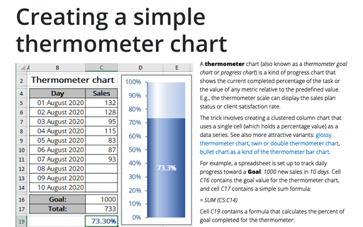
A thermometer chart is a kind of progress chart that shows the current completed
percentage of the task or the value of any metric relative to the predefined value. E.g.,
the thermometer scale can display the sales plan status or client satisfaction rate.
How to create a funny dog breeds lifespan chart in Excel
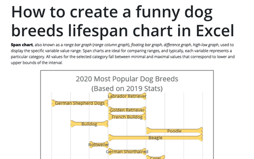
Span chart, also known as a range bar graph (range column graph),
floating bar graph, difference graph, high-low graph, used
to display the specific variable value range. Span charts are ideal for comparing ranges, and
typically, each variable represents a particular category. All values for the selected category
fall between minimal and maximal values that correspond to lower and upper bounds of the interval.
How to create a span chart in Excel
Span chart, also known as a range graph, floating graph,
difference graph, high-low graph,
shows dataset ranges between a minimum value and a maximum value:
How to create a box and whisker plot in Excel
When you work with some statistical data such as lifespan, weight, or height of the specific
type of pets, you have different charts and diagrams to compare them. The box and whisker
chart is one of the useful graphical representation of statistical data that that shows the median,
quartiles, and extreme values at one plot.
How to create a Bullet chart in Excel
A bullet graph (the name by its creator Stephen Few) or bullet chart (in
Microsoft office) is designed to demonstrate the difference between the target value and the
actual one. Sometimes there are ranges of performance enabled beside the current value bar –
they show something like "low", "medium" and "high" or "poor", "satisfactory", "good" and
"excellent" value ranges:
How to create a simple Bullet graph in Excel
A bullet graph (the name by its inventor Stephen Few) or bullet chart (in
Microsoft office) generally is used to display progress towards the specific target:
How to evaluate startup or new business plans
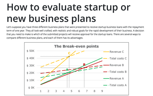
Let's suppose you have three different business plans that were presented to receive startup
business loans with the repayment term of one year. They all look well crafted, with realistic
and robust goals for the rapid development of their business. A decision that you need to make
is which of the submitted projects will receive approval for the startup loans. There are
several ways to compare different business plans, and each of them has its advantages.
How to plot investment opportunity zones in Excel
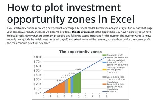
If you start a new business, create a new product, or change a business model, break-even
analysis lets you find out at what stage your company, product, or service will become
profitable. Break-even point is the stage where you have no profit yet but have no
loss already. However, there are many preceding and following stages important for the
investor. The investor wants to know not only how quickly the initial investments will pay off,
and extra income will be received, but also how quickly the normal profit and the economic profit
will be earned.
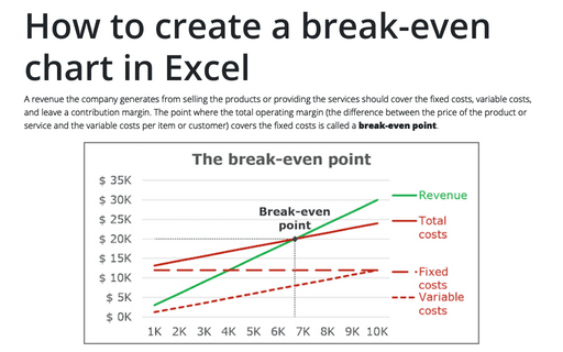
How to create a break-even chart in Excel
A revenue the company generates from selling the products or providing the services should cover the
fixed costs, variable costs, and leave a contribution margin. The point where the total operating
margin (the difference between the price of the product or service and the variable costs per item
or customer) covers the fixed costs is called a break-even point.
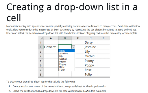
Creating a drop-down list in a cell
Manual data entry into spreadsheets and especially entering data into text cells
leads to many errors. Excel data validation tools allow you to reduce the inaccuracy
of Excel data entry by restricting the set of possible values to a pre-defined list.
Users can select the item from a drop-down list with few choices, instead of typing
text into the data entry form template.
