Creating Pie of Pie and Bar of Pie charts
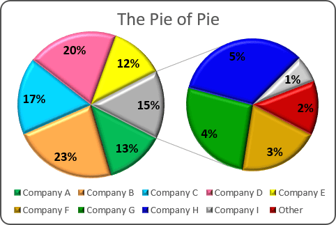
For example, if you have several companies that operate on the market, you can represent a part of every company on the market as a slice.
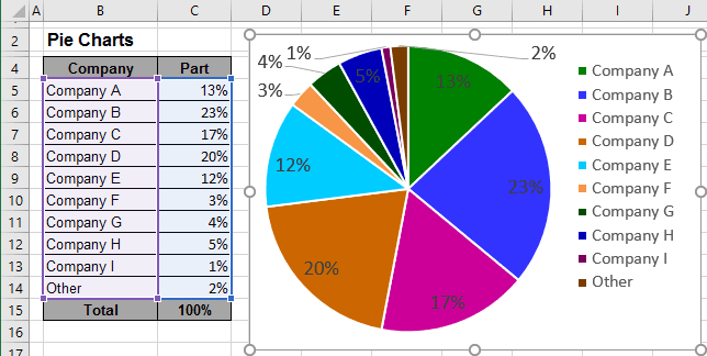
This data contains five slices that fall below 10%.
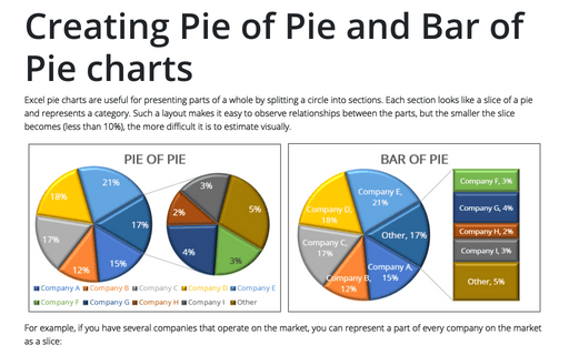
To make smaller slices more visible in a pie chart, Microsoft Excel provides the Pie of Pie (see above), and Bar of Pie (see below) chart sub-types.
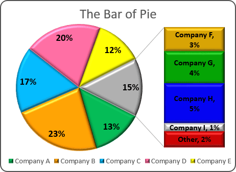
Each of these chart sub-types separates the smaller slices from the main pie chart and displays them in a supplementary pie or stacked bar chart. To create a Pie of Pie or Bar of Pie chart, follow these steps:
1. Select the data range (in this example, B5:C14).
2. On the Insert tab, in the Charts group, choose the Pie and Doughnut button:

Choose Pie of Pie  or Bar of Pie
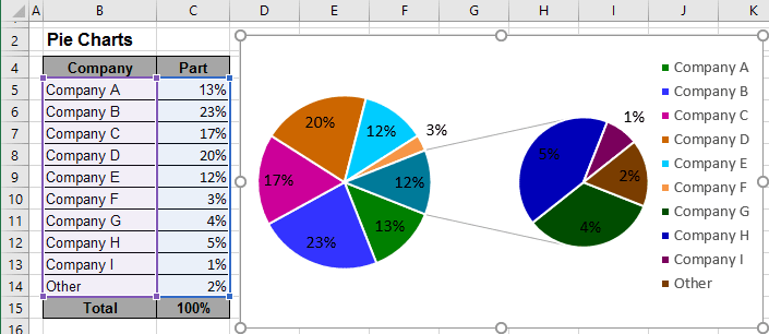
3. Right-click in the chart area. In the popup menu, select Format Data Series...

4. On the Format Data Series pane, in the Series Options tab, select which data to display in the second pie (in this example, the second pie shows all values less than 10%):
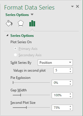
There are several ways to choose which categories (slices) to display in the secondary pie or bar chart:
- Split series by Position (enter the number of positions moved to the secondary chart)
- Split series by Value (the values less than the specified moved to the secondary chart)
- Split series by Percentage Value (the values less than the specified percentage moved to the secondary chart)
- Split series by Custom (drag and drop categories between to charts)
You can then make any other adjustments to get the look you desire:
- Pie Explosion detaches the slice from the primary chart and moves it closer to the secondary chart
- Gap Width controls the distance between charts
- Second Plot Size specifies the relative size of the second chart.
See also this tip in French: Un graphique en Secteurs de secteur ou Barres de secteur.
