Chart in Excel 365
How to draw flowchart and swimlane flow chart in Excel
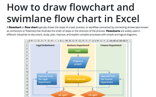
A flowchart or flow chart typically shows the steps of a task, process, or workflow connected
by connecting arrows (also known as connectors or flowlines) that illustrate the order of steps or the
direction of the process. Flowcharts are widely used in different industries to document, study,
plan, improve, and explain complex processes with simple and logical diagrams.
Highlight data series in line chart
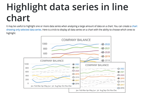
It may be useful to highlight one or more data series when analyzing a large amount of data on a chart. You can create a chart showing only selected data series. Here is a trick to display all data series on a chart with the ability to choose which ones to highlight:
Side by side comparison bar chart with differences
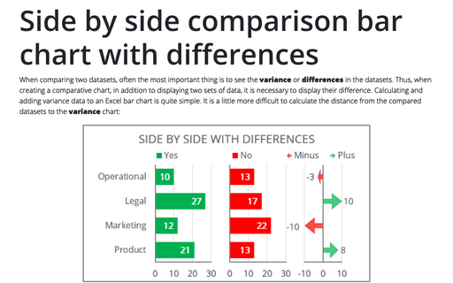
When comparing two datasets, often the most important thing is to see the variance or differences in the datasets. Thus, when creating a comparative chart, in addition to displaying two sets of data, it is necessary to display their difference. Calculating and adding variance data to an Excel bar chart is quite simple. It is a little more difficult to calculate the distance from the compared datasets to the variance chart:
Create bidirectional bar chart in Excel
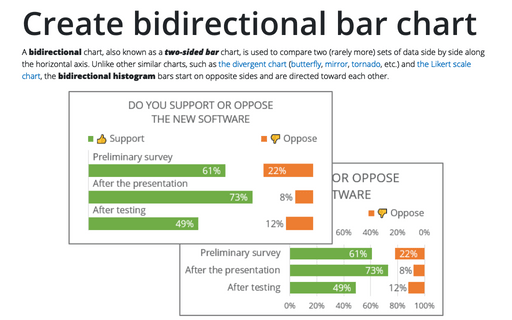
A bidirectional chart, also known as a two-sided bar chart, is used to compare two (rarely more) sets of data side by side along the horizontal axis. Unlike other similar charts, such as the divergent chart (butterfly, mirror, tornado, etc.) and the Likert scale chart, the bidirectional histogram bars start on opposite sides and are directed toward each other.
Side by side comparison bar chart with the same axes
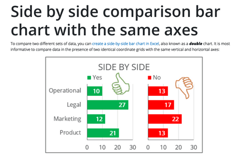
To compare two different sets of data, you can create a side-by-side bar chart in Excel, also known as a double chart. It is most informative to compare data in the presence of two identical coordinate grids with the same vertical and horizontal axes:
Side by side comparison bar chart
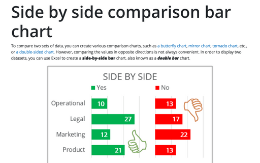
To compare two sets of data, you can create various comparison charts, such as a butterfly chart, mirror chart, tornado chart, etc., or a double-sided chart. However, comparing the values in opposite directions is not always convenient. In order to display two datasets, you can use Excel to create a side-by-side bar chart, also known as a double bar chart.
How to make Tornado chart in Excel
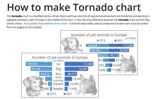
The tornado chart is a modified version of bar charts with two columns of data series whose bars are horizontal and pointing in opposite directions, with the base in the middle of the chart. In fact, the only difference between the tornado chart and the very similar charts - the butterfly chart and the mirror chart - is that the data series used to create the tornado chart must be sorted from the largest to the smallest.
How to make Mirror chart in Excel
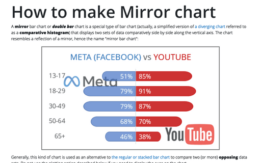
A mirror bar chart or double bar chart is a special type of bar chart (actually, a simplified version of a diverging chart referred to as a comparative histogram) that displays two sets of data comparatively side by side along the vertical axis. The chart resembles a reflection of a mirror, hence the name "mirror bar chart":
How to create Butterfly chart in Excel
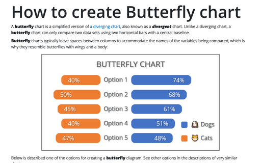
A butterfly chart is a simplified version of a diverging chart, also known as a divergent chart. Unlike a diverging chart, a butterfly chart can only compare two data sets using two horizontal bars with a central baseline.
