Excel 2016
How to create a comparative histogram chart in Excel
Excel 2016 offers several new pre-defined charts, including the histogram chart. This
pre-defined chart makes possible
to create
different types of histogram charts
with little effort.
How to create a histogram chart by category using frequencies in Excel
There are several
ways to create a histogram chart in Excel.
By the moment, Excel uses two different algorithms to calculate the data
for a histogram chart:
How to create a histogram chart by categories in Excel
Histograms show the distribution of numeric data, and there are several
different ways
how to create a histogram chart.
Distributions of non-numeric data, e.g., ordered categorical data, look similar to
Excel histograms. However, you cannot use Excel histogram tools and need to reorder
the categories and compute frequencies to build such charts.
How to create a simple histogram chart in Excel
A histogram chart is often confused with a bar chart because it displays data
using bars of different heights. The 'true' histogram chart shows the distribution of
numerical data. Each bar of the histogram represents the count of data values within
the specified range. See more about
different types
of histogram charts in Excel.
How to hide the cell values in Excel without hiding cells
Conditional formatting of Excel cells simplifies
highlighting values by adding color scales,
data bars, sparklines, and in-cell icons to the cell. The exact values of the highlighted cells
are rarely meaningful and may even interfere with the perception of information. Custom cell format
allows hiding values of such cells without hiding the cells.
How to create irregular polygon charts in Excel
Many organizations utilize 360-degree feedback (also known as multi-rater feedback, multi-source feedback, multi-source assessment, or 360-degree review) to assist employees in work and social skills development. This process includes gathering employee's subordinates, colleagues, supervisor(s), and manager(s) feedback; and comparing self-evaluation and individual group metrics.
A radar chart for personality assessment test visualization
Today, HR professionals in large companies build detailed personality profiles, which include scores of workplace-oriented behavioral indices of the employee. The behavioral scores cover such areas as leadership, communication skills, interpersonal finesse, empathy, diligence, rationality, analyticity, etc. Here radar charts become especially handy because tables, bars, and lines look cluttered and are hard to analyze for a large number of variables.
How to compare strengths and weaknesses, skills, or performance metrics
Time to time, you need to compare strengths and weaknesses, skills, or performance metrics for people, teams, or companies. The dimensions have different qualitative meanings, and, if you choose a bar chart to plot such data, you need to create a separate graph for each aspect. A much better option is to normalize the data and use a spider chart, which renders multiple axes with the same scale.
How to change comma to decimal point and vice versa in Excel
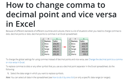
Because of different standards of different countries and cultures, there is a lot
of situations when you need to change commas to dots, decimal points or dots, decimal
points to commas in an Excel spreadsheet:
How to reduce ribbon size in Excel
After recent updates, the ribbon in Microsoft Excel can take up to 1/3 of the available screen
space. Microsoft Office help tells that you can
hide or unhide your ribbon,
but you cannot reduce the size of your ribbon, or size of the text or the icons. False! You can
change the mode and remove unnecessary white space around buttons, and, thus, reduce the
ribbon size.


