Excel 2016
How to create an axis with subcategories
Excel offers a lot of different tricks to create great informative charts and diagrams. A lot of
the useful adjustments related to the axis. E.g., you can hide an axis, use primary and
secondary axis, change the presentation of data on the axis, etc.
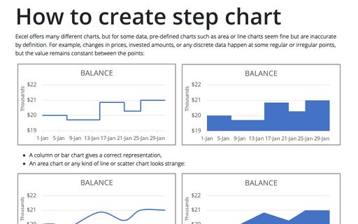
How to create step chart in Excel
There are a lot of different pre-defined charts in Excel, but for some types of data, pre-defined
charts such as area chart or line chart can look fine but are incorrect.
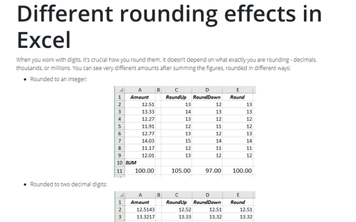
Different rounding effects in Excel
When you work with digits, it's crucial how you round them. It doesn't depend on what exactly you
are rounding - decimals, thousands, or millions. You can see very different amounts after summing
the figures, rounded in different ways:
Unrealized Gain and Loss
To show the unrealized gain and loss require the new Excel feature - Data Types. Unfortunately, this feature doesn’t work at the moment for Excel 2016.
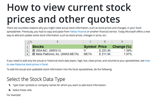
How to view current stock prices and other quotes in Excel
Current stock prices and other quotes require the new Excel feature - Data Types. Unfortunately, this feature doesn’t work at the moment for Excel 2016.
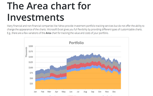
The Area chart for Investments
Many financial and non-financial companies like Yahoo provide investment portfolio tracking services
but do not offer the ability to change the appearance of the charts. Microsoft Excel gives you full
flexibility by providing different types of customizable charts. E.g., there are a few variations of
the Area chart for tracking the value and costs of your portfolio.
How to highlight a data point
One of the essential parts of any work with data is presenting results. You can use many different
charts, diagrams in Microsoft Excel or PowerPoint.
Progressively create a Gantt chart in Excel
A Gantt chart is one of the most popular tools in project management. It illustrates project schedules
by showing activities, like tasks and events, against time.
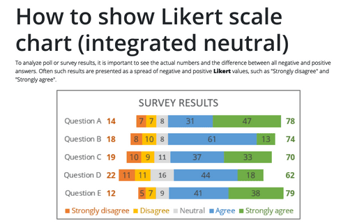
How to show Likert scale chart (integrated neutral)
When you analyze quiz answers, you need to see the numbers and the difference between all negative
and positive answers. This is not easy, if you have more than 3 possible answers - positive, neutral
and negative. However, you can create a chart that shows the whole picture:
How to create an automatically extended or dynamic drop-down list
When you work with data in Excel, you often need to add more and more new data. However, it
takes some time to update formulas, charts, tables, when you add new data. Excel proposes functions
that can help to customize your data and avoid routine updating. This tip is about creating an
automatically extended (also known as dynamically updated or just dynamic)
drop-down list.

