How to add labels to the Mosaic plot
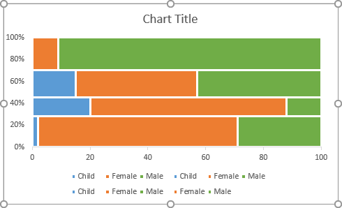
There are at least two types of labels that are parts of the mosaic plot:
- Data labels at the center of each mosaic piece,
- Vertical axis labels instead of 0 - 20 - *** - 100.
To add the labels for the mosaic pieces, do the following:
1. Create a new data range to calculate the positions of each label:
For every mosaic piece from the prepared data:
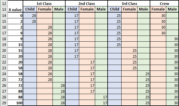
Calculate the X and Y positions for the labels:

Where:
- X calculated as the middle of the width of each item plus the width of all
previous items in the row:
- 1st Class Child: = A15 / 2
- 1st Class Female: = A15 + (A25 - A15) / 2
- 1st Class Male: = A25 + (A29 - A25) / 2
- 2nd Class Child: = A21 / 2
- 2nd Class Female: = A21 + (A27 - A21) / 2
- 2nd Class Male: = A27 + (A29 - A27) / 2
- 3rd Class Child: = A19 / 2
- 3rd Class Female: = A19 + (A23 - A19) / 2
- 3rd Class Male: = A23 + (A29 - A23) / 2
- Crew Female: = A17 / 2
- Crew Male: = A17 + (A29 - A17) / 2
- Y calculated as the middle of the height of each item plus the height
of all previous pieces in the column:
- 1st Class: = B14 / 2
- 2nd Class: = B14 + E14 / 2
- 3rd Class: = B14 + E14 + H14 / 2
- Crew: = B14 + E14 + H14 + K14 / 2
2. Add the new data series for labels to the chart:
2.1. Do one of the following:
- Under Chart Tools, on the Design tab, in the Data group, choose Select Data:

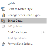
- Right-click in the chart area and choose Select Data... in the popup menu:
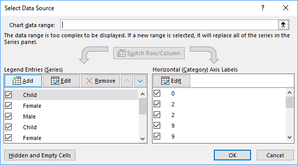
2.2. In the Select Data Source dialog box, click the Add button:
2.3. In the Edit Series dialog box, choose cells with categories (Y) and click OK several times:
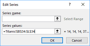
Excel adds the new data series to the chart and breaks the layout, but don't worry:
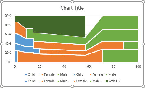
3. Change the chart type:
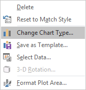
3.1. Right-click on the chart and choose Change Chart Type... in the popup menu:
3.2. In the Change Chart Type dialog box:
- Select the Combo tab,
- Select the Custom Combination chart type,
- Be sure that for the all data series except the last one have 100% Stacked Area chart type,
- Choose the Scatter type for the newly added data series and select the Secondary Axis checkbox.
4. Change the new data series with the labels:
4.1. Open the Select Data Source dialog box.
4.2. In the Select Data Source dialog box, under Legend Entries (Series), select the new data series and click the Edit button.
4.3. In the Edit Series dialog box, choose cells for Series X values (X) and click OK several times:
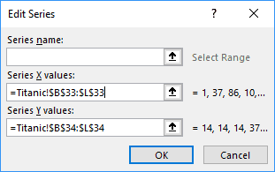
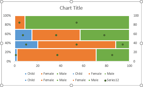
Excel updates the new data series in the chart:
5. If it is necessary, change the secondary axis:
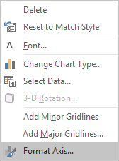
5.1. Right-click on the horizontal axis and choose Format Axis... in the popup menu:
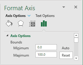
5.2. On the Format Axis pane, on the Axis Options tab, in the Axis Options section, under Bounds, type 100 in the Maximum field:
6. Add the data labels:
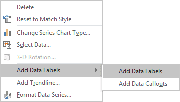
6.1. Right-click on each new data series and choose Add Data Labels -> Add Data Labels in the popup menu:
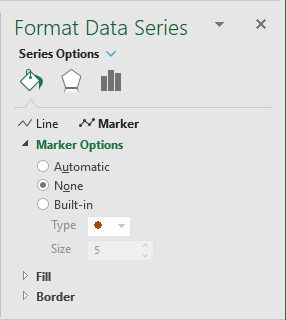
6.2. Right-click on the new data series and select Format Data Series... in the popup menu.
6.3. On the Format Data Series pane, on the Fill & Line tab, in the Marker Options section, select the No Marker radio button:
6.4. Right-click on the new data labels and select Format Data Labels... in the popup menu:
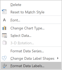
6.5. On the Format Data Labels pane, on the Label Options tab, in the Labels Options section:
- Under Label Contains:
- Select the Value From Cells radio button:

- In the Data Labels Range dialog box, select the appropriate data
range:

- Unselect all other checkboxes.
- Select the Value From Cells radio button:
- Under Label Positions, choose the Center option:

- Make any other adjustment you desire.
To add the labels for the vertical axis, do the following:
7. Add a new data series to show the labels for the vertical axis.
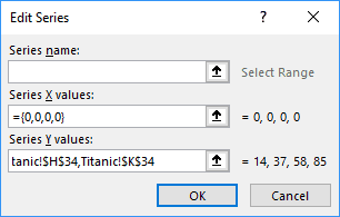
In the Edit Series dialog box:
- In the Series X values field, type = {0,0,0,0} (so, the new data series will be shown on the vertical axis),
- In the Series Y values field, select the data range or cells that were used for the other labels:
8. Add data labels, remove markers for the new data series like it did for the data labels.
9. On the Format Data Labels pane, on the Label Options tab, in the Labels Options section:
- Under Label Contains, check the Value From Cells radio button and
select the appropriate data range:

- Under Label Positions, choose the Left option.
10. Change the title, remove unnecessary items from the Legend and hide axes:

Make any other adjustments you find appropriate.

