How to create a Heatmap chart in Excel
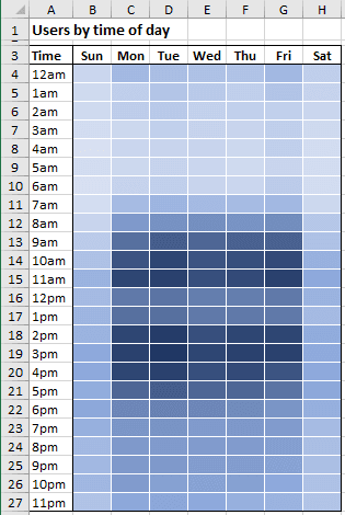
Excel does not provide a chart template for heatmap charts yet. The simplest way to create a heatmap in Excel is to add Conditional formatting to the spreadsheet cells.
To create a heatmap, do the following:
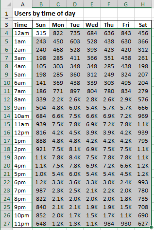
1. Select the data.
For example:
2. On the Home tab, in the Styles group, click the arrow next to Conditional Formatting..., then select Color Scales and then click More Rules...:
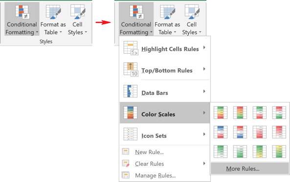
Note: You can also choose the New Rules... from this drop-down list.
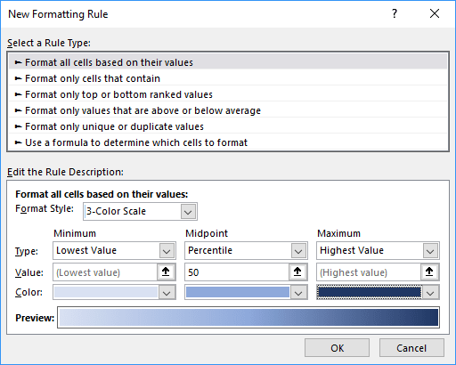
3. In the New Formatting Rule dialog box:
- Under Select a Rule Type, be sure that the option Format all cells based on their values was selected,
- Under Edit the Rule Description, on the Format Style dropdown list, select the 3-Color Scale option and then select the colors for Minimum, Midpoint, and Maximum values:
- Click OK.
Excel creates the heatmap:
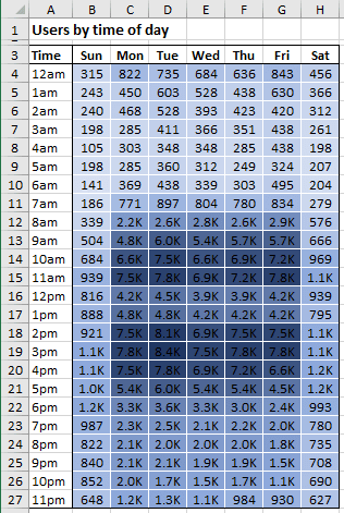
Note: See also how to hide the cell values in Excel without hiding cells.
Heatmap charts are also handy for categorical data visualization if there is a natural ordering for the categories when you need to emphasize data relationships.

