How to add pictures to vertical axis of the bar chart
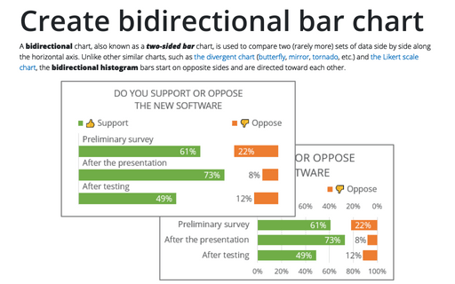
For example, data on the highest-earnings professional tennis players as of January 30, 2023, presented in the form of a simple bar chart, will be more attractive if the flags of the athletes' countries are added to the vertical axis:

To a chart like the one above, do the following:
Create a simple bar chart
You can create different types of bar charts.
1. Select the data range.
In this example, C3:C13, F3:F13 (hold Ctrl to select several data ranges):

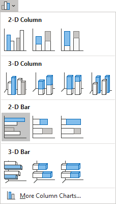
2. On the Insert tab, in the Charts group, click the Insert Column or Bar Chart button:

From the Insert Column or Bar Chart dropdown list, under 2-D Bar, select Clustered Bar:
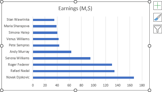
Excel creates a simple bar chart:
3. Optionally, format the chart:
- Revert the vertical axis labels (see how to change axis labels' order in a bar chart),
- Hide the horizontal axis,
- Add the data labels (see how to add data labels for more details):

Add a new data series to the bar chart
1. Add a new data series to the existing chart
1.1. Select the chart, then do one of the following:
- On the Chart Design tab, in the Data group, click the Select Data button:

- Right-click on the chart plot area and choose Select Data... in the popup menu:
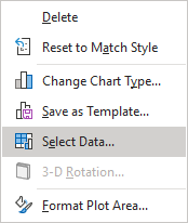
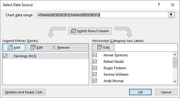
1.2. In the Select Data Source dialog box, under Legend Entries (Series), click the Add button:
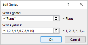
1.3. In the Edit Series dialog box:
- Optionally, in the Series name field, type the name you prefer,
- In the Series values field, type as many numbers as many bars you have in the chart (in this example, = {1,2,3,4,5,6,7,8,9,10}):
After clicking the OK button twice, Excel adds new data series to the chart:

2. Change the chart type for the new data series
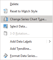
2.1. Select any data series, then right-click the selection and choose Change Series Chart Type... in the popup menu:
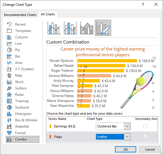
2.2. In the Change Chart Type dialog box, on the Combo tab, from the Chart Type dropdown list, choose Scatter type for the new data series (Excel automatically selects the Secondary Axis checkbox):
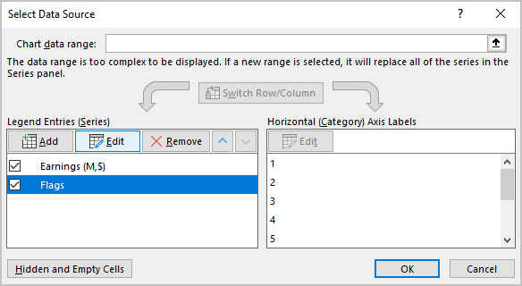
2.3. In the Select Data Source dialog box (see step 1.1. how to open this dialog box), under Legend Entries (Series), select the new data series and click the Edit button:
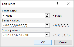
2.4. In the Edit Series dialog box, in the Series X values field (the empty one), type as many zeros as many bars you have in the chart (in this example, 10 times: = {0,0,0,0,0,0,0,0,0,0}):
Excel moves the scatter data series:

Note: If you want to add markers to the axis that intersects the horizontal axis, not at zero, in the Series X values field, add the leftmost or rightmost value. For example, to insert labels at the rightmost position of the chart plot area, type 10 times value 200 - maximum value of the horizontal axis:

3. Format secondary vertical axis
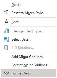
3.1. Right-click on the secondary vertical axis and choose Format Axis... in the popup menu:
3.2. On the Format Axis pane, on the Axis Options tab, in the Axis Options section:
- In the Minimum field, type 0.5,
- In the Maximum field, type the maximum value of the markers plus 0.5:
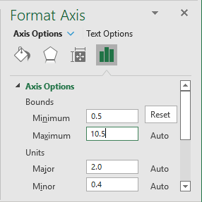
Excel displays new data series markers directly on the axis at the start of each bar:

3.3. Hide the secondary vertical axis.
Add more space between axis labels and the scatter data series
4. Change the distance between the axis and its labels
4.1. Right-click on the primary vertical axis, then select Format Axis... in the popup menu.
4.2. Open the Format Axis pane, on the Axis Options tab, in the Labels section, in the Distance from axis field, and increase the default value to more suitable.
For this example, type 700:
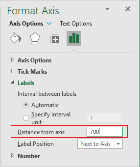
Note: The distance depends on the chart dimensions, the picture sizes you will add, etc. You can experiment with this value.
Excel adds space between the axis and its labels:

Format markers
5. Modify data series labels
Optionally, modify all labels of the additional data series to change the position of the labels and to hide the text of the label:
5.1. Do one of the following:
- Right-click on any of the new data series marker, then choose Format Data Labels... in the popup menu:

- Right-click on any label of the new data series, then choose Format Data Labels... in the popup menu:
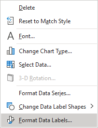
See also how to quickly select different chart elements.
5.2. On the Format Data Labels pane:
- On the Label Options tab, select the appropriate option in the Label Position group.
For this example, the Left position:

- On the Text Options tab, in the Text Fill & Outline group:
- In the Text Fill section, choose No fill,
- In the Text Outline section, choose No line:
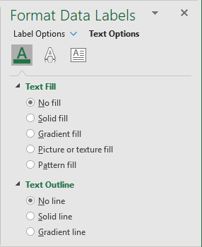
6. Modify each data series label
6.1. Right-click on any data label and select Format Data Label... in the popup menu:
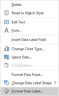
6.2. On the Format Data Label pane, on the Fill & Line tab, in the Fill section:
- Select the Picture or texture fill option,
- Click the Insert... button:

- In the Insert Pictures dialog box, choose the picture location, select the picture file, and then click Open or Insert:
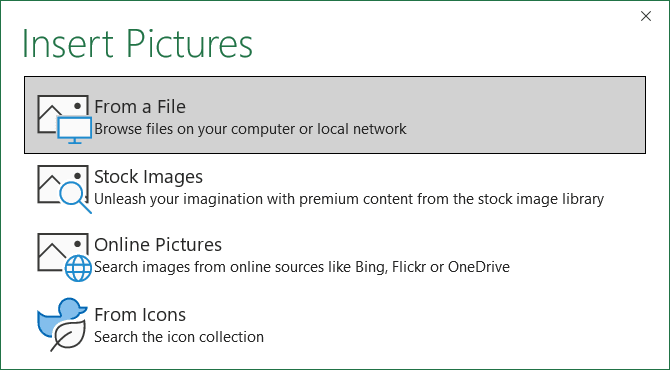
Excel displays the inserted picture in the label:

6.3. Resize the inserted picture to the best look:
When the picture is selected, do one of the following:
- On the Chart Format tab, in the Size group, type or select the appropriate values on the Height and Width fields:

- On the Format Data Label pane, on the Label Options tab, in the Size & Properties group, in the Size section, type or select the appropriate values on the Height and Width fields:

After repeating the previous steps for all data labels, you will see the pictures on the vertical chart axis:

7. Hide markers of the additional data series
7.1. Right-click on any data series marker and choose Format Data Series... in the popup menu:
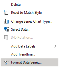
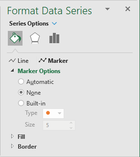
7.2. On the Format Data Series pane, on the Fill & Line tab, in the Marker Options section, select the None option:
