How to make Mirror chart in Excel
Generally, this kind of chart is used as an alternative to the regular or stacked bar chart to compare two (or more) opposing data sets. Do not use the plotting option described below if you need to display the axes on the chart.
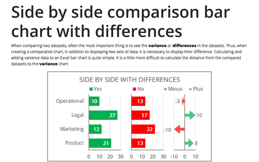
In addition to the mirror chart, for the same purposes can be used the following types of charts:
- A butterfly chart that usually leaves spaces between columns:

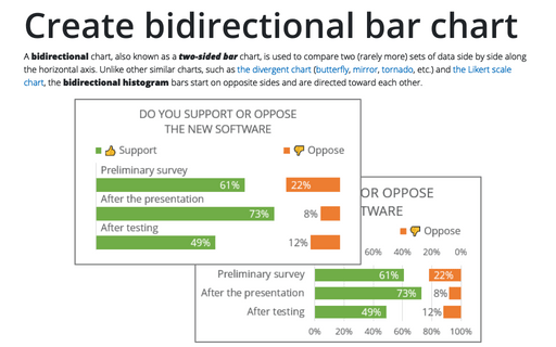
- A double-sided or bidirectional chart that displays two data sets on opposite sides:

- A tornado chart similar to all other charts but with sorted data:

- A demographic pyramid, also known as a population pyramid, is a special chart for representing and analyzing the population of both genders using age groups. It can be created using any of the mentioned ways, where female and male population values are displayed on the right and left, and the age groups are the vertical categories.
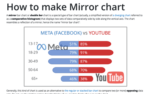
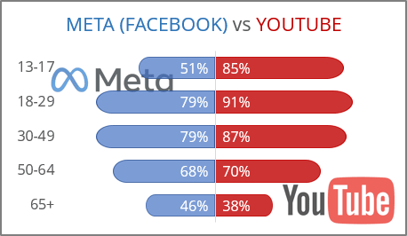
For example, according to the results of a survey conducted in a company, were identified the most actively used social media applications among different age groups:
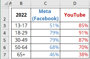
To create a mirror chart in Excel, do the following:
1. Prepare the data
To arrange the data symmetrically to some vertical axis, you need to add a column with the following formula:
= 100% - value of the left column:
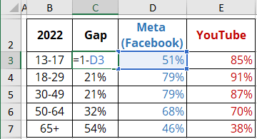
Note: See how to calculate the size of this column for non-percentage data (more complex variant).
2. Create a simple bar chart
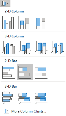
Select the data range (in this example, B2:E7), then on the Insert tab, in the Charts group, choose the Insert Column or Bar Chart button:

From the Insert Column or Bar Chart dropdown list, under 2-D Bar, choose the Stacked Bar chart:
Excel creates a simple bar chart:
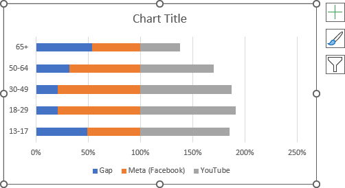
3. Format the horizontal axis
To move the horizontal axis to the correct position, do the following:
3.1. Right-click on the horizontal axis and choose Format Axis... in the popup menu:
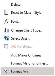
3.2. On the Format Axis pane, on the Axis Options tab:
To position axis
- In the Axis Options section:
- Under Bounds, in the Maximum field, type 2 (100% for the left data range and 100% for the right data range),
- Under Vertical axis crosses:
- Check the Axis value option,
- Type the middle value = 1:
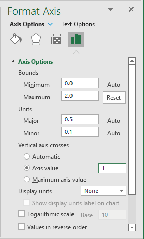
To hide the axis
- In the Labels section, from the Label Position dropdown list, choose None:
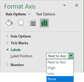
4. Format the vertical axis
To move labels to the correct position in the reverse order, do the following:
4.1. Right-click on the vertical axis and choose Format Axis... in the popup menu.
4.2. On the Format Axis pane, on the Axis Options tab:
- In the Axis Options section, select the Categories in reverse order checkbox:

- In the Labels section, from the Label Position dropdown list, choose Low:
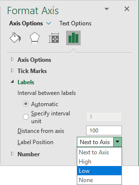
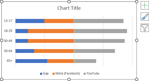
Excel changes the axis in the chart:
5. Format the chart
Optionally, move the legend, type the chart title, and fill the data series as you prefer (see more about filling options in Microsoft).
6. Format data series
Hide the first data series
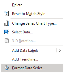
6.1. Right-click on the first data series (in this example, Gap) and choose Format Data Series... in the popup menu:
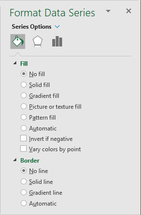
6.2. On the Format Data Series pane, on the Series Options tab:
- In the Fill section, select the No fill option,
- In the Border section, select the No line option:
Change the thickness of other data series
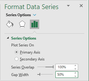
6.3. On the Format Data Series pane, on the Series Options tab, in the Series Options group, type or select a value for the most pleasing effect.
For example, 50%:
Format other data series by changing the bar shape
6.4. On the Insert tab, in the Illustrations group, click the Shapes button:
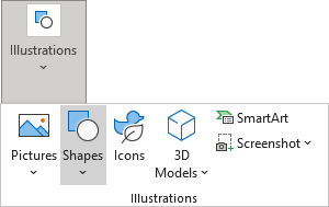
From the Shapes dropdown list, select the shape you prefer. For example, Rectangle: Top Corners Rounded:

6.5. Format the shape:
6.5.1. Change the thickness and format of this shape using yellow points:

6.5.2. Rotate the shape by:
- Using the rotation handle at the top of the selecting border:

- On the Shape Format tab, in the Arrange group, select some commands in the Rotate dropdown list.
For example, Rotate Right 90o:

6.5.3. Customize the shape filling options (see more about filling options in Microsoft).
6.6. Copy the shape to the Clipboard by clicking the Copy button on the Clipboard group on the Home tab (or by pressing Ctrl+C):

6.7. Select the chart data series and click the Paste button on the Clipboard group on the Home tab (or by pressing Ctrl+V):

For example:
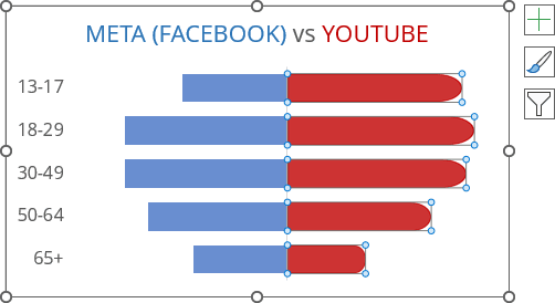
Repeat this customization for other data series.
7. Add data labels
To add data labels to the chart, do one of the following:
- Click on the Chart Elements button, select the Data Labels list, then select the position of the labels:
- For the left data series, choose Inside Base,
- For the right data series, choose Inside End:

- On the Chart Design tab, in the Chart Layouts group, click the Add Chart Element button:

From the Add Chart Element dropdown list, choose Data Labels, then select the place for the labels:
- For the left data series, choose Inside Base:

- For the right data series, choose Inside End.
- For the left data series, choose Inside Base:
Make any adjustments to the stepped chart as you desire.
