How to change axis labels order in a bar chart
Excel
365
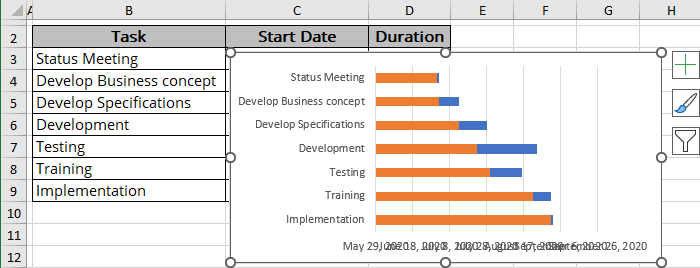
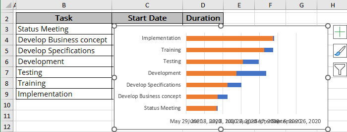
Excel can display the data series in an inconvenient order for bar charts. For example, if you have a table with tasks for a Gantt chart, after creating a bar chart (see how to create a simple Gantt chart for more details), you expect to see tasks on the list arranged from top to bottom. Unexpectedly, Excel displays them in the reverse order:
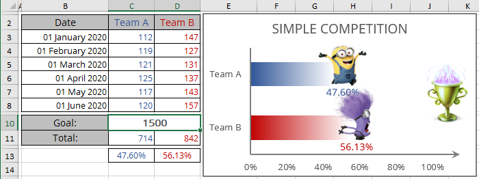
A similar inconvenient order Excel uses for the chart created from the table columns:
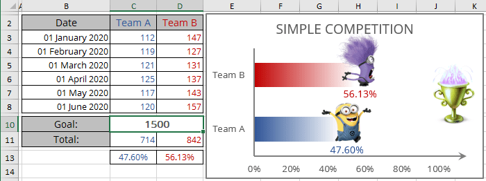
See more about the competition chart.
To change the order of the labels on the axis, do the following:
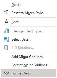
1. Right-click the horizontal axis and click the Format Axis... in the popup menu (or double-click the axis):
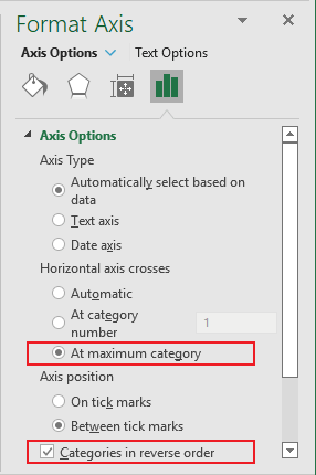
2. On the Format Axis pane, on the Axis Options tab, in the Axis Options group:
- Under Axis position, select the Categories in reverse order checkbox to display the labels in the reverse order,
- Optionally, under Horizontal axis crosses, choose the At maximum category option to return the horizontal axis on the bottom of the plot area:
Excel rebuilds the chart to display the axis labels in the reverse order:
