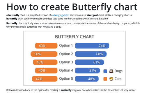
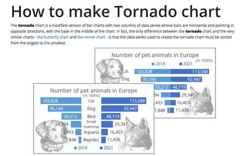
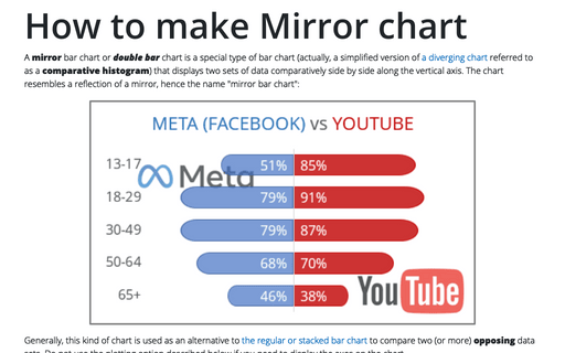
How to create Butterfly chart in Excel
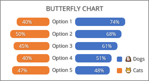
Butterfly charts typically leave spaces between columns to accommodate the names of the variables being compared, which is why they resemble butterflies with wings and a body:
Below is described one of the options for creating a butterfly diagram. See other options in the descriptions of very similar charts:
- Creating a regular bar chart using the negative values of the compared values to reflect them relative to the central baseline on the example of a mirror chart:

- Using two axes as in the proposed method of creating a butterfly diagram, but in opposite directions on the example of the bidirectional chart or two-sided diagrams:

- Using additional data on the example of plotting a tornado chart:

For example, the butterfly chart will be created based on the results of a survey conducted at the company among pet owners who said they have a "man's best friend" - a dog or feline companion - a cat:
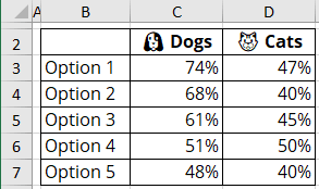
To create a butterfly chart like the one above, do the following:
1. Create a regular bar chart
1.1. Select the data range (in this example, B2:G7).
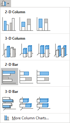
1.2. On the Insert tab, in the Charts group, choose the Insert Column or Bar Chart button:

From the Insert Column or Bar Chart dropdown list, under 2-D Bar, select Clustered Bar:
Excel creates a simple clustered bar chart:
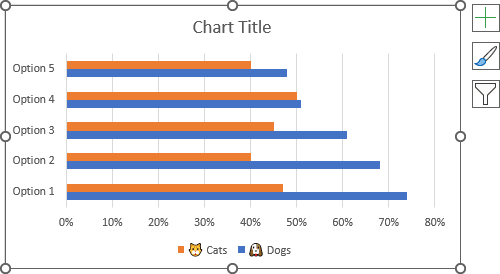
1.3. Optionally, change the order of the vertical axis labels:
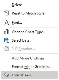
1.3.1. Right-click on the vertical axis and select Format Axis... in the popup menu:
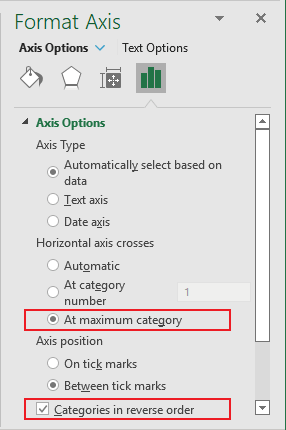
1.3.2. On the Format Axis pane, on the Axis Options tab, in the Axis Options group:
- Select the At maximum category option,
- Check the Categories in reverse order check box:
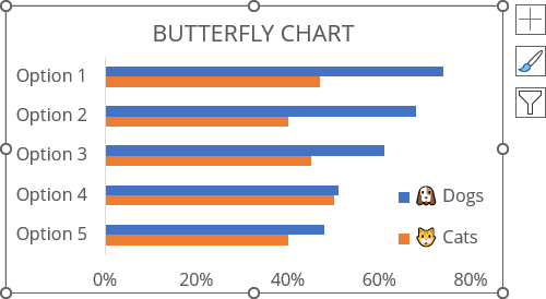
1.4. Optionally, format the chart to move the legend, type a title, etc.
For example:
2. Add the secondary horizontal axis
To display the second data series on the opposite side, select it, then do the following:
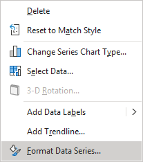
2.1. Right-click on the selection and choose Format Data Series... in the popup menu:
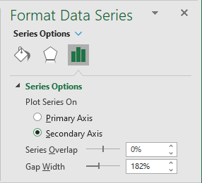
2.2. On the Format Data Series pane, on the Series Options tab, in the Series Options group, under Plot Series On, select the Secondary Axis option:
3. Format and hide the primary horizontal axis
3.1. Right-click on the primary horizontal axis and choose Format Axis... in the popup menu.
3.2. On the Format Axis pane, on the Axis Options tab:
- In the Axis Options section:
- In the Minimum field, type some negative value (in this example, -1.2),
- In the Maximum field, type the appropriate value:

Note: You can experiment with the minimum amount to adjust the size of the middle section of the chart. If you want to create a more interesting version of the inner element, see how to add middle points in the tornado chart.
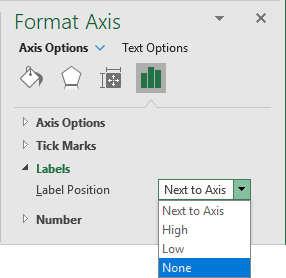
- In the Labels section, from the Label Position dropdown list, select None:
4. Format and hide the secondary horizontal axis
4.1. Right-click on the secondary horizontal axis and choose Format Axis... in the popup menu.
4.2. On the Format Axis pane, on the Axis Options tab:
- In the Axis Options group:
- In the Minimum field, type the same negative value as for the primary axis (in this example, -1.2),
- In the Maximum field, type the appropriate value,
- Check the Values in reverse order check box:

- In the Labels section, from the Label Position dropdown list, select None.
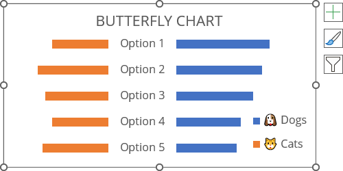
Excel recreates the chart:
5. Format data series
For example, to create the rounded data series, do the following:
5.1. Right-click the data series, then select Format Data Series... in the popup menu (see step 2.1.).
5.2. On the Format Data Series pane:
- On the Series Options tab, in the Series Options group, type or select the maximum value (500%) in the Gap Width field:

- On the Fill & Line tab:
- Optionally, in the Fill section, select the color you prefer,
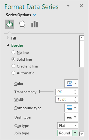
- In the Border section, select the Solid line option, then:
- Select the same color that is selected for the filling,
- Select or type a larger width in the Width field (for example, 15pt),
- From the Join type dropdown list, select Round:
6. Add data labels
To add data labels to the chart, do one of the following:
- Click on the Chart Elements button, select the Data Labels list, then select the position of the labels:

- On the Chart Design tab, in the Chart Layouts group, click the Add Chart Element button:

From the Add Chart Element dropdown list, choose Data Labels, then select the place for the labels:

Make any adjustments to the stepped chart as you desire.
