Bubble chart
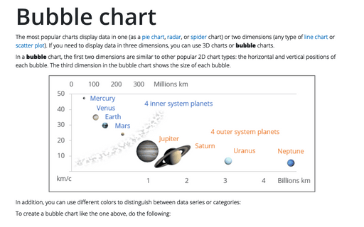
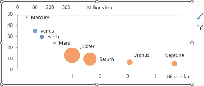
In a bubble chart, the first two dimensions are similar to other popular 2D chart types: the horizontal and vertical positions of each bubble. The third dimension in the bubble chart shows the size of each bubble.
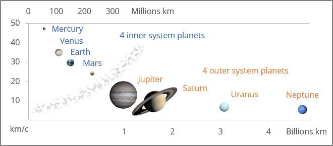
In addition, you can use different colors to distinguish between data series or categories:
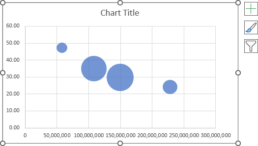
To create a bubble chart like the one above, do the following:
1. Create a simple bubble chart
1.1. Select the data range.
The selected data range should contain:
- The first column - the data for the horizontal axis (Series X values),
- The second column - the data for the vertical axis (Series Y values),
- The third column - the data for the bubble size (Series bubble size).
Note: Be careful! To present the real differences between bubbles, you should keep in mind that Excel creates bubbles:
- Using the circle Area (used by default), not the circle radius or diameter:
Series bubble size = Circle area = π * Radius2
- Using the circle Width or circle diameters (see below how to choose this option for the bubble chart):
Series bubble size = Circle width = Radius * 2.
In this example, for the first data series, were selected D4:D7, G4:G7, K4:K7:
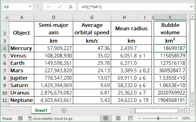
- Column D contains the average distance from Sun to the planet,
- Column G contains the average orbital speed of the planet,
- Column H contains the average radius of the planet,
- Column K contains the formula to calculate the circle area using the average planet radius:
= PI () * <column H> ^ 2,
The PI () function returns the number 3.14159265358979, the mathematical constant pi, accurate to 15 digits.
Note: You can also create another formula: = <column H> * 2, to create a bubble chart using circle diameters. See below how to choose this parameter.
1.2. On the Insert tab, in the Charts group, choose the Insert Scatter (X, Y) or Bubble Chart button:

From the Insert Scatter (X, Y) or Bubble Chart dropdown list, choose Bubble or 3-D Bubble:
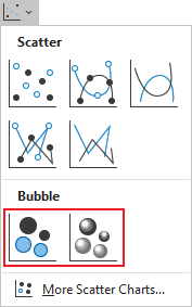
Excel creates a simple bubble chart. For this example:
2. Add new data series to the bubble chart
2.1. Do one of the following:
- Select the chart, then on the Chart Design tab, in the Data group, choose Select Data:

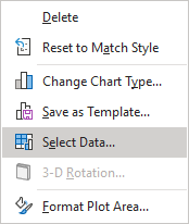
- Right-click on the chart area and choose Select Data... in the popup menu:
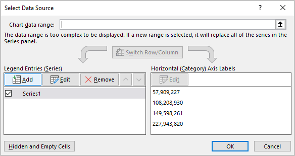
2.2. In the Select Data Source dialog box, under Legend Entries (Series), click the Add button:
2.3. In the Edit Series dialog box:
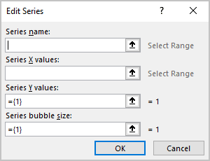
- In the Series X values field, choose or type the data for the horizontal axis (in this example, D8:D11),
- In the Series Y values field, choose or type the data for the vertical axis (in this example, G8:G11),
- In the Series X values field, choose or type the data for the bubble size (in this example, K8:K11):
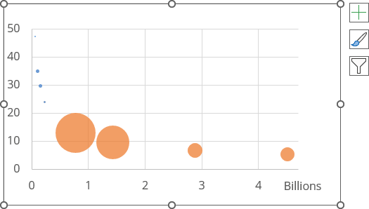
3. Use secondary axes
It is often useful to add a secondary horizontal axis for one of the data series to display different data series in one chart.
To add the secondary horizontal axes to the bubble chart, do the following:
3.1. Add the secondary vertical axis to the chart:
3.1.1. Select the data series you prefer to display on the secondary axis (in this example, the first data series).
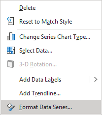
3.1.2. Right-click the selection and choose Format Data Series... in the popup menu:
3.1.3. On the Format Data Series pane, on the Series Options tab, in the Plot Series On group, select the Secondary Axis option:
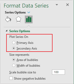
Excel adds the secondary vertical axis to the chart (see more about using the secondary vertical axis).
3.2. Add the secondary horizontal axis to the chart by doing one of the following:
- On the Chart Design tab, in the Chart Layouts group, click the Add Chart Element dropdown list:

In the Add Chart Element dropdown list, select the Axes list and then click Horizontal:
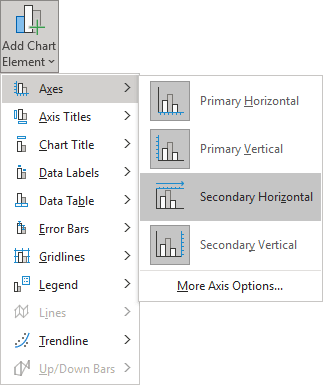
- Click the Chart Elements button, then in the Chart elements list, in the Axes list, select the Secondary Horizontal checkbox:

Excel adds the secondary horizontal axis to the chart (see more about using the secondary horizontal axis):
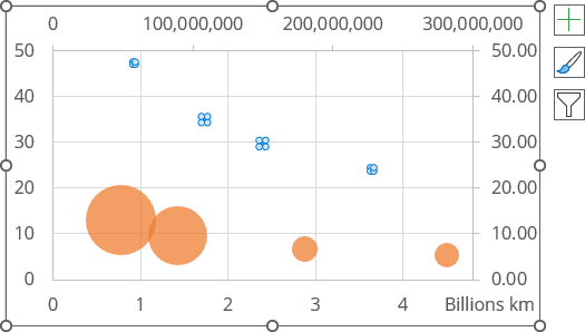
3.3. Format the vertical and horizontal axes of the chart.
For example:
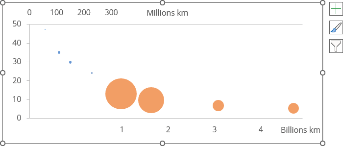
4. Format a bubble chart
4.1. To format the bubble sizes, right-click on any of the bubbles, then select the Format Data Series... in the popup menu.
4.2. On the Format Data Series pane, on the Series Options tab:
- in the Size represents group, choose the appropriate option:
- Area of bubbles, to use the circle area values (Circle Area = π * Radius2)
- Width of bubbles, to use the circle diameters (Circle Width = Radius * 2)
- in the Scale bubble size to field, choose the percentage of the used bubble size:
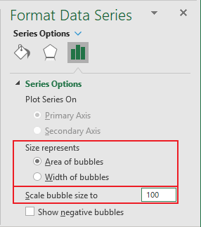
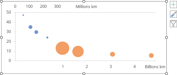
For this example:
- The first data series (inner planets) is set to use 300% of the bubble size,
- The second data series (outer planets) is set to use 80% of the bubble size:
5. Add bubble labels
To add the data labels to the chart, do the following:
5.1. Right-click on the data series and select Add Data Labels -> Add Data Labels in the popup menu:
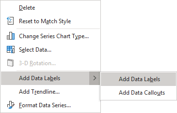
See more about adding data labels to the data series.
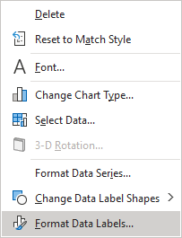
5.2. Right-click on any data label and select Format Data Labels... in the popup menu:
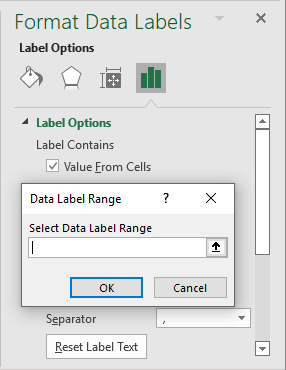
5.3. On the Format Data Labels pane, on the Label Options section, in the Label Contains group, check the Value From Cells option and then choose cells in the Data Label Range dialog box:
5.4. Format and place labels as you prefer.
For example:
6. Use different colors and effects
Bubble charts in Excel allow you to further differentiate between data series or categories.
You can use different fillings or effects for different data series or points. See more about fill and outline options in Microsoft.
Make any other adjustments to get the look you desire.
