Creating Pie of Pie and Bar of Pie charts
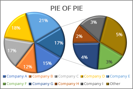
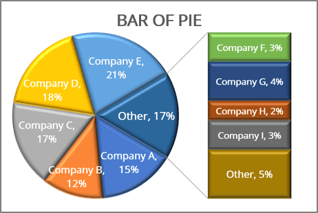
For example, if you have several companies that operate on the market, you can represent a part of every company on the market as a slice:
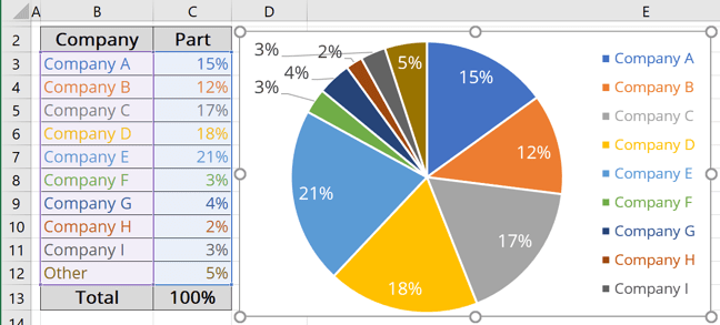
This data contains five slices that fall below 10%.
To make smaller slices more visible in a pie chart, Microsoft Excel provides the Pie of Pie and Bar of Pie chart sub-types. Each chart sub-types separates the smaller slices from the main pie chart and displays them in a supplementary pie or stacked bar chart. To create a Pie of Pie or Bar of Pie chart, follow these steps:
Create a chart
1. Select the data range.
In this example, B3:C12).
2. On the Insert tab, in the Charts group, click the Insert Pie or Doughnut Chart button:

From the Insert Pie or Doughnut Chart dropdown list, choose:
- The Pie of Pie chart:

- Or the Bar of Pie chart:

Excel creates a simple chart. For example, the Pie of Pie chart:
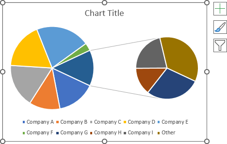
Format the chart
3. Optionally:
- Add the data labels (see how to add data labels to the pie or donut chart),
- Move the Legend.
To move the Legend, click the Chart Elements button, choose the Legend list, and select the preferred position.
For example, position the Data Legend on the Right:

For example:

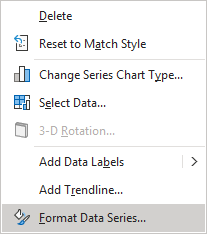
4. Right-click on the chart area and select Format Data Series... in the popup menu:
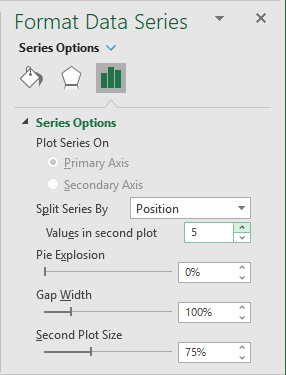
5. On the Format Data Series pane, in the Series Options group, under the Split Series By Position, in the Values in second plot field, select which data to display in the second pie.
In this example, the second pie shows the 5 values:
Note: There are several ways to choose which categories (slices) to display in the secondary pie or bar chart:
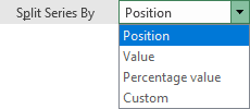
- Split series by - Position displays as many values in the second pie as specified in the Value in second plot field.
For example, the 4 values:

- Split series by - Value displays in the second pie all values less than the specified value in the Values less than field.
For example, all values less than 0.1 (10%):

- Split series by - Percentage Value displays in the second pie all parts less than the specified percentage in the Values less than field. If you have values in the data series, Excel calculates their percentage automatically.
For example, values less than 10%:

- Split series by - Custom allows specifying which pie you prefer to see each slice by selecting a data point and choosing the appropriate value in the Point Belongs to list.
For example, the data point with 5% (Other) is selected for the second pie:

You can then make any other adjustments to get the look you desire:
- Pie Explosion detaches the slice from the pie chart:
For example, the pie explosion of 20%:

- Gap Width controls the distance between charts.
For example, the distance is 25%:

- Second Plot Size specifies the relative size of the second chart.
For example, the second pie has the size of 88% of the first one:

See also how to add the 3D effects to the pie chart.
See also this tip in French: Un graphique en Secteurs de secteur ou Barres de secteur.
