A radar chart for personality assessment test visualization
Here radar charts become especially handy because tables, bars, and lines look cluttered and are hard to analyze for a large number of variables.
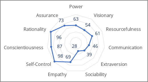
Some human resources experts identify them as spider charts, web charts, star plots, irregular polygons, polar charts, cobweb charts, or Kiviat diagrams.
To create a radar chart in Excel, do the following:
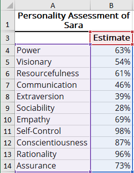
1. Select the chart data.
For example:
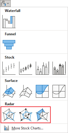
2. On the Insert tab, in the Charts group, click the Insert Waterfall, Funnel, Stock, Surface, or Radar Chart dropdown list:

Select the Radar, Radar with Markers, or Filled Radar:
Excel creates the chart from your data:
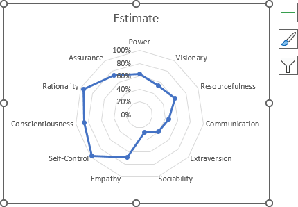
3. Select the title and change it or remove it.
4. Select the axis and remove it.
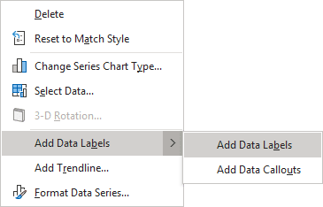
5. Right-click on any of the data point and choose Add Data Labels -> Add Data Labels in the popup menu:
A radar chart with data labels completely replaces the scores table.
See also this tip in French: Un diagramme radar pour la visualisation des tests d’évaluation de la personnalité.

