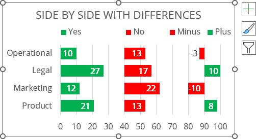
Side by side comparison bar chart with differences
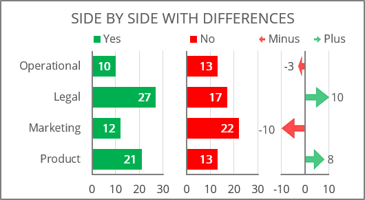
To create a side-by-side chart with differences like the one above, do the following:
1. Prepare a data
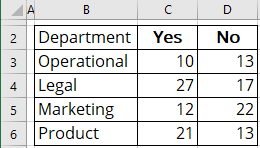
For example, a chart must be created for some survey data in several departments of an enterprise:
1.1. Define the new values:
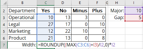
- Major - grid size for the chart, according to which the axes will need to be aligned (in this example, 10),
- Gap - minimum size between data columns (in this example, 5).
1.2. Calculate the differences:
- The Minus value is the difference between the first and the second datasets if the second dataset is greater than the first at the given point:

- The Plus amount is the difference between the first and the second datasets if the first dataset is greater than the second at the given point:

1.3. Calculate the width in the coordinate grid for every column using the following formula:
= round up the maximum value of the column values plus the defined gap value,
So, Width: = ROUNDUP ((MAX (<column values>) + gap) / major, 0) * major:
Note: See more about different rounding effects in Excel.
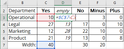
1.4. Add a new column between two data sets to calculate the space between them by the following formula:
= Calculated width of the first column minus the dataset value:
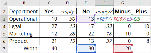
1.5. Add a new column after the second data set to calculate the space after it by the following formula:
= Calculated width of the second column plus the width of the Minus column minus the dataset value and the Minus value:
2. Create a chart
2.1. Select the data range (in this example, B2:H6).
2.2. On the Insert tab, in the Charts group, choose the Insert Column or Bar Chart button:

From the Insert Column or Bar Chart dropdown list, under 2-D Bar, select Stacked Bar:
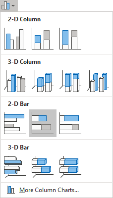
Excel creates a simple stacked bar chart:
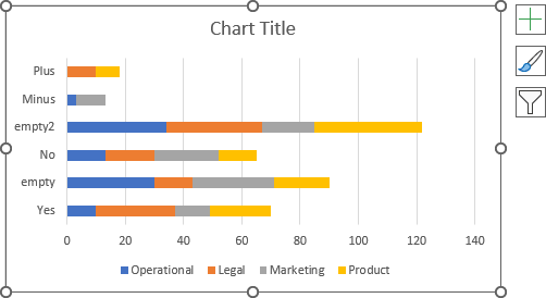
2.3. Switch rows and columns by doing one of the following:
- On the Chart Design tab, in the Data group, click the Switch Row/Column button:

- Right-click on the chart plot area and choose Select Data... in the popup menu:
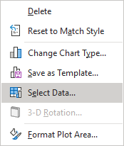
In the Select Data Source dialog box, click the Switch Row/Column button:

Excel changes the chart:
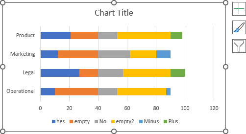
3. Format the axes
3.1. Optionally, change the order of the vertical axis labels (see how to change axis labels order in a bar chart).
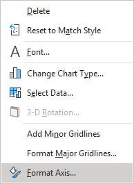
3.2. Right-click on the horizontal axis and choose Format Axis... in the popup menu:
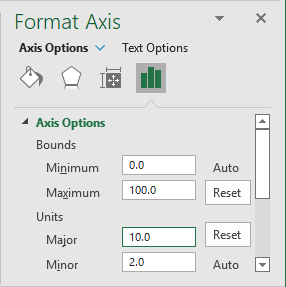
3.3. On the Format Axis pane, on the Axis Options tab, in the Axis Options section:
- Under Bounds, type the needed value in the Maximum field (in this example, 100),
- Under Units, type the appropriate value (defined in step 1.1. as the major value) in the Major field (in this example, 10):
4. Format the data series
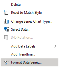
4.1. Right-click on the first data series and choose Format Data Series... in the popup menu:
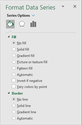
4.2. On the Format Data Series pane, on the Fill & Line tab:
- For every data series, select the appropriate filling option (see more about filling options in Microsoft).
- For the empty data series:
- In the Fill section, select the No fill option,
- In the Border section, select the No line option:
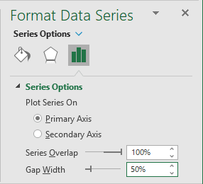
4.3. Optionally, on the Format Data Series pane, on the Series Options tab, in the Series Options group, type or select the appropriate value (50%) in the Gap Width field:
5. Format the chart
5.1. Add the labels (see how to add data labels for more details).
5.2. Type the chart title, remove unnecessary labels from the legend, move the legend, then make any other adjustments you desire:
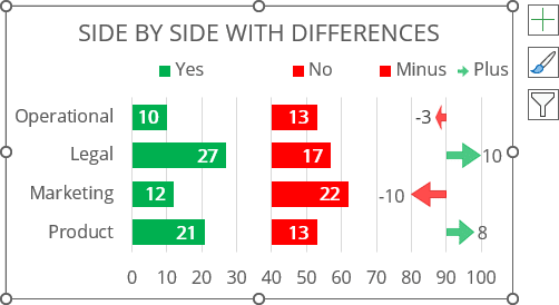
Note: You can also change the shapes for the variance chart:
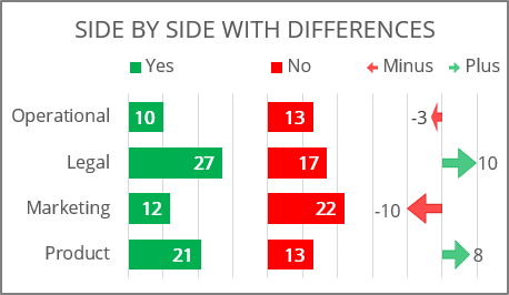
6. Format the horizontal axis
Note: You can just hide the horizontal axis labels:
6.1. Prepare data
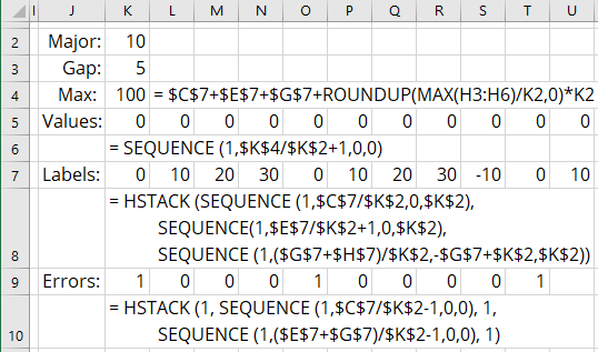
To add the vertical axes for the chart, create the following formulas for the spreadsheet:
1) Max - the width of the plot area as a sum of the width of all columns (see step 1.3.),
2) Values - array with as many zeros as labels should be displayed on the chart:
= SEQUENCE (<rows>, [<columns>], [<start>], [<step>])
where:
The SEQUENCE () function generates a list of sequential numbers in an array with a specified number of <rows> and <columns>, starting on the <start> value with specified <step>.
In this example, you need to generate as many zeros as labels should be displayed on the chart:
= SEQUENCE (1, max / major + 1, 0, 0)
3) Labels - array with the axis labels:
| = HSTACK ( | SEQUENCE (1, width of first column / major, 0, major), |
| SEQUENCE (1, width of second column / major + 1, 0, major), | |
| SEQUENCE (1, width of differences / major + 1, minimum value, major)) |
where:
The HSTACK (<array1>, [<array2>], ...) function combines arrays horizontally into a single array.
The first SEQUENCE () function returns the axis labels for the first column.
The second SEQUENCE () function returns the axis labels for the second column.
The third SEQUENCE () function returns the axis labels for the differences chart.
Note: Use the VSTACK () function to combine the vertical sequences (in columns instead of rows).
4) Errors - array for the vertical axis lines:
| = HSTACK ( | SEQUENCE (1, width of first column / major - 1, 0, 0), 1, |
| SEQUENCE (1, (width of second column + Minus column) / major - 1, 0, 0), 1) |
6.2. Add a new data series to the chart
Do one of the following:
- On the Chart Design tab, in the Data group, click the Select Data button:

- Right-click on the chart plot area and choose Select Data... in the popup menu.
In the Select Data Source dialog box:
- Under Legend Entries (Series), click the Add button:

- In the Edit Series dialog box, in the Series values field, type the defined names created for axis values (in this example, K5:U5 or Values), then click OK:
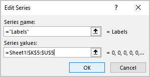
Excel adds a new data series to the chart:
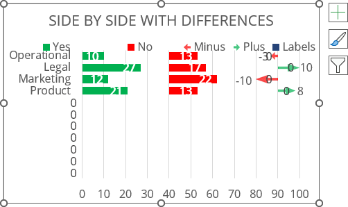
6.3. Change the new data series type
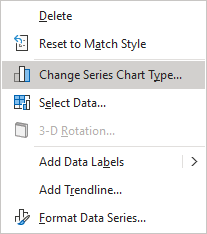
Right-click on any data series and choose Change Series Chart Type... in the popup menu:
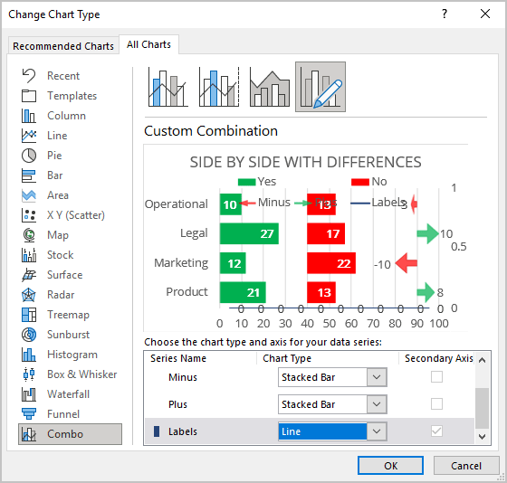
In the Change Chart Type dialog box, on the Combo tab, for the new data series:
- Check the Secondary Axis checkbox,
- Select the Line chart type:
6.4. Format the new data series
To format the newly added data series, add, format, and remove the secondary horizontal axis:
6.4.1. Add the secondary horizontal axis:
Do one of the following:
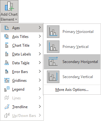
- On the Chart Design tab, in the Chart Layouts group, click the Add Chart Element drop-down list:

From the Add Chart Element dropdown list, select the Axes list and then click Secondary Horizontal:
- Click the Chart Elements button, then in the Chart Elements list, in the Axes list, select the Secondary Horizontal checkbox:

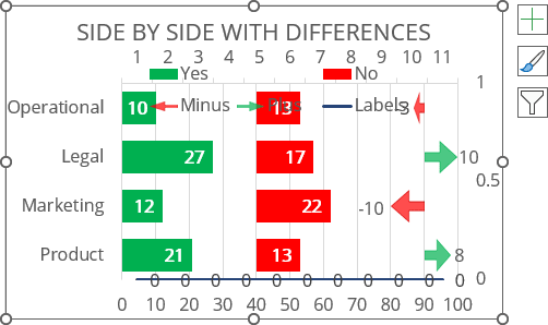
Excel adds the secondary horizontal axis for the selected data series (on the top of the plot area):
6.4.2. Format the secondary horizontal axis:
Right-click on the secondary horizontal axis (see how to select the invisible chart elements) and choose Format Axis... in the popup menu:

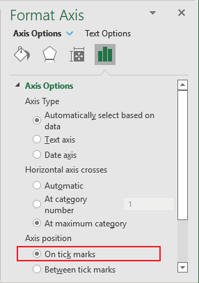
On the Format Axis pane, on the Axis Options tab, in the Axis Options section, under Axis position, select the On tick marks option:
6.4.3. Delete the secondary horizontal axis:
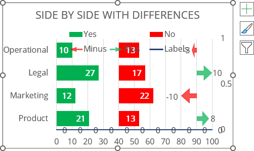
6.5. Add the error bars
To imitate second vertical axes, add and format the error bars for the new data series:
6.5.1. Select the new data series, then do one of the following:
- On the Chart Design tab, in the Chart Layouts group, click the Add Chart Element drop-down list:

From the Add Chart Element list, choose the Error Bars list and then click More Error Bars Options...:

- Click the Chart Elements button, then in the Chart Elements list, in the Error Bars list, select More Options...:

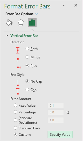
6.5.2. On the Format Error Bars pane for the Vertical Error Bar, on the Error Bar Options tab:
- In the Direction group, select Plus,
- In the End Style group, select No Cap,
- In the Error Amount group, select the Custom option:
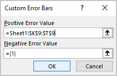
6.5.3. In the Custom Error Bars dialog box, in the Positive Error Value field, type the specified data range (in this example, K9:T9 - see step 6.1.4):
Excel adds the error bars:
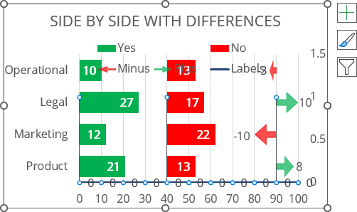
6.6. Format secondary vertical axis
Right-click on the secondary vertical axis (see how to select the invisible chart elements) and choose Format Axis... in the popup menu.
On the Format Axis pane, on the Axis Options tab:
- In the Axis Options section, under Bounds, type the correct value in the Maximum field (in this example, 1):

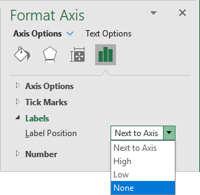
- In the Labels section, from the Label Position dropdown list, select None:
6.7. Hide the primary horizontal axis
On the Format Axis pane for the primary horizontal axis, on the Axis Options tab, in the Labels section, from the Label Position dropdown list, select None. See also how to hide the horizontal axis labels for more details.
6.8. Change the new data series labels
Right-click on the new data series labels and choose Format Data Labels... in the popup menu:
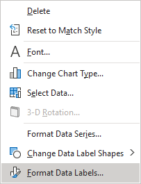
On the Format Data Labels pane, on the Label Options tab, in the Label Options section:
- In the Label Contains group:
- Check the Value From Cells option,
- Choose the appropriate cells (in this example, H6:O6) in the Data Label Range dialog box:
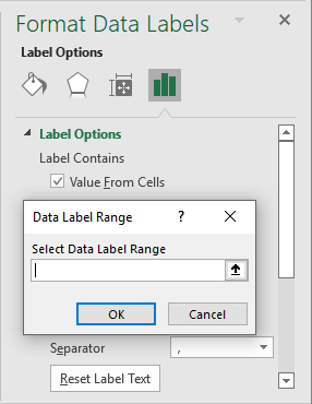
- Unselect all other checkboxes.
- In the Label Position group, select Below:

6.9. Format the new data series
For example, hide the middle data series points:
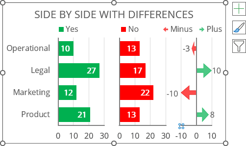
Make any other adjustments you desire.
