How to add a horizontal line to the chart
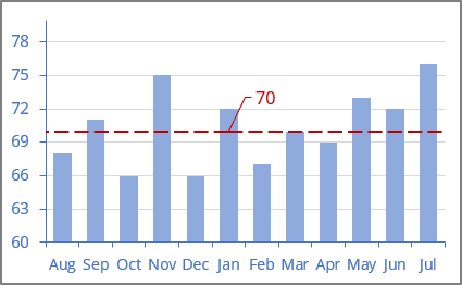
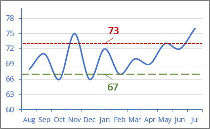
See how to add a vertical line to the scatter plot, a line or bar chart, or a horizontal line to a chart.
To add a horizontal line to a line or column chart, do the following:
I. Add new data for the horizontal line
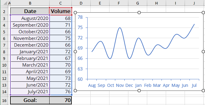
1. Add the cells with the goal or limit (limits) to your data.
For example, cell C16 contains the goal that should be displayed as a horizontal line:
II. Add a new data series
2. Add a new data series to your chart by doing one of the following:
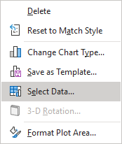
- Right-click on the chart plot area and choose Select Data... in the popup menu:
- On the Chart Design tab, in the Data group, choose Select Data:

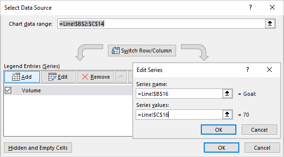
In the Select Data Source dialog box, under Legend Entries (Series), click the Add button, then in the Edit Series dialog box, type:
- Optionally, in the Series name box, the name of this line (for this example, Goal),
- In the Series values box, the cell with the goal (for this example, $C$16):
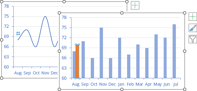
By default, Excel adds the new data series to the first point on the x-axis. Note that a new data series can be invisible (see how to select invisible chart elements):
III. Change a data series type
Note: This step is necessary because Excel adds only Y Error bars to the first and last data points. To see the horizontal line, you need to add X Error bars.
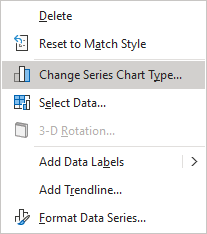
3. Right-click on any data series and choose Change Series Chart Type... in the popup menu:
In the Change Chart Type dialog box, choose the Scatter type:
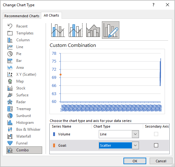
Don't worry about the chart! Repeat step 2 to change the data series:
- In the Select Data Source dialog box, select the added data series, then under Legend Entries (Series), click the Edit button.
- In the Edit Series dialog box, in the Series X values box, add any cell from the horizontal (category) axis but the first or last one (see the note why).
For example, $B$8:

You will see the correct data for the same horizontal (category) axis:
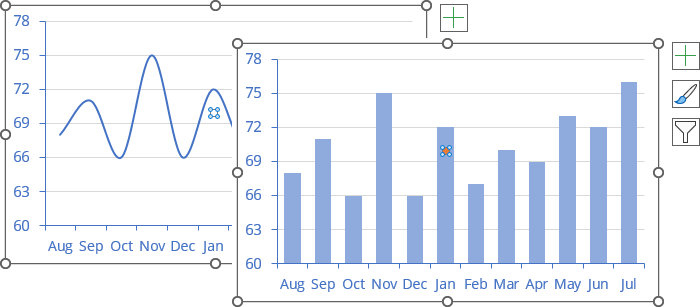
IV. Add the horizontal line
4. On the chart, select the new data series (see how to select invisible chart elements), then do one of the following:
- Click on the Chart Elements button, select the Error Bars list, then choose More Options...:

- On the Chart Design tab, in the Chart Layouts group, click the Add Chart Element dropdown list:

In the Add Chart Element dropdown list, choose the Error Bars list, then click More Error Bars Options...:

See more about other options in Adding Error bars.
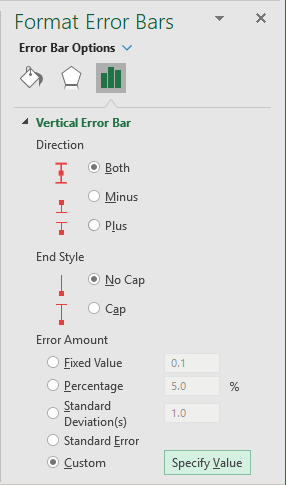
5. On the Format Error Bars pane for the Horizontal Error bar (see below how to select the Horizontal Error bar), on the Error Bar Options tab:
- In the Direction group, select Both,
- In the End Style group, select No Cap,
- In the Error Amount group, select the Custom option, then click the Specify Value button:
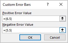
On the Custom Error Bars dialog box, type or select the appropriate value for negative and positive values. For this example:
You can then make any other adjustments to get the expected look.
Note: To select the Horizontal Error bar for some data series, do one of the following:
- Click the arrow next to Error Bar Options and choose the Series {data series name}: X Error Bars in the dropdown list:
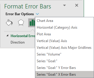
- On the Chart Format tab, in the Current Selection group, click the arrow of the Chart Elements dropdown list, then select Series {data series name}: X Error Bars for the needed data series:

See also this tip in French: Comment ajouter une ligne horizontale au graphique.


