Excel 365
How to create Budget Template that works for you
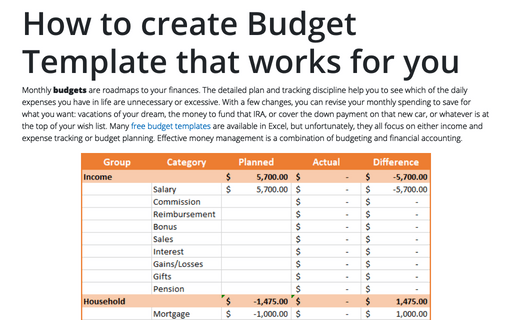
Monthly budgets are roadmaps to your finances. The detailed plan and tracking discipline help you to see which of the daily expenses you have in life are unnecessary or excessive. With a few changes, you can revise your monthly spending to save for what you want: vacations of your dream, the money to fund that IRA, or cover the down payment on that new car, or whatever is at the top of your wish list. Many free budget templates are available in Excel, but unfortunately, they all focus on either income and expense tracking or budget planning. Effective money management is a combination of budgeting and financial accounting.
How to draw flowchart and swimlane flow chart in Excel
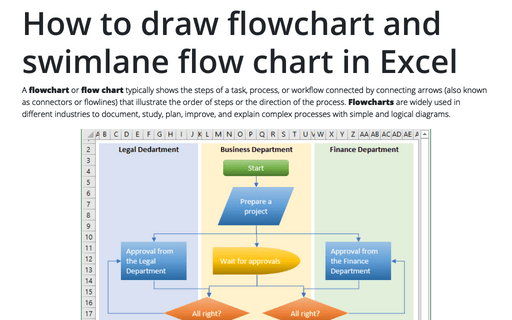
A flowchart or flow chart typically shows the steps of a task, process, or workflow connected
by connecting arrows (also known as connectors or flowlines) that illustrate the order of steps or the
direction of the process. Flowcharts are widely used in different industries to document, study,
plan, improve, and explain complex processes with simple and logical diagrams.
How to change flowchart connector or flowline
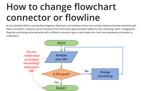
As the standard defines, process flow diagrams, flowcharts, and workflow charts must connect steps and process elements with elbow connectors. Excessive use of connector lines of the same type and style makes the chart confusing. Often, changing the flowchart and linking some elements with a different connector type or style makes the chart more expressive and easier to understand.
How to add text to the flowchart connector or flowline
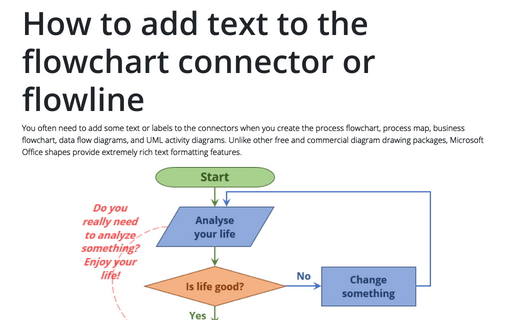
You often need to add some text or labels to the connectors when you create the process flowchart, process map, business flowchart, data flow diagrams, and UML activity diagrams. Unlike other free and commercial diagram drawing packages, Microsoft Office shapes provide extremely rich text formatting features.
Highlight data series in line chart
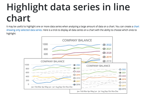
It may be useful to highlight one or more data series when analyzing a large amount of data on a chart. You can create a chart showing only selected data series. Here is a trick to display all data series on a chart with the ability to choose which ones to highlight:
Free Budget Templates for Excel
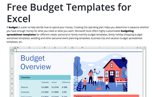
A budget is a plan to help decide how to spend your money. Creating this spending plan helps you determine in advance whether you have enough money for what you need or what you want. Microsoft Excel offers highly customizable budgeting spreadsheet templates for different needs: personal or family monthly budget templates, family holiday shopping budget worksheet templates, wedding and other personal event planning templates, business trip and vacation budget spreadsheet templates, etc.
How to create drop-down list in Excel cell
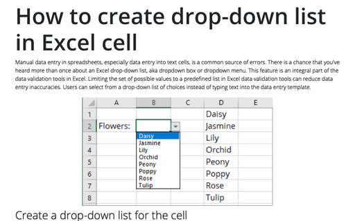
Manual data entry in spreadsheets, especially data entry into text cells, is a common source of errors. There is a chance that you've heard more than once about an Excel drop-down list, aka dropdown box or dropdown menu. This feature is an integral part of the data validation tools in Excel. Limiting the set of possible values to a predefined list in Excel data validation tools can reduce data entry inaccuracies. Users can select from a drop-down list of choices instead of typing text into the data entry template.
Side by side comparison bar chart with differences
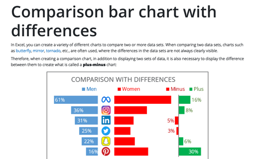
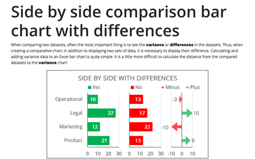
When comparing two datasets, often the most important thing is to see the variance or differences in the datasets. Thus, when creating a comparative chart, in addition to displaying two sets of data, it is necessary to display their difference. Calculating and adding variance data to an Excel bar chart is quite simple. It is a little more difficult to calculate the distance from the compared datasets to the variance chart:
Create bidirectional bar chart in Excel
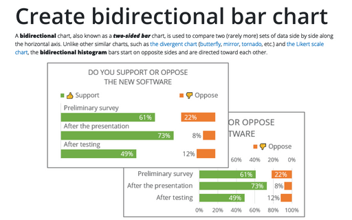
A bidirectional chart, also known as a two-sided bar chart, is used to compare two (rarely more) sets of data side by side along the horizontal axis. Unlike other similar charts, such as the divergent chart (butterfly, mirror, tornado, etc.) and the Likert scale chart, the bidirectional histogram bars start on opposite sides and are directed toward each other.
