How to create a simple Bullet graph in Excel

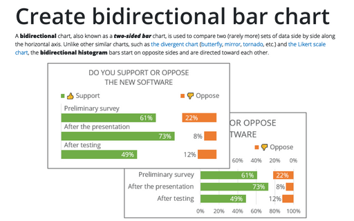
Both values, actual and target, can be shown as a percentage (see How to create a Bullet chart in Excel):

To create a bullet chart in Excel, do the following:
1. Create a bar chart.
1.1. Select the data.
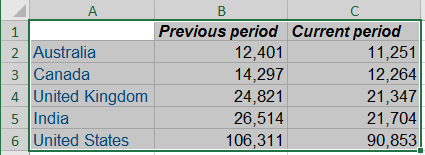
For example, the total visits for the previous month (the target) vs the visits for the current month:
1.2. On the Insert tab, in the Charts group, click the Column button:

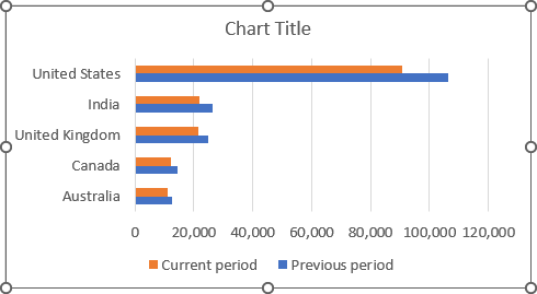
From the Column dropdown list, select the Clustered Bar
 chart (or
the Clustered Column
  chart):
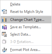
1.3. Right-click on the chart and choose Change Chart Type... in the popup menu:
1.4. In the Change Chart Type dialog box:
- Select the Combo tab,
- Check the Secondary Axis checkbox for the Previous period data series and select the Scatter type for this data series,
- Re-select for the Current period data series the Clustered bar chart type (Excel changes it after choosing the Combo tab).
- Click OK.
1.5. Do one of the following:
- Under Chart Tools, on the Design tab, in the Data group, choose
Select Data:

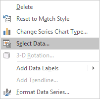
- Right-click in the chart area and choose Select Data... in the popup menu:
1.6. In the Select Data Source dialog box:
- Select the Previous period data series (the target),
- Under Legend Entries (Series), click the Edit button:

1.7. In the Edit Series dialog box:
- Choose cells with the correct values for this data series (Series X values),
- Type = {1,2,3,4,5} for the Series Y values:

- Click OK twice:
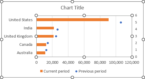
2. Change the Secondary Axis:
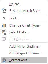
2.1. Right-click the secondary horizontal axis and choose Format Axis... in the popup menu:
2.2. On the Format Axis pane, on the Axis Options tab, in the Axis Options section:
- In the Bounds Minimum field, type 0.5 to positioning the target points
in the middle of each bar:

- Ensure that Excel calculates the Bounds Maximum as 5.5:
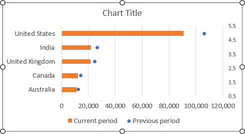
2.3. Remove the secondary axis.
3. Create the target markers:
3.1. Select the Previous period data series (the target).
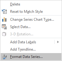
3.2. Right-click on the data series and choose Format Data Series... in the popup menu:
3.3. On the Format Data Series pane, on the Fill & Line tab, under Marker:
- In the Marker Options section, select the Built-in option, the appropriate
Type and Size:

Note: If you create a column chart, it is enough to select the rectangular marker, and the size about 20. After that, you can skip other customization for the target markers.
- In the Fill section, select the Solid fill option and the color you prefer:

- In the Border section, select the No line option.
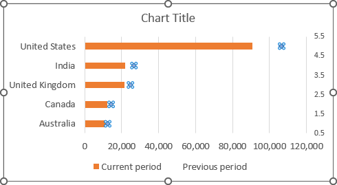
Excel shows the target data series as markers you selected:
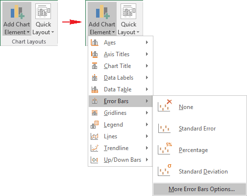
3.4. To create the target markers more visible, select this data series, and then under Chart Tools, on the Design tab, in the Chart Layouts group. From the Add Chart Element dropdown list, select Error Bars and then More Error Bars Options...:
3.5. On the Format Error Bars pane:
- On the Error Bars Options tab, in the Vertical Error Bar section:
- In the End Style group, select No Cap option,
- In the Error Amount group, select the Fixed value option and then type the value you want:

- On the Fill & Line tab:
- Select the Solid line option, choose the Color and Width as you have chosen for target markers,
- Choose the Round item from the Cap type drop-down list:


