How to create a funny dog breeds lifespan chart in Excel
For example, below is a dog breed life expectancy chart created for the top 10 of 2018 Most Popular Dog Breeds by the American Kennel Club (AKC):
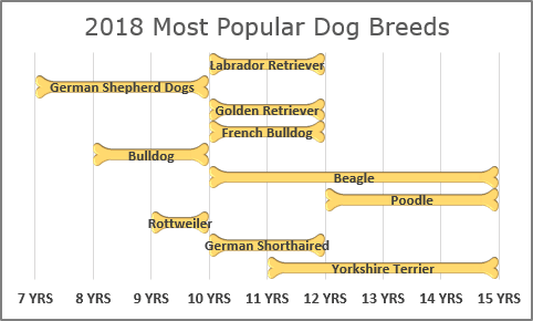
Span charts focus on only the extreme points and give no information on the values in between the minimum and maximum or on averages or the data distribution. To show other information, including minimum and maximum, use the box charts.
In this example, the chart is created from the top 10 lines of the dog breed life expectancy list by AKC:
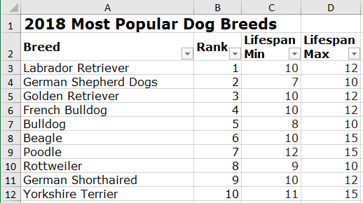
To create a span chart, do the following:
1. Insert to the spreadsheet the picture with the bone for the chart ranges: the start of the bone, the middle of the bone, the end of the bone:
- The simplest way: insert an existing picture, duplicate it and, cut as you
need. For example:

- The creative way: create own pictures for the bone parts. For example:
- You can create the bone parts in Microsoft PowerPoint by using three types of
shapes: heart, moon, and rectangle (see
How to combine shapes to create a custom shape):


Note: PowerPoint offers a useful function to union the shapes that doesn't exist in Excel.
- Copy the parts created in the PowerPoint to the Clipboard.
- Paste them to the Excel spreadsheets as pictures: on the Home tab, in the
Clipboard group, click the Paste dropdown list and select the
Picture button:

Note: If you don't see the as Picture button, you can select Paste Special... and then in the Paste Special dialog box, select the picture format and click OK.
- Make any adjustments you want. We recommend cropping all three pictures to have
the same height. It helps to create a consistent chart easier:

- You can create the bone parts in Microsoft PowerPoint by using three types of
shapes: heart, moon, and rectangle (see
How to combine shapes to create a custom shape):
2. Add the new three columns to the data for the different parts of bone:
- the Start and End values are fixed (for this example, 0.3),
- the Difference value is calculated as the difference between maximum, minimum
values and the width of the start and endpoints:
= Lifespan Max – Lifespan Min – Start – End:
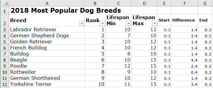
3. Create a span chart:
3.1. Select the data for the chart (in this example, A3:A12, C3:C12, E3:G12).
Note: You can choose different discontinuous ranges by holding Ctrl and selecting them.
3.2. On the Insert tab, in the Charts group, click the Insert Bar or Column Chart button:

From the Insert Bar or Column Chart dropdown list, select the Stacked Bar
 chart.
Excel creates a chart:
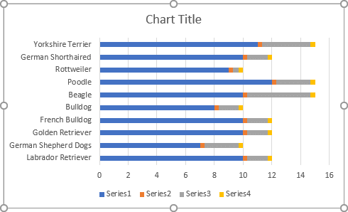
4. Format the vertical axis:
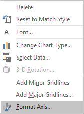
4.1. Right-click on the vertical axis and choose Format Axis... in the popup menu:
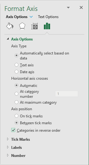
4.2. In the Format Axis pane, on the Axis Options tab, under Axis Position, select the Categories in reverse order checkbox:
5. Format the horizontal axis:
5.1. Right-click on the horizontal axis and choose Format Axis... in the popup menu.
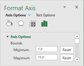
5.2. On the Format Axis pane, on the Axis Options tab, under Bounds, type the appropriate values for Minimum and Maximum fields:
6. Format the data series:
The first data series:
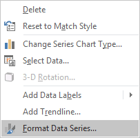
6.1. Right-click on the first data series (Lifespan Min) and choose Format Data Series... in the popup menu:
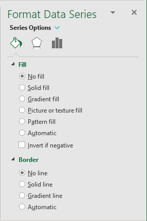
6.2. On the Format Data Series pane:
- On the Fill & Line tab:
- In the Fill section, choose the No fill option,
- In the Border section, choose the No line option:
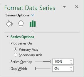
- On the Series Options tab, in the Gap Width field, choose the value you like.
For example, 0%:
The second, third, and fourth data series:
6.3. Select the appropriate picture (the start, middle, or end part of the bone).
6.4. Right-click on the appropriate data series and choose Format Data Series... in the popup menu.
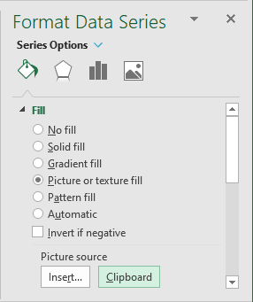
6.5. On the Format Dara Series pane, on the Fill & Line tab, in the Fill group, select the Picture or texture fill option, and then click Clipboard:
7. Add the data labels:
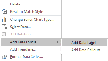
7.1. Right-click on the middle part of the bone data series and choose Add Data Labels -> Add Data Labels in the popup menu:
7.2. Right-click on the data labels and select Format Data Labels... in the popup menu:
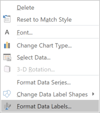
7.3. On the Format Data Labels pane:
- On the Label Options tab, in the Labels Options section, under
Label Contains, select the Category Name option and unselect others:

- On the Size & Properties tab, in the Alignment group, remove
Left margin and Right margin values:

8. Remove the vertical axis, the legend, and make any other adjustments you want.

