Excel 2016
Adding Up/Down Bars to a line chart
If you have a line chart with two different data series, you might want to compare those series at each
point along the horizontal axis. There are two different options for this, available in two locations,
along with the Design tab, under Chart Tools of the ribbon.
Glossy Gantt chart with a vertical line
If you need to create a simple Gantt chart, see
Creating a Gantt chart or
Gantt chart with progress.
To add events to your Gantt chart, see
Progress Gantt chart with events.
This tip will help you to extend those charts by a vertical line that shows the current date.
Progress Gantt chart with events
Gantt chart is a pervasive project management tool intended to reveal task management problems. But
you can enrich it with additional information like project milestones, presentation dates, and similar
events.
How to add a vertical line to the line or bar chart
This tip is about how to add a vertical line in your chart. E.g., this will be useful to show data and
highlight a current date.
How to add a vertical line to the scatter chart
This tip is about how to add a vertical line in your chart. E.g., this will be useful to show data and
highlight a current date.
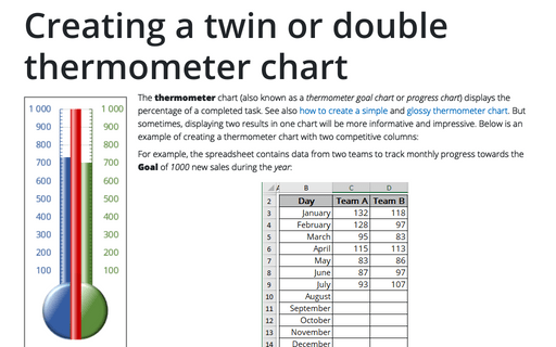
Creating a twin or double thermometer chart
The thermometer chart displays the percentage of a task that's completed. See also
how to create a simple thermometer chart,
and
how to create a glossy thermometer chart.
But sometimes it will be more informative to display two results in one chart.
This tip is how to create a thermometer chart with two competitive columns.
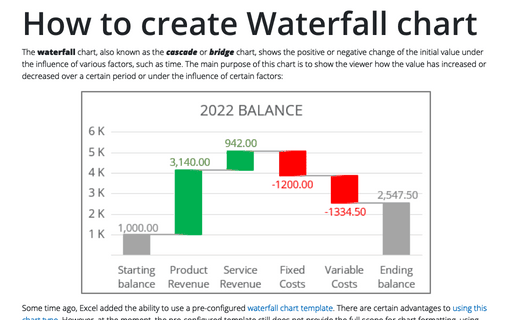
How to create Waterfall chart
The waterfall chart is normally used for understanding how an initial value is affected by a series of
intermediate positive or negative values. Usually the initial and the final values are represented by whole
columns, while the intermediate values are denoted by floating columns.
Waterfall chart using Error bars
The Waterfall chart is usually used for understanding how an initial value is affected by a series of
intermediate positive or negative values. As we have shown, Creating a Waterfall chart can be created
using a combination of Excel Bar charts. This tip will show you how to streamline this process using
the Error Bar chart. The Waterfall chart is typically used for understanding how an initial value is
affected by a series of intermediate positive or negative values.
How to hide points on the chart axis
Sometimes you need to omit some points of the chart axis, e.g., the zero point. This tip will show you how
to hide specific points on the chart axis using a custom label format.
Conditional formatting for chart axes
Another powerful trick to attain the attention of the audience and improve the effect of your presentation
is to use axis label formatting customized for the specific value ranges.


