Conditional formatting for chart axes
Excel
2016
Another powerful trick to attain the attention of the audience and improve the effect of your presentation
is to use axis label formatting customized for the specific value ranges.


To change the format of the label on the Excel 2016 chart axis, do the following:
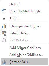
1. Right-click in the axis and choose Format Axis... in the popup menu:

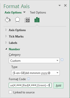
2. On the Format Axis task pane, in the Number group, select Custom category and then change the field Format Code and click the Add button:

- If you need a unique representation for positive, negative, and zero values, just write multiple
formats, separating each with a semicolon.
- If you write two formats, the first applies to positive and zero values and the second applies to negative values.
- If you write three formats, the first applies to positive values, the second to negative values, and the third to zero.
- If you write four formats, they apply to positive, negative, zero, and text values, respectively.
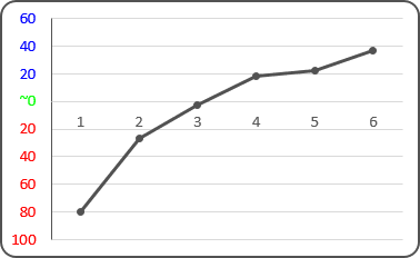
[Blue]#,###;[Red]#,###;[Green]~0;
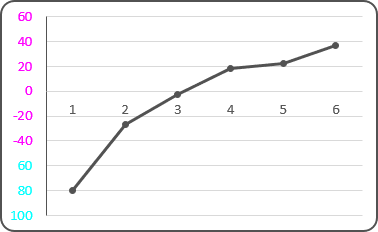
- If you want to create a custom condition based on values below or equal to some point (for example,
-60) and greater than it, you could type the following condition codes:
[Cyan][<=-60];[Magenta][>-60]
See also How to hide points on the chart axis.
See also this tip in French: Mise en forme conditionnelle des axes du graphique.

