Adding Up/Down Bars to a line chart
Excel
2016
If you have a line chart with two different data series, you might want to compare those series at each
point along the horizontal axis. There are two different options for this, available in two locations,
along with the Design tab, under Chart Tools of the ribbon.
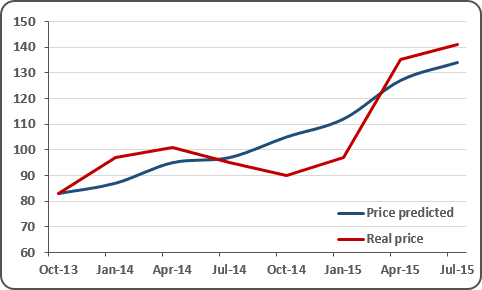
Create a line chart with two different data series, for example:
First way:
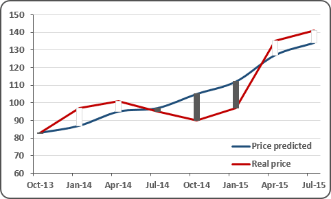
To add Up/Down Bars to your chart, select it and then under Chart Tools, on the Design tab, in the Chart Layouts group, click the Add Chart Element icon and choose Up/Down Bars list:
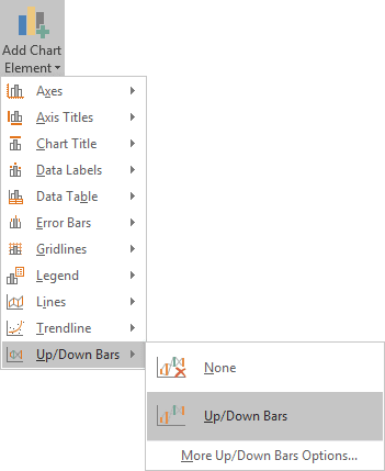
In the Up/Down Bars drop-down list, select Up/Down Bars.
Second way:
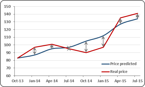
To add High-Low Lines to your chart, select it and then under Chart Tools, on the Design tab, in the Chart Layouts group, click the Add Chart Element icon and choose Lines list:
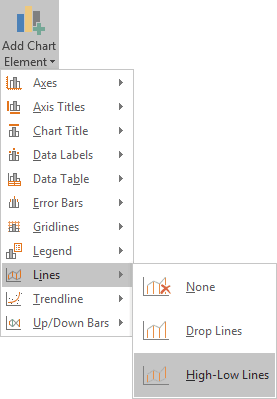
In the Lines drop-down list, select High-Low Lines.
See also this tip in French: Ajouter de barres Haut / Bas à un graphique en courbes.

