Chart in Excel 365
Simple combination chart
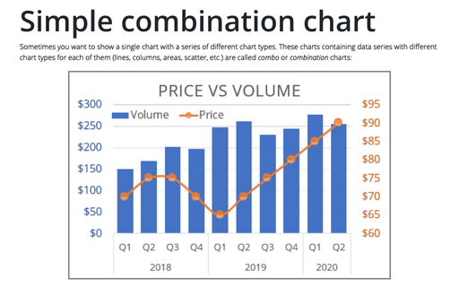
Sometimes you want to show a single chart with a series of different chart types. These charts containing data series with different chart types for each of them (lines, columns, areas, scatter, etc.) are called combo or combination charts:
Combining several charts into one chart
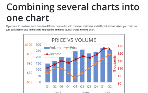
If you want to combine more than two different data series with common horizontal and different vertical values, you could not just add another axis to the chart. You need to combine several charts into one chart.
Using two axes in one chart
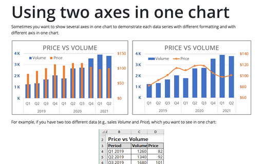
Sometimes you want to show several axes in one chart to demonstrate each data series with different
formatting and with different axis in one chart.
Excel 3-D Pie charts
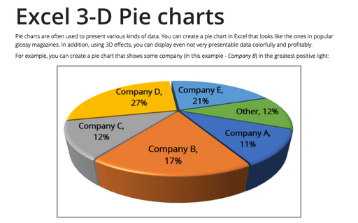
Pie charts are often used to present various kinds of data. You can create a pie chart in Excel that looks like the ones in popular glossy magazines. In addition, using 3D effects, you can display even not very presentable data colorfully and profitably.
Creating Pie of Pie and Bar of Pie charts
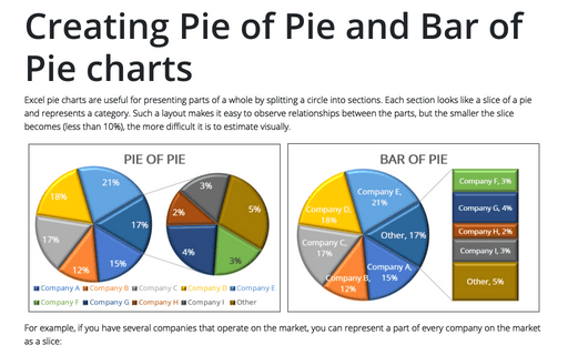
Excel pie charts are useful for presenting parts of a whole by splitting a circle into sections. Each section looks like a slice of a pie and represents a category. Such a layout makes it easy to observe relationships between the parts, but the smaller the slice becomes (less than 10%), the more difficult it is to estimate visually.
Using Pie Charts and Doughnut Charts in Excel
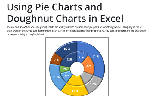
The pie and donut (in Excel, doughnut) charts are widely used to present multiple parts of something whole. Using any of these chart types in Excel, you can demonstrate each part in one chart keeping their proportions. You can also represent the changes in those parts using a doughnut chart:
Creating a gauge chart
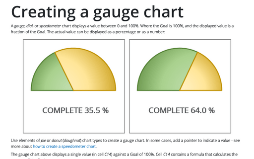
A gauge, dial, or speedometer chart displays a value between 0 and 100%. Where the Goal is 100%, and the displayed value is a fraction of the Goal. The actual value can be displayed as a percentage or as a number:
Show chart data for empty cells
If there are some gaps in source data for the chart, by default, Excel does not display them on the chart, and this looks odd. Excel offers a useful feature to display interpolated values instead of gaps in the chart. In addition, Excel allows you to process data with #N/A errors as empty cells.
Show chart data in hidden cells
Excel allows you to create charts and diagrams from different data sets, even those that contain hidden or empty cells. However, sometimes you may see unexpected results. For example, if there are hidden cells in the chart data, by default, Excel ignores such data and doesn't display the corresponding chart elements. You can easily force Excel to handle hidden data.
How to add a horizontal line to the chart
Usually, horizontal lines are added to a chart to highlight a target, threshold, limits, base, average, or benchmark. These lines, for example, can help control if a process is behaving differently than usual. Excel allows you to add a vertical line to an existing chart in several different ways, e.g., by calculating line values for a scatter, line, or column chart, but using error bars is the easiest way to add a vertical line to a chart:
