Side by side comparison bar chart
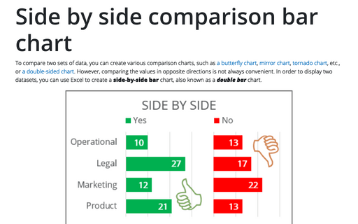
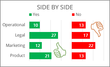
On a double bar chart, two bars are drawn in parallel for each dataset:
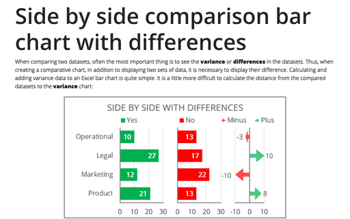
Of course, using this approach, you can display multiple datasets in grouped horizontal columns (see how to create small multiple bars). See also the side-by-side comparison chart with differences:
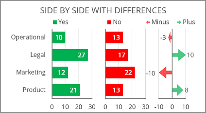
To create a side-by-side chart in Excel, do the following:
1. Prepare the data
For example, a chart must be created for some survey data in several departments of an enterprise:
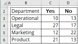
1.1. Define two new values:
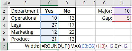
- Major - grid size for the chart, according to which the axes will need to be aligned (in this example, 10),
- Gap - minimum size between data columns (in this example, 5).
1.2. Calculate the width of the first column using the following formula:
= round up the maximum value of the first dataset plus the defined gap value,
So, Width: = ROUNDUP ((MAX (C3:C6) + gap) / major, 0) * major:
Note: See more about different rounding effects in Excel.
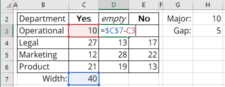
1.3. Add a new column between two data series to calculate the gap between them by the following formula:
= Calculated width in the previous step minus the current dataset value:
2. Create a chart
2.1. Select the data range (in this example, B2:E6).
2.2. On the Insert tab, in the Charts group, choose the Insert Column or Bar Chart button:

From the Insert Column or Bar Chart dropdown list, under 2-D Bar, select Stacked Bar:
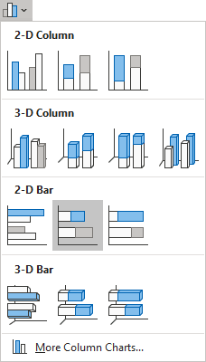
Excel creates a simple stacked bar chart:
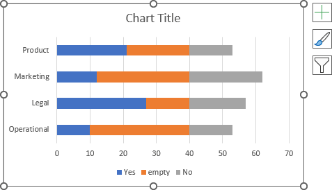
3. Format the vertical axis
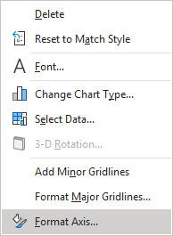
3.1. Right-click on the vertical axis and choose Format Axis... in the popup menu:
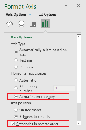
3.2. On the Format Axis pane, on the Axis Options tab, in the Axis Options section:
- Under Horizontal axis crosses, select the At maximum category option,
- At the end of the section, check the Categories in reverse order checkbox:
4. Optionally, format the legend
4.1. Do one of the following:
- On the Chart Design tab, in the Data group, click the Select Data button:

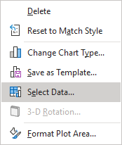
- Right-click on the chart plot area and choose Select Data... in the popup menu:
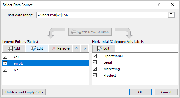
4.2. In the Select Data Source dialog box, select the added data series (in this example, Empty), then under Legend Entries (Series), click the Edit button:
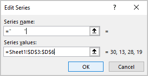
4.3. In the Edit Series dialog box, in the Series name field, type the empty symbols (in this example, ten spaces - " "), then click OK:
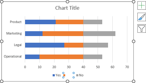
On the chart, the legend displays the empty label instead of the unnecessary one:
5. Format the data series
5.1. Right-click on the first data series and choose Format Data Series... in the popup menu:
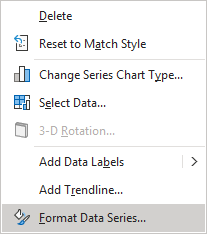
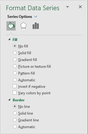
5.2. On the Format Data Series pane, on the Fill & Line tab:
- For every data series, select the appropriate filling option (see more about filling options in Microsoft).
- For the gap data series:
- In the Fill section, select the No fill option,
- In the Border section, select the No line option:
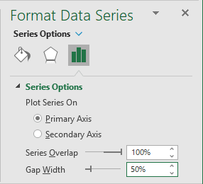
5.3. Optionally, on the Format Data Series pane, on the Series Options tab, in the Gap Width field, choose the value you like. For example, 50%:
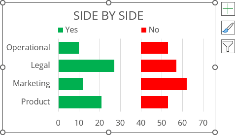
5.4. Type the chart title, remove the unnecessary label from the legend, move the legend, then make any other adjustments you desire:
6. Add data labels
To add data labels to the chart, do one of the following:
- Click on the Chart Elements button, select the Data Labels list, then select the position of the labels:

- On the Chart Design tab, in the Chart Layouts group, click the Add Chart Element button:

From the Add Chart Element dropdown list, choose Data Labels, then select the place for the labels:

Remove unnecessary labels:
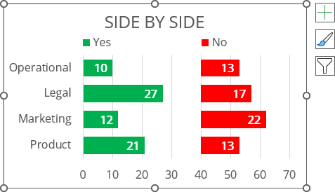
7. Format the horizontal axis
Choose one of the options:
- Hide the horizontal axis labels,
- Format the horizontal axis labels.
Make any other adjustments you desire.
