Chart in Excel 365
How to create re-sorting chart in Excel
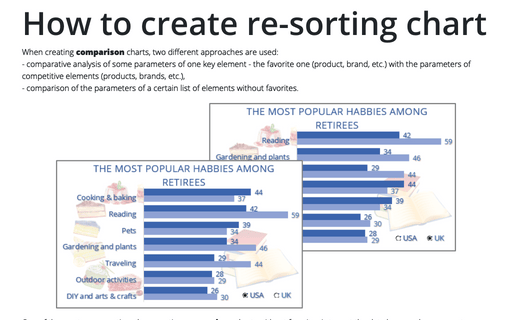
When creating comparison charts, two different approaches are used:
- comparative analysis of some parameters of one key element - the favorite one (product, brand, etc.) with the parameters of competitive elements (products, brands, etc.),
- comparison of the parameters of a certain list of elements without favorites.
- comparative analysis of some parameters of one key element - the favorite one (product, brand, etc.) with the parameters of competitive elements (products, brands, etc.),
- comparison of the parameters of a certain list of elements without favorites.
How to add pictures to vertical axis of the bar chart
Nowadays, icons, logos, and abbreviations often carry more information than the textual names of companies, brands, applications, games, etc. To create memorable charts and faster understanding and recognition of information, instead of the names of countries, brands, etc., you can substitute the corresponding pictures on the axis of the charts.
How to create one chat of split bars or small multiple bars in Excel
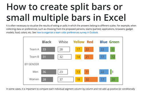
It is often necessary to visualize the results of voting or polls in which the answers belong to different scales. For example, when collecting data on preferences, such as choosing from the proposed persons, teams (parties); applications, browsers; gadget models; food, colors; etc. See how to organize a team color preferences survey in Outlook.
How to create simple diverging bar chart
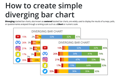
Diverging stacked bar charts, also known as centered stacked bar charts, are widely used to display the results of surveys, polls, or questionnaires analyzed through a ranking scale such as a Likert or numeric scale.
How to create bar chart of the survey results
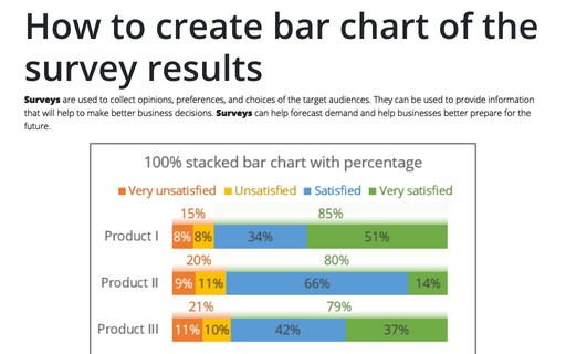
Surveys are used to collect opinions, preferences, and choices of the target audiences. They can be used to provide information that will help to make better business decisions. Surveys can help forecast demand and help businesses better prepare for the future.
Cascade chart using stepped line chart in Excel
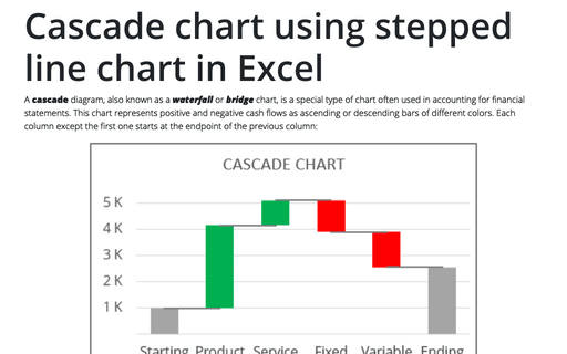
A cascade diagram, also known as a waterfall or bridge chart, is a special type of chart often used in accounting for financial statements. This chart represents positive and negative cash flows as ascending or descending bars of different colors. Each column except the first one starts at the endpoint of the previous column:
How to create step chart in Excel
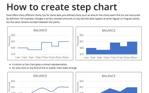
Excel offers many different charts, but for some data, pre-defined charts such as area or line charts seem fine but are inaccurate by definition. For example, changes in prices, invested amounts, or any discrete data happen at some regular or irregular points, but the value remains constant between the points:
How to show Likert scale chart with extra neutral
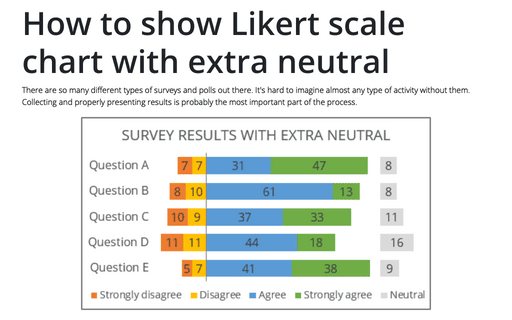
There are so many different types of surveys and polls out there. It's hard to imagine almost any type of activity without them. Collecting and properly presenting results is probably the most important part of the process.
How to show Likert scale chart (integrated neutral)
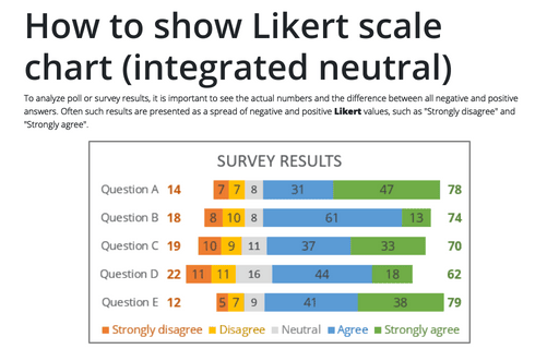
To analyze poll or survey results, it is important to see the actual numbers and the difference between all negative and positive answers. Often such results are presented as a spread of negative and positive Likert values, such as "Strongly disagree" and "Strongly agree".
How to create interactive chart with dropdown list in Excel
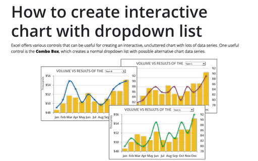
Excel offers various controls that can be useful for creating an interactive, uncluttered chart with lots of data series. One useful control is the Combo Box, which creates a normal dropdown list with possible alternative chart data series.
