How to show Likert scale chart (integrated neutral)
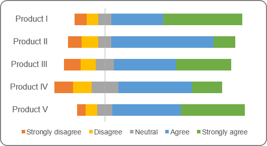
The main feature of this chart is the positioning of bars relative to the center.
To create an Excel chart like the one above, do the following:
1. Add an additional data to your chart data:
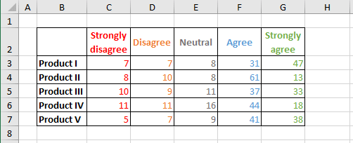
1.1. For correct positioning, calculate the maximum of all negative marks plus half of neutral marks (if you don't have neutral marks, calculate the maximum of negative marks):
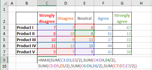
1.2. Add a new column to calculate the difference between the maximum and the sum of negative marks and half of neutral marks:
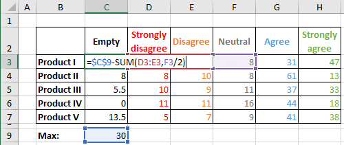
2. Create a plain bar chart using all data (for this example, B2:H7):
2.1. On the Insert tab, in the Charts group, click the Insert Column or Bar Chart button:

Under 2-D Bar, choose the Stacked Bar
 chart.
Excel creates the bar chart:
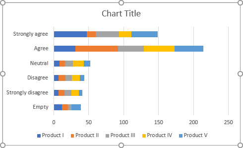
2.2. Select the chart data by doing one of the following:
- Under Chart Tools, on the Design tab, in the Data group, choose Select Data:

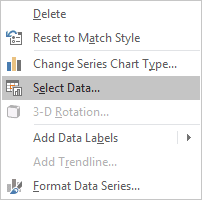
- Right-click in the chart area and choose Select Data... in the popup menu:
2.3. On the Select Data Source dialog box, click the Switch Row/Column button:
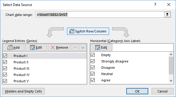
2.4. Click OK:
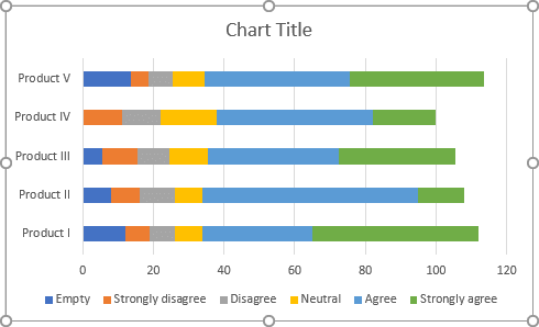
3. Format the horizontal axis:
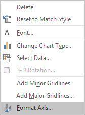
3.1. Right-click on the horizontal axis and choose Format Axis... in the popup menu:
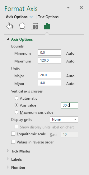
3.2. On the Format Axis pane, on the Axis Options tab, in the Axis Options section, under Vertical axis crosses:
- Check the Axis value radio button,
- Type the maximum value that you calculated in the step 1.1.:
4. Format the vertical axis:
4.1. Right-click on the vertical axis and choose Format Axis... in the popup menu.
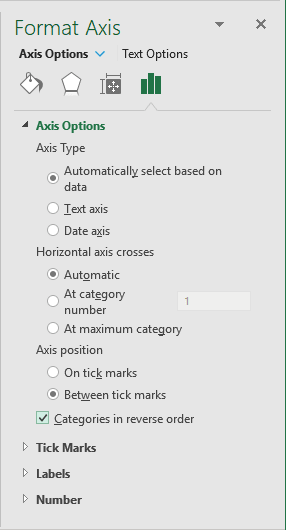
4.2. On the Format Axis pane, on the Axis Options tab:
- In the Axis Options section, check the Categories in reverse order checkbox:
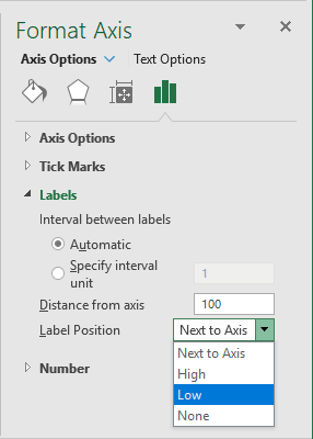
- In the Labels section, in the Label Position drop-down list, choose Low:
5. Format the data series:
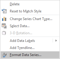
5.1. Right-click on the first data series (in this example, Empty) and choose Format Data Series... in the popup menu:
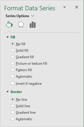
5.2. On the Format Data Series pane, on the Series Options tab:
- In the Fill section, select the No fill option,
- In the Border section, select the No line option:
Excel hides the first data series:
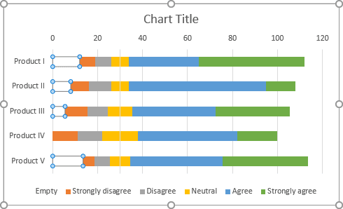
Add any other adjustments you prefer.
