A radar chart for personality assessment test visualization
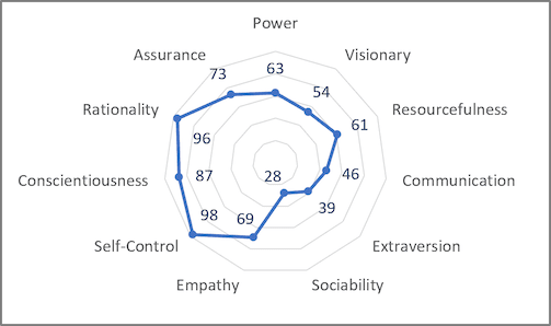
Some human resources experts identify them as spider charts, web charts, star plots, irregular polygons, polar charts, cobweb charts, or Kiviat diagrams.
To create a radar chart in Excel, do the following:
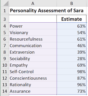
1. Select the chart data.
For example:
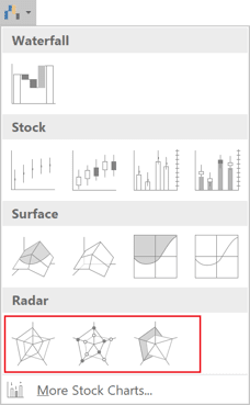
2. On the Insert tab, in the Charts group, click the Insert Waterfall, Funnel, Stock, Surface, or Radar Chart dropdown list:

Select the Radar, Radar with Markers, or Filled Radar:
Excel creates the chart from your data:
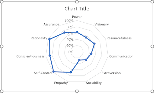
3. Select the title and change it or remove it.
4. Select the axis and remove it.
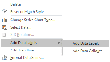
5. Right-click on any of the data point and choose Add Data Labels -> Add Data Labels in the popup menu:
A radar chart with data labels completely replaces the scores table.
See also this tip in French: Un diagramme radar pour la visualisation des tests d’évaluation de la personnalité.

