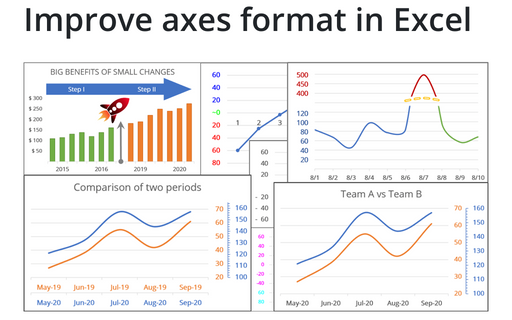
Improve axes format in Excel
1. Hide some points
Sometimes you need to omit some points of the chart axis, e.g., the zero point:
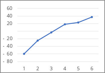
See How to hide points on the chart axis for more details.
2. Format value ranges differently
Another powerful trick to attain the attention of the audience and improve the effectiveness of your presentation is to use axis label formatting customized for the specific value ranges:
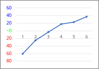
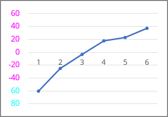
See Conditional formatting of chart axes for more details.
3. Format data ranges differently along the horizontal axis
Most reports and presentations contain a lot of boring charts that describe the state before and after some event, action, etc. However, using simple visual tricks, you can shake up the audience and draw attention to the essence of your presentation:

See How to add Dividers to the chart for more details.
4. Format data ranges differently along horizontal and vertical axes
Periodical processes like the volume of support service calls often have critical zones that indicate a severe problem that needs to be investigated and mitigated. The following tip shows how to reveal and emphasize those critical zones for analysis:
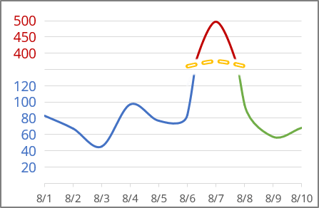
See Creating a chart with critical zones for more details.
5. Create two horizontal or vertical axes on the same side
If you need to display two different data series for the one- or compatible-time ranges that have different value scales, you can add the secondary vertical axis.
While the secondary vertical axis provides a way to display two different types of data for the one time range, the secondary horizontal axis allows you to create a chart showing two data series for different time ranges:
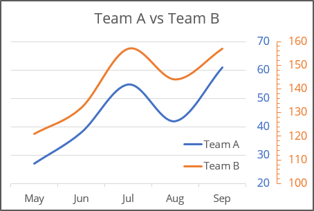
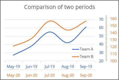
See How to create two vertical axes on the same side and How to create two horizontal axes on the same side for more details.
See also this tip in French: Comment améliorer le format des axes dans Excel.
