How to add Dividers to the chart
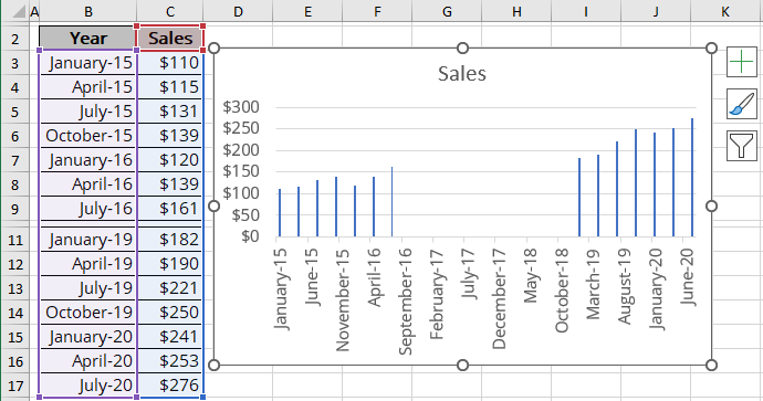
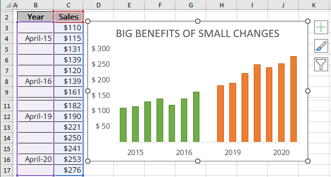
For example, you want to demonstrate the changes in sales due to the company policy during 2015 - 2016 and 2019 - 2020:

To create one chart with separator, follow these steps:
1. Insert a blank row between separated parts of the chart (in this example - row 10).
2. Select the data cells.
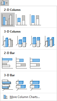
3. On the Insert tab, in the Charts group, click the Insert Bar or Column Chart button:

Choose Clustered Column:
Excel creates the new chart:
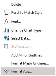
4. Right-click the vertical axis and choose Format Axis... in the popup menu (or double-click the axis):
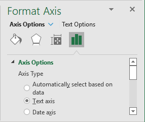
5. On the Format Axis pane, in the Axis Options tab:
- In the Axis Options section, choose the field Text axis (to hide the gap period):
- In the Number section, change the field Format Code (in example to show only years) and click the Add button:

6. In the source data (B3:C17), clear the duplicate years. As you clear an entry in the worksheet, the corresponding entry along the chart axis disappears.
You can then make any other adjustments to get the look you desire:
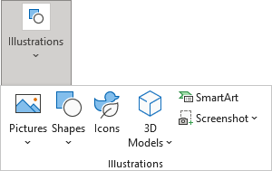
7. Select the chart. On the Insert tab, in the Illustrations group,choose the type of object what you want to add in the chart:
See also this tip in French: Comment ajouter des séparateurs au graphique.

