Creating a simple competition chart
Visualizing a competition is a quite simple, but pretty creative process:
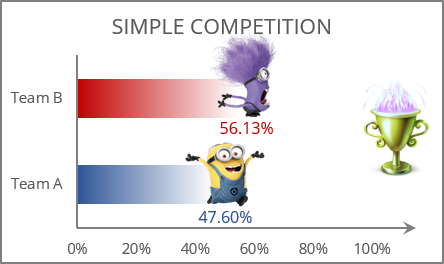
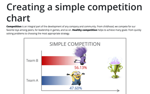
The easiest way to visualize the competition process is to create clustered bar charts, in which a comparison is made between two or more objects, phenomena, or groups of data. The graphics are accompanied by a textual representation of the progress in percentage or quantitative format.
To create a chart like the one above, do the following:
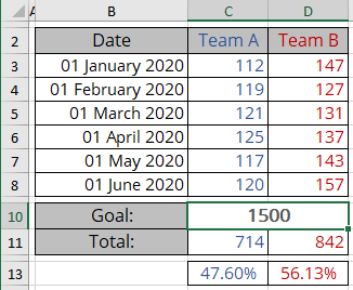
1. Select all necessary data - in this example, C2:D2, C13:D13:
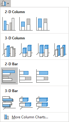
2. On the Insert tab, in the Charts group, click the Insert Column or Bar Chart button:

From the Insert Column or Bar Chart dropdown list, select Clustered Bar:
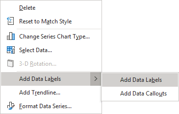
3. Right-click on the chart data series, then select Add Data Labels -> Add Data Labels in the popup menu:
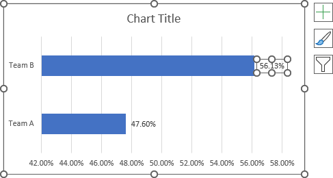
4. Select one of the data labels:
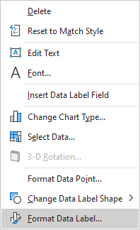
5. Right-click on the selected data label and select Format Data Label... in the popup menu:
6. On the Format Data Label pane, on the Fill & Line tab, in the Fill section:
- Choose the Picture or texture fill option,
- Click on the Insert... button:

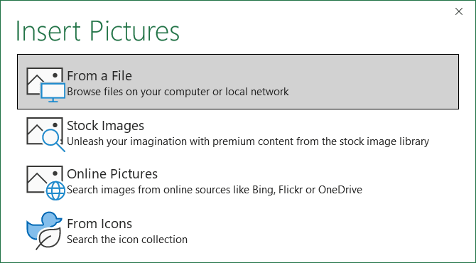
- In the Insert Pictures dialog box, choose the picture location, select the picture file, and then click Open or Insert:
7. Make changes to the second data label (repeat steps 4 - 6).
Note: Instead of adding data labels for points scored or results achieved, the graph can show the remaining scores to reach the Goal.
Make any other adjustments to get the desired look; see also how to create a chart with dynamic labels.
See also this tip in French: Créer un graphique de compétition simple.
