Creating a Gantt chart
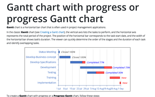
Gantt charts are convenient for planning and estimating the project's expected duration. In addition, they allow you to keep track of the activities that can be carried out in parallel to each other:
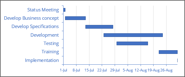
Although Excel doesn't support Gantt charts per se, creating a simple Gantt chart is fairly easy. The key is getting your data set up properly.
For example, the above Gantt chart is set up to illustrate a schedule for the project, in range B2:D9:
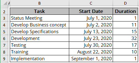
- Column B contains task names,
- Column C contains the corresponding start date for each task,
- Column D contains the duration of the task, in days.
To create a Gantt chart in Excel, follow the next steps:
Create a bar chart
1. Select the data range.
For this example, B2:D9.
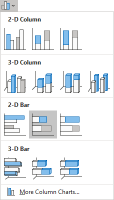
2. On the Insert tab, in the Charts group, click the Insert Bar or Column Chart button:

From the Insert Bar or Column Chart dropdown list, select Stacked Bar:
Correct the chart data
3. Do one of the following:
- On the Chart Design tab, in the Data group, choose Select Data:

- Right-click on the chart area and choose Select Data... in the popup menu:
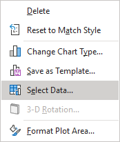
In the Select Data Source dialog box:
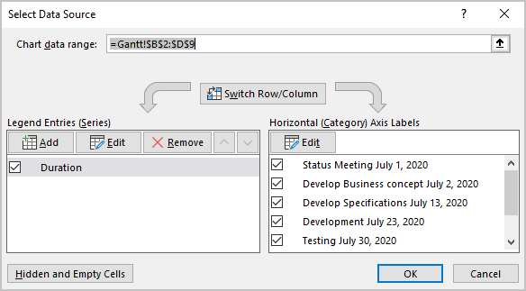
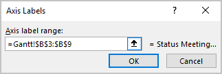
- Under Horizontal (Category) Axis Labels, click the Edit button to correct data for the horizontal axis:
In the Axis Labels dialog box, change data to the appropriate data range (task names). For example, B3:B9:
- Under Legend Entries (Series) group:
- Ensure that the existing data series contain the correct data range (task duration) — for example, D3:D9.
- Create a new data series for the start date by clicking the Add button.
In the Edit Series dialog box, type or select the appropriate data. For example, C3:C9:

- Reorder data series by clicking the moving buttons:
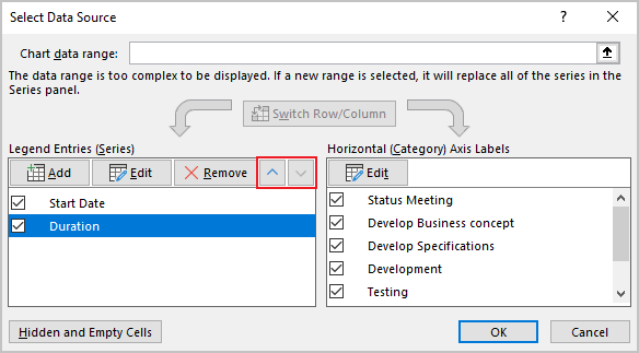
- The first data series: data range for starting date,
- The second data series: data range for the duration.
Customize the horizontal axis
4. Right-click on the horizontal (Category) axis and select Format Axis... in the popup menu:
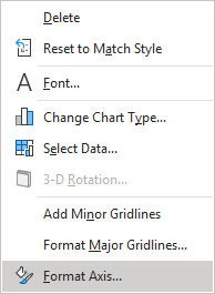
On the Format Axis pane, in the Axis Options tab:
- In the Axis Options section, set the Minimum and Maximum values to correspond to the earliest and latest dates in the data. You also may want to set the Major unit to 7 to indicate weeks:

- In the Number section, choose the Date format you prefer:

Customize the vertical axis
5. Change the order of tasks on the vertical axis:
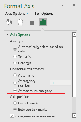
5.1. Right-click on the vertical (Value) axis and select Format Axis... in the popup menu.
5.2. On the Format Axis pane, in the Axis Options group:
- Under Horizontal axis crosses, select the At maximum category option,
- Select the Categories in reverse order checkbox:
Hide the first data series
6. Right-click on the first data series and choose Format Data Series... in the popup menu:
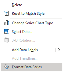
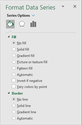
To make the first data series invisible, on the Format Data Series pane, on the Series Options tab, in the Fill & Line group :
- In the Fill section, select No fill,
- In the Border section, select No line:
Apply another chart formatting as desired.
See also this tip in French: Comment créer un diagramme de Gantt.

