How to add a vertical line to the scatter chart
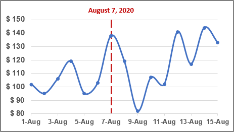
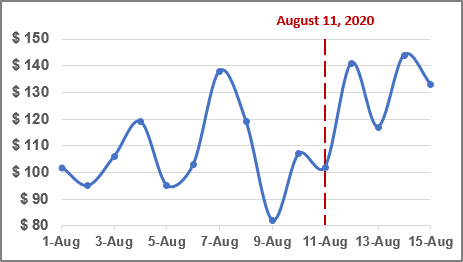
To add a vertical line to your scatter chart, do the following:
I. Add new data for the vertical line
1. Add the date with the current date to your data.
For example, cell $C$2 contains the data that should be displayed as the vertical line:
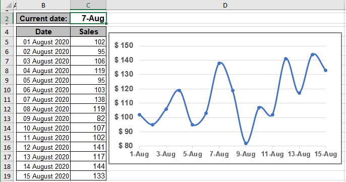
2. To add a new data series to your chart, do one of the following:
- On the Chart Design tab, in the Data group, choose Select Data:

- Right-click on the chart area and choose Select Data... in the popup menu:
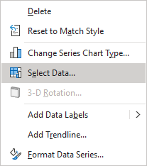
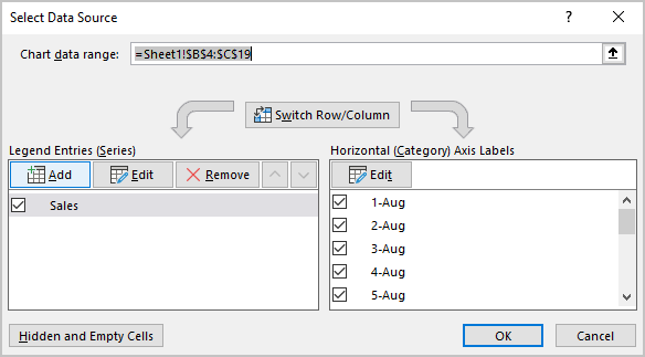
In the Select Data Source dialog box:
2.1. Under Legend Entries (Series), click the Add button:
2.2. In the Edit Series dialog box, type:
- In the Series X values box - the cell with the current date ($C$2)
- In the Series Y values box - any visible value, for example, the maximum of the vertical axis (150):
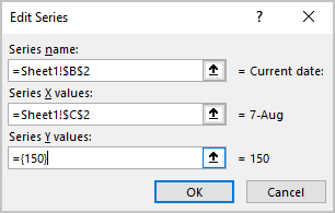
Note: You can use any visible value, but it is more convenient to use the maximum value.
2.3. Click the OK button twice to close the Select Data Source dialog box.
II. Add the vertical line
3. On the chart, select the new data series, then do one of the following:
- Click on the Chart Elements button, select the Error Bars list, then choose More Options...:

- On the Chart Design tab, in the Chart Layouts group, click the Add Chart Element dropdown list:

In the Add Chart Element dropdown list, choose the Error Bars list, then click More Error Bars Options...:

See more about other options in Adding Error bars.
In the Format Error Bars pane for the Vertical Error bar (see below how to select the Vertical Error bar), on the Error Bar Options tab:
- In the Direction group, select Minus (in the example, we selected the maximum value, so we don't need the Plus error line),
- In the End Style group, select No Cap,
- In the Error Amount group, select the Percentage option, then type 100% in the text field:

Note: To select the Vertical Error bar for some data series, do one of the following:
- On the Chart Format tab, in the Current Selection group, click the arrow of the Chart Elements dropdown list, then select Series {data series name}: Y Error Bars for the needed data series:

- Click the arrow next to Error Bar Options and choose the Series {data series name}: Y Error Bars in the dropdown list:

- On the Chart Format tab, in the Current Selection group, click the arrow of the Chart Elements dropdown list, then select Series {data series name}: Y Error Bars for the needed data series:
III. Add the vertical line label
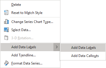
4. Right-click the data series for the vertical line, then choose Add Data Labels -> Add Data Labels in the popup:
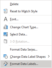
5. Right-click on the added data series labels and choose Format Data Labels... in the popup menu:
6. On the Format Data Labels pane, on the Label Options tab:
- In the Label Options section:
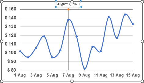
- In the Label Contains group, select the X Value checkbox and unselect all other checkboxes,
- In the Label Position group, select the Above option:

- In the Number section, select the appropriate data format. For example:

Note: If you have formatted the data on the spreadsheet, you can select the Linked to source checkbox to format the label in the same way as the source data:
IV. Customize the chart
7. Select and delete the Horizontal Error bars (X Error Bars).
You can then make any other adjustments to get the expected look.
If you change the date, the chart will be changed too:
See also this tip in French: Comment ajouter une ligne verticale au graphique.


