Customize the vertical axis labels
In addition to changing the font size and reorganizing the axis labels, it is often necessary to hide or highlight some of the labels with color or larger font size. For example:
- In the chart with Critical zones, the vertical axis should display only some labels:
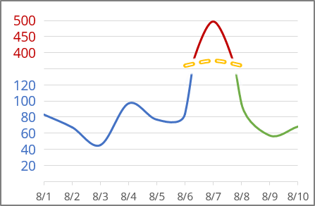
See more about creating a chart with critical zones.
- In simple funny charts such as a tally chart, the vertical axis should display different colors for different bars:
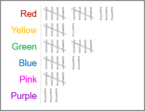
See more about creating a tally chart in Excel.
Note: See also how to conditionally highlight axis labels.
Add a new data series to the chart
The main purpose of the new data series is to substitute the axis labels - the new data series labels will be displayed instead of the axis labels.
To add one or multiple data series to the existing chart, follow the next steps:
1. Do one of the following:
- On the Chart Design tab, in the Data group, choose Select Data:

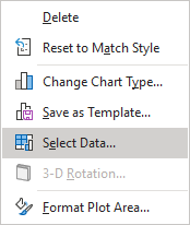
- Right-click on the chart area and choose Select Data... in the popup menu:
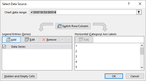
2. In the Select Data Source dialog box:
2.1. Under Legend Entries (Series), click the Add button:
2.2. In the Edit Series dialog box:
- In the Series values or Series X values box (for the scatter chart), type the constant values equal to the minimal value on your chart as many times as many labels you want to see on the chart.
For example:
- For the tally chart, 5 points:
= {0,0,0,0,0}:

- For the Critical zones chart, the first date on the x-axis 6 times for the Labels data series and 3 times for the Labels2 data series::

Note: You can create one additional data series even for the Critical zones chart, but it is a little more complex, but you will need to customize each new data series label instead of customizing all data series labels.
- For the tally chart, 5 points:
- For the scatter chart, in the Series Y values field, type the values from the y-axis you want to see.
For example:
- In the charts with one additional data series, repeat the same values for the y-axis.
- For the Critical zones chart (two additional data series), the first 6 and the last 3 values of the additional data for the Labels and Labels2 data series, respectively.
Note: For scattered bar charts and 100% scattered bar charts, ensure the added data series is the first in the order of the data series. To reorganize data series, in the Select Data Source dialog box, use the Move Up and Move Down buttons:
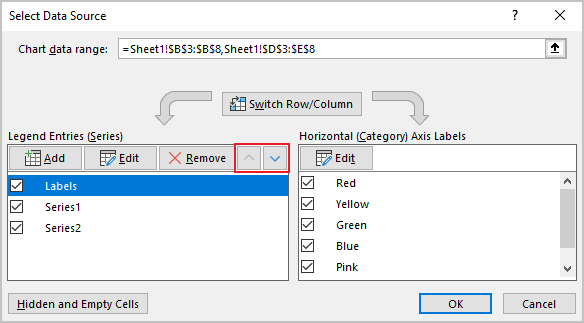
After closing the dialog box, Excel rebuilds the chart - you should see the added data series at the axis.
For example:
- The tally chart, the first data series:

- The Critical zones chart with two additional data series:

Note: See how to select the invisible chart elements for more details. If you don't see a new data series in the axis even after selecting it, check the data in the Edit Series dialog box (step 2.2.).
Hide the axis labels
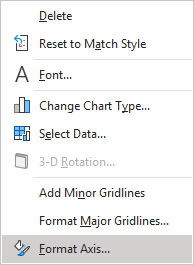
3. Right-click on the vertical axis and choose Format Axis... in the popup menu (or double-click the vertical axis):
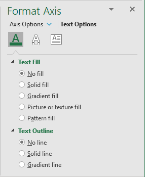
On the Format Axis pane, do one of the following:
- On the Text Options tab, in the Text Fill & Outline group:
- In the Text Fill section, select No fill,
- In the Text Outline section, select No line:
- On the Axis Options tab, in the Axis Options group, in the Labels section, from the Label Position list, select None:
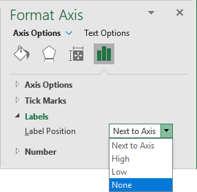
Note: The Labels section looks different for the stacked charts:

Add the new data series labels
4. Select the new data series, then do one of the following:
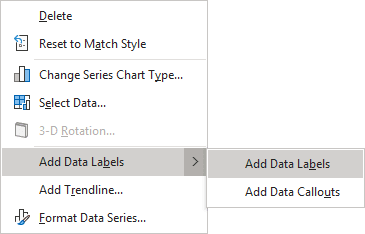
- Right-click on the selection, then choose Add Data Labels -> Add Data Labels in the popup:
- Click on the Chart Elements button, select the Data Labels list, then choose Left:

- On the Chart Design tab, in the Chart Layouts group, click the Add Chart Element button:

From the Add Chart Elements list, choose Data Labels, then select Left:

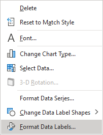
5. Right-click on the added data series labels and choose Format Data Labels... in the popup menu:
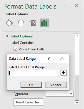
On the Format Data Labels pane, on the Label Options tab, in the Label Options section:
- Under Label Contains:
- Select the Value From Cells checkbox, then choose data labels in the Data Label Range dialog box:
- Unselect all other checkboxes.
- Select the Value From Cells checkbox, then choose data labels in the Data Label Range dialog box:
- Optionally, under Label Position, select the Left option:

6. Make formatting you want for the new data series labels instead of axis labels.
Hide the labels data series
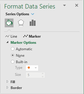
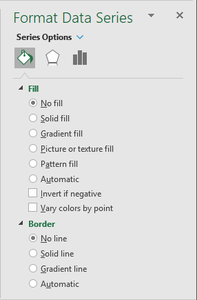
To make the additional data series invisible (if needed), on the Format Data Series pane, on the Series Options tab, in the Fill & Line group:
- For the scatter chart:
- In the Marker Options section, select None:
- In the Border section, select No line if necessary.
- In the Marker Options section, select None:
- For other charts:
- In the Fill section, select No fill,
- In the Border section, select No line:
See a more complex solution where the positions of the new labels on the axis are calculated in the Marimekko or Mekko chart.


