Excel 365
Copy and paste only nonblank cells
Unfortunately, when you try to paste a series of cells with blank cells, the Paste special with Skip blanks option doesn't seem to work.
Unmerging all merged cells
Here's a quick way to unmerge all merged cells in a worksheet:
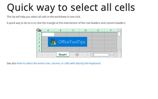
Quick way to select all cells
This tip will help you select all cells in the worksheet in one click.
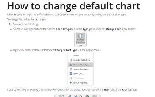
How to change default chart
When Excel is installed, the default chart is a 2-D Column chart, but you can easily change the default chart type.
How to hide points on the chart axis
Excel proposes very useful formatting for numeric data that can be applied for cells and some chart elements. For example, the standard formatting can be used when you need or want to omit some points of the chart axis, e.g., the zero point. Below you will find how to hide specific points on the chart axis using standard formatting and using a custom label format:
Conditional formatting for chart axes
One of the useful tricks to attain the attention of the audience and improve the effect of presenting your data is to use axis label formatting customized for the specific value ranges:
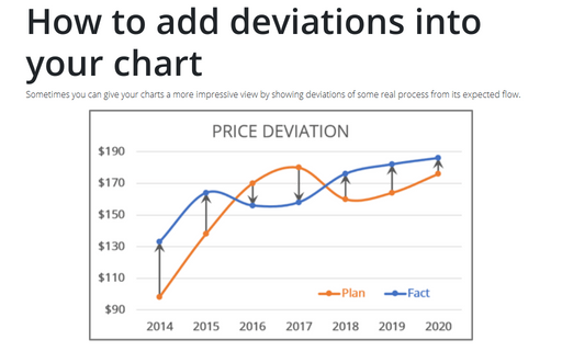
How to add deviations into your chart
Sometimes you can give your charts a more impressive view by showing deviations of some real process from its expected flow.
Using shortcut keys to create a chart
Excel proposes an easy and very fast way to create a chart by using shortcut keys.
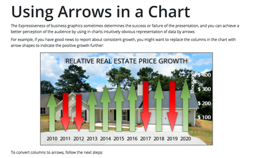
Using Arrows in a Chart
The Expressiveness of business graphics sometimes determines the success or failure of the presentation, and you can achieve a better perception of the audience by using in charts intuitively obvious representation of data by arrows.
How to add Dividers to the chart
Most reports and presentations contain a lot of boring charts that describe the state before and after some
event, action, etc. However, using simple visual tricks, you can shake up the audience and draw attention
to the essence of your presentation.


