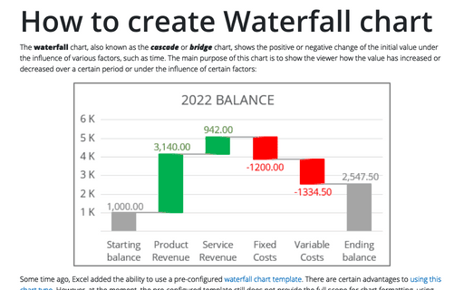
How to create Waterfall chart
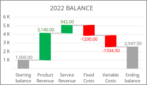
Some time ago, Excel added the ability to use a pre-configured waterfall chart template. There are certain advantages to using this chart type. However, at the moment, the pre-configured template still does not provide the full scope for chart formatting, using multiple data series and combining it with other chart types.
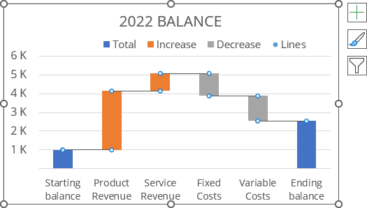
To create a simple waterfall chart like the one above, do the following:
Create additional data
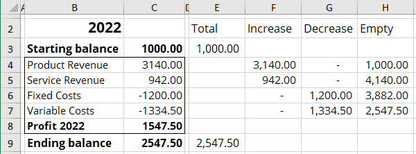
1. Add four new columns with the following formulas:
- Column E (Total) with the total values (starting and final balance),
- E3: = C3,
- E9: = C9,
- Column F (Increase) with only positive values:
- F4: = IF (C4 > 0, C4, 0),
- Column G (Decrease) with only negative values:
- G4: = IF (C4 < 0, -C4, 0),
- Column H (Empty) with the data that will be hidden in the chart (sum of all positive values in the previous row minus the negative value in the current row):
- H4: = H3 + E3 + F3 - G4:
Create a column chart
2. Select the data range.
In this example, E2:H7, E9:H9.
Note: To select several data ranges, hold Ctrl and choose the ones you need.
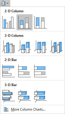
3. On the Insert tab, in the Charts group, choose the Insert Column or Bar Chart button:

From the Insert Column or Bar Chart dropdown list, choose Stacked Column:
Excel creates a simple stacked column chart with not really correct data (don't worry, it will be modified later):
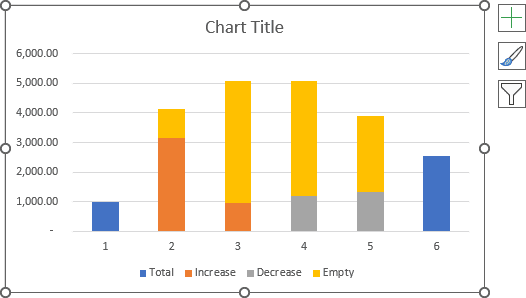
Reorganize the data series
4. Select the chart data by doing one of the following:
- On the Chart Design tab, in the Data group, choose Select Data:

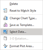
- Right-click on the chart plot area and choose Select Data... in the popup menu:
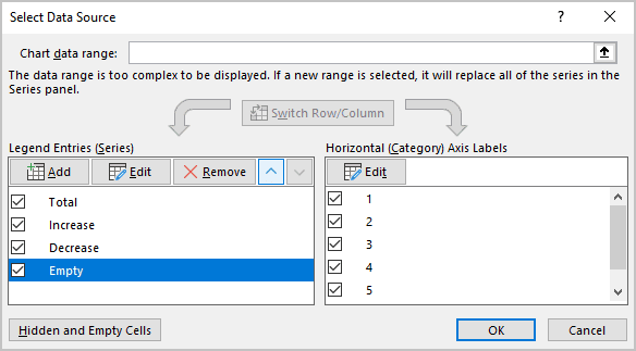
5. In the Select Data Source dialog box, select the Empty data series, then click the Move Up button to move it to the first position:
Add the axis labels
In the Select Data Source dialog box (see step 5. above), under Horizontal (Category) Axis Labels, click the Edit button.
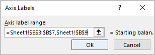
6. In the Axis Labels dialog box, select the data for the axis labels:
Format the first (Empty) data series
7. Right-click on the first (Empty) data series columns and choose Format Data Series... in the popup menu:
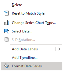
8. On the Format Data Series pane, on the Fill & Line tab:
- In the Fill group, select No fill,
- In the Border group, select No line:
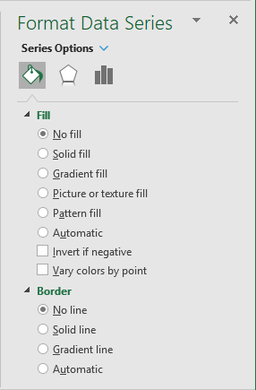
You can then make any other adjustments to get the look you desire:
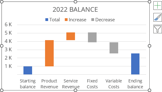
Add the connector lines
Connector lines are not necessary for the cascade charts. You can add a new data series to display connector lines using different ways, such as:
- Add a line step chart,
- Add a scatter chart for subtotal, then display Error Bars for them:
Add the connector lines points
9. To add the connector lines points, do the following:
9.1. Add new data to define the points where connection lines need to be added:
Column I with the Subtotals, where I3: = C3, I4: = I3 + C4, etc.:

9.2. Right-click on the chart area and choose Select Data... in the popup menu, or on the Chart Design tab, in the Data group, choose Select Data (see step 4. above).
9.3. In the Select Data Source dialog box, under Legend Entries (Series), click the Add button:
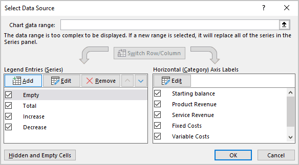
9.4. In the Edit Series dialog box, choose the line points (in this example, I3:I7), then click OK twice:
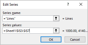
After closing the dialog boxes, Excel adds the new data series as columns:
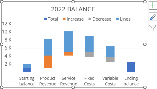
10. To change the new data series chart type, do the following:
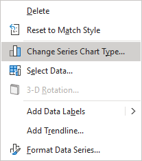
10.1. Right-click on the new data series and choose Change Series Chart Type... in the popup menu:
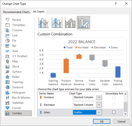
10.2. In the Change Series Chart Type dialog box, on the Combo tab, for the new data series, select the Scatter chart type:
Create the connector lines using Error Bars
11. To create the connector lines, do the following:
11.1. Select the data series with the connector line points, then do one of the following:
- On the Chart Design tab, in the Chart Layouts group, click the Add Chart Element dropdown list:

In the Add Chart Element dropdown list, choose the Error Bars list, then select More Error Bars Options...:

- Click the Chart Elements button:

In the Chart Elements list, choose the Error Bars list, then select More options...:

See more about other options for Adding Error bars.
11.2. Delete the Vertical Error Bars by selecting them (see how to select different elements in the chart) and doing one of the following:
- Right-click on any vertical error bars and select Delete in the popup menu:

- Click the Delete key on the keyboard.
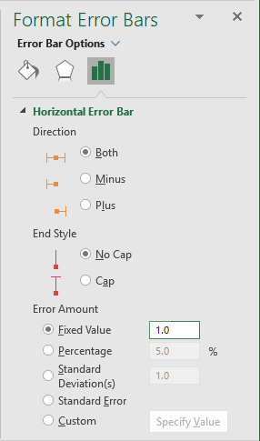
11.3. On the Format Error Bars pane for the Horizontal Error bar (see how to select the Horizontal Error bar), on the Error Bar Options tab:
- In the Direction group, select Plus,
- In the End Style group, select No Cap,
- In the Error Amount group, select the Fixed Value option:
Excel adds the connector lines to the chart:
Format data series marks and lines
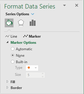
12. To hide scatter data series, right-click on any data point and choose Format Data Series... in the popup menu:

On the Format Data Series pane, on the Fill & Line tab, under Marker, in the Marker Options section, select None:
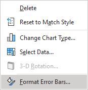
13. To format connection lines, right-click on any error bar, and choose Format Error Bars... in the popup menu:
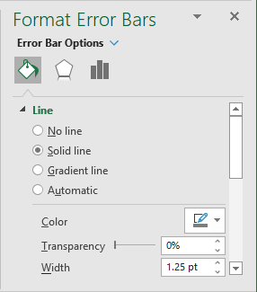
On the Format Error Bars pane, on the Fill & Line tab, select the Solid line option, and choose the Color and Width:
Notes: To see a more organic chart, use the same line width for the data series borders and for the error bars:
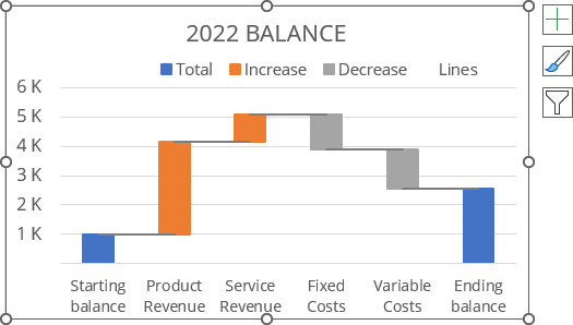
You can then make any other adjustments to get the look you desire.
