How to create Master and Scrolled Detail charts
When you create a chart with a scroll bar, it will be useful to create a chart with all data to see which data fragment you see in the scrolling chart.
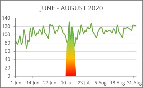
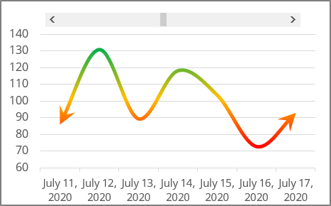
To create charts like these (sales data for the week for three months), do the following:
Step I: Create a chart with a scroll bar
See how to create a Scrolling chart.
Step II: Create a chart with total data
1. Select the data range (in this example, B2:C95).
2. On the Insert tab, in the Charts group, click the Insert Line or Area Chart button:

From the Insert Line or Area Chart, choose Line:
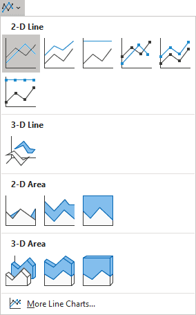
Excel creates a chart with the total data.
Step III: Add additional data
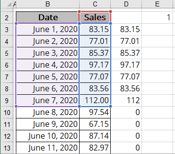
1. Add the next column to your data (in this example, D3:D95) and enter the following formula in the first cell (D3):
= IF (AND (ROW (B3) >= $E$2 + ROW ($B$2), ROW (B3) - $E$2 < 7 + ROW ($B$2)), C3, 0).
This formula displays values for visible data and hides values (displays zero) for non-visible data from the scroll chart created in Step I.
2. Copy this formula down to the other cells of the column:
Step IV: Add a shaded box on the chart with a total data
1. Select the additional data (in this example, D2:D95), and press Ctrl+C to copy the range. Select the chart with the total data and press Ctrl+V to paste a new series to the chart:
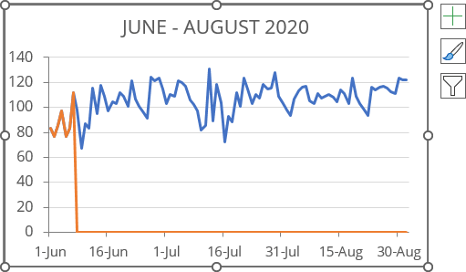
2. Select the second data series and do one of the following:
- On the Chart Design tab, in the Type group, click the Change Chart Type button:

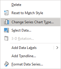
- Right-click the selection and select Change Series Chart Type... in the popup menu:
3. In the Change Chart Type dialog box, choose the Area chart type for Series2:
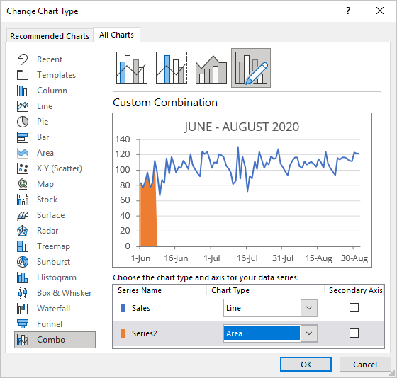
4. Click the area chart to select the second series. Make the desired adjustments using the fill and outline options in Microsoft.
See also this tip in French: Comment créer des graphiques de défilement principal et détaillés.
