Creating a rainbow thermometer chart
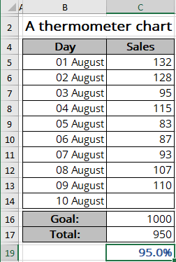
For example, a spreadsheet is set up to track daily progress towards a Goal of 1000 new sales in 10 days. Cell C16 contains the Goal value, and cell C17 contains a simple sum formula:
= SUM (C5:C14)
Cell C19 contains a formula that calculates the percent of the Goal (see Creating a simple thermometer chart):
= C17 / C16:
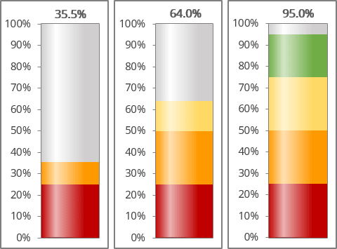
To create a chart like the one above, do the following:
Calculate additional data
1. Add additional data to see different colors for different intervals.
In this example, the chart should display different colors for different intervals:
- Red for data in the range of less than 25%:
= IF (<value> < 25%, <value>, 25%)
- Orange for the interval of more than 25% but less than 50%:
= IF (IF (<value> - 25% < 0, 0, IF (<value> - 25% < 25%, <value> - 25%, 25%))
- Yellow for the interval greater than 50% but less than 75%:
= IF (IF (<value> - 50% < 0, 0, IF (<value> - 50% < 25%, <value> - 50%, 25%))
- Green for the last interval - more than 75%:
= IF (<value> > 75%, <value> - 75%, 0)
- Empty area:
= 1 - <value>:

Note: You can use the AND () function instead of two IF () functions. For example:
= IF (AND (<value> - 25% > 0, <value> - 25% < 25%), <value> - 25%, 25%)
Create a chart
2. Select the new cells with calculated values (in this example, C20:C24).
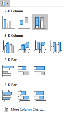
3. On the Insert tab, in the Charts group, click the Insert Bar or Column Chart button:

Choose 100% Stacked Column:
Change the chart data series
By default, Excel creates a column chart from the range of data in one column or one row as separate columns:
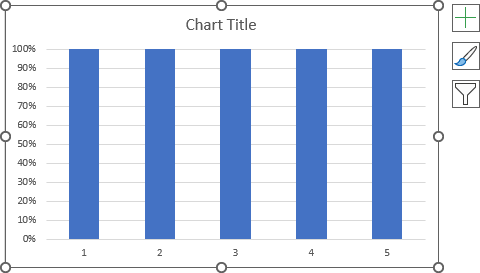
If you have a range of data in one row or one column (as in the example), you need to switch columns and rows to display the data correctly on the chart:
4. Do one of the following:
- Right-click on the chart plot area, then choose Select Data... in the popup menu:
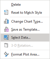
In the Select Data Source dialog box, click the Switch Row/Column button:

- Select the chart, then on the Chart Design tab, in the Data group, click the Switch Row/Column button:

Excel rebuilds the chart:
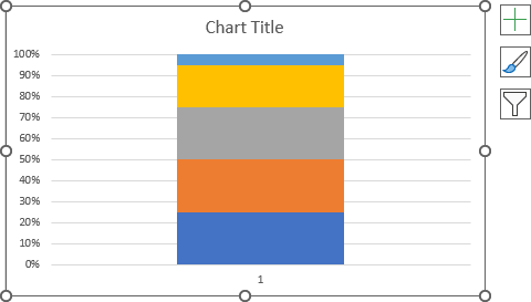
Format the chart
5. Remove the horizontal (Category) axis and the chart title if needed.
To see and adjust all the data series, you need to emulate different variations of the data used for the chart (this is also useful for checking the correctness of the formulas used).
So, to customize all data series, we recommend entering a value close to the Goal. For this example, 95%.
6. Right-click on the data series and choose Format Data Series... in the popup menu:
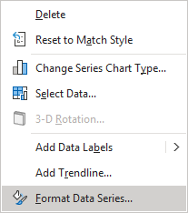
On the Format Data Series pane, on the Fill & Line tab, in the Fill section, choose different colors for every series (see more about filling options).
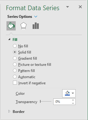
Note: You can choose different series by selecting each data series on the chart or the Format Data Series pane by clicking the arrow next to Chart Options:
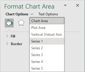
See more about how to select the chart elements quickly.
Make any other adjustments to get the look you desire.
See also this tip in French: Comment créer un graphique de thermomètre arc-en-ciel.

