Creating a simple thermometer chart
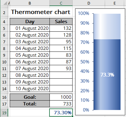
The trick involves creating a clustered column chart that uses a single cell (which holds a percentage value) as a data series. See also more attractive variants: glossy thermometer chart, twin or double thermometer chart, bullet chart as a kind of the thermometer bar chart.
For example, a spreadsheet is set up to track daily progress toward a Goal: 1000 new sales in 10 days. Cell C16 contains the goal value for the thermometer chart, and cell C17 contains a simple sum formula:
= SUM (C5:C14)
Cell C19 contains a formula that calculates the percent of goal completed for the thermometer:
= C17 / C16
To create the chart like the one above, do the following:
Create a simple chart
1. Select cell C19.
Note: To simplify your work, leave the blank cell before cells around cell C19. Without this blank row, Excel uses the entire data block for the chart, not just a single cell. Because C19 is isolated from the other data, the Chart Wizard uses only a single cell.
2. On the Insert tab, in the Charts group, click the Insert Bar or Column Chart button:

Choose Clustered Column:
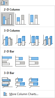
Excel creates a simple column chart with one column:
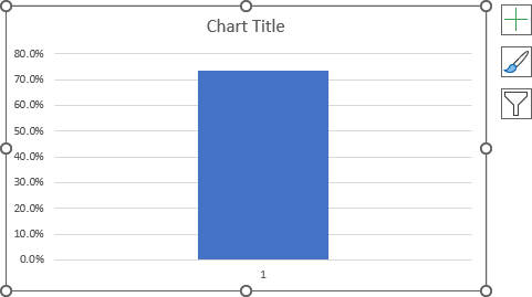
Format the chart
3. Remove unnecessary chart elements such as the chart title and horizontal (Category) axis.
This axis is not needed for this chart type because it contains only one label, usually 1. You can leave this axis and change the axis label to display the informative data.
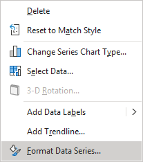
4. In the thermometer chart, the column width equals the chart width. To make the column occupy the entire width of the plot area, right-click on the column and choose Format Data Series... in the popup menu (or double-click on the column):
On the Format Data Series pane, on the Series Options tab, change the Gap Width setting:
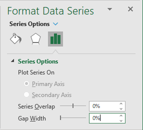
Set the Gap Width to 0.
Note: You can do the same for the bar chart if you prefer to create a horizontal thermometer chart. See the example of the bullet chart.
Format the axis
5. Right-click on the vertical axis and choose Format Axis... in the popup menu (or double-click on the axis):
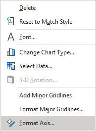
On the Format Axis task pane, on the Axis Options tab, set the Minimum value to 0 and the Maximum value to 1 (due to the use of the percentage axis):
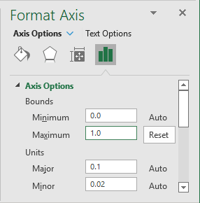
Note: See how to adjust the axis when using values instead of percentages on the axis.
Add and format the data label
6. Right-click on the data series and select Add Data Labels -> Add Data Labels in the popup menu:
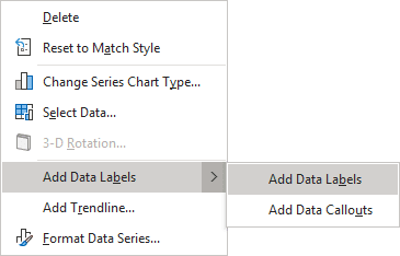
7. Right-click on the data labels and select Format Data Labels... in the popup menu:
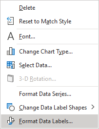
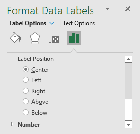
8. On the Format Data Labels task pane, on the Label Options tab:
- In the Label Contains group, select the Value checkbox:
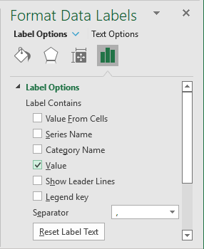
- In the Label Position group, select the Center option:
You can also change the label format on the Number tab (for more details, see the conditional formatting of chart axes).
Make any other adjustments to make your thermometer chart more appealing to the audience.
See also this tip in French: Comment créer un graphique simple de thermomètre.
