Bubble and Area chart
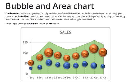
For example, to merge a Bubble chart with an Area chart:
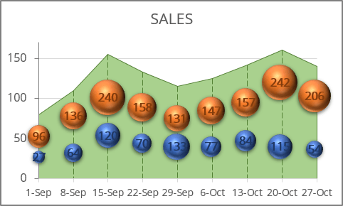
An area chart or area graph is a variant of a standard line chart in which the area below the line of the chart is shaded or filled.
The area graph above represents the sales volume for a specified time period.
A bubble chart is a variant of the common scatter plot where the dots can represent third and even fourth dimensions - the bubbles have their own sizes and can be filled with different colors or textures (see more about bubble charts).
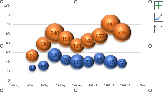
The bubble chart above represents two data series - the number of visits by men and women, where purchases were made, reflecting the sales volume in the area chart.
To create a chart like the one above, do the following:
Create an area chart
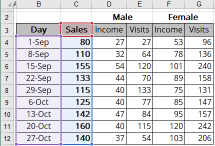
1. Select the data range for the area chart.
In this example, B3:C12:
2. On the Insert tab, in the Charts group, choose the Insert Line or Area Chart button:

From the Insert Line or Area Chart dropdown list, select the Area  chart and then modify this chart:
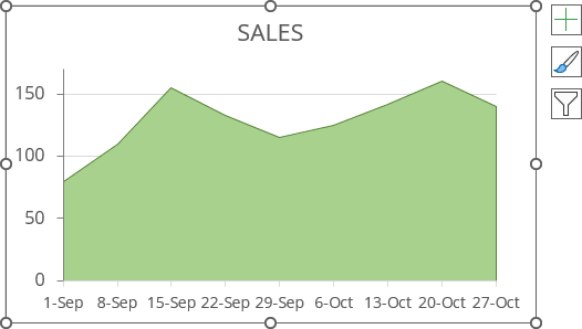
3. To add vertical lines, on the Chart Design tab, in the Chart Layouts group, click the Add Chart Element dropdown list:

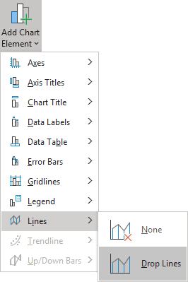
In the Add Chart Element dropdown list, select the Lines list and then Drop Lines:
To customize drop lines: do the following:
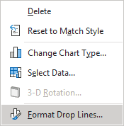
1) Right-click on any of these lines and choose Format Drop Lines... in the popup menu:
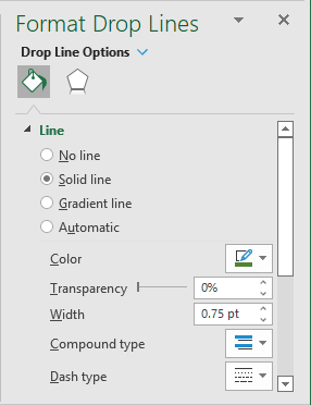
2) On the Format Drop Lines pane, on the Fill & Line tab, in the Line section, select the Solid line option and choose the color and width in the appropriate fields:
Create a bubble chart
1. Select the data range for a bubble chart.
The data range for a bubble chart contains the following:
- The first column - the data for the horizontal axis (Series X values),
- The second column - the data for the vertical axis (Series Y values),
- The third column - the data for the bubble size (Series bubble size).
See more about bubble charts.
In this example, B3:B12, D3:E12.
2. On the Insert tab, in the Charts group, choose the Insert Scatter (X, Y) or Bubble Chart button:

From the Insert Scatter (X, Y) or Bubble Chart dropdown list, choose Bubble or 3-D Bubble:
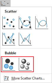
Excel creates a simple bubble chart. For this example:
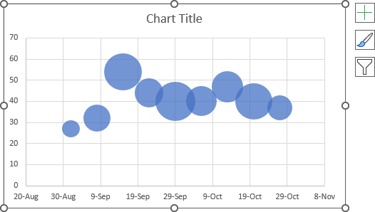
If necessary, add another data series (see how to add a new data series to the bubble chart) and format the bubble chart:
3. Hide axes.
Note: It is necessary to remove the gridlines, but we recommend doing that later after combining two charts. Gridlines are very helpful when you place one chart on another.
4. Right-click on the chart area and select Format Chart Area... in the popup menu:
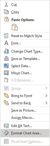
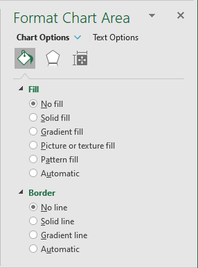
5. On the Format Chart Area pane:
- In the Fill section, select the No fill checkbox.
- In the Border section, select the No line checkbox.
6. Right-click in the chart area and select Format Plot Area... in the popup menu.
7. The last and most challenging step is to place the second chart over the first one.
8. Remove gridlines on the bubble chart and make any other adjustments you prefer.
See also this tip in French: Comment créer le graphique à bulles et à aires.
