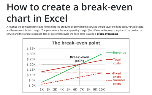
How to create a break-even chart in Excel
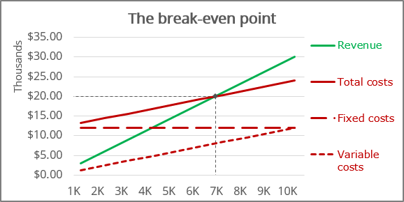
It is calculated by dividing the total fixed costs of the business by the price of the product or service less than variable costs per item or customer. Break-even analysis through break-even chart in Excel allows you to see the break-even point both in production units and in sales dollars and estimate the required growth rate of sales:
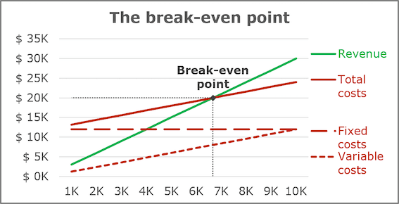
The break-even point (or breakeven point, BEP) is the volume of production and sales of products at which fixed costs will be offset by income. With the production and sale of each subsequent unit of production, the company begins to make a marginal profit:
where the Contribution margin for a product (or service) is the price minus the variable costs.
For example, the first company has the following estimates in its business plan:
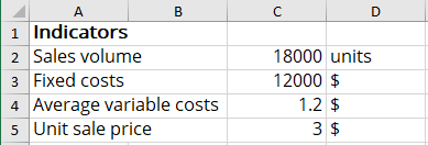
Using the above formulas, calculate the critical factors for the first business plan:

So, to cover all fixed costs, the first company managers should sell more than 6,667 units of the product or attract 6,667 customers to the service.
To create a graph for BEP in Excel, do the following:
- Create a chart of revenue and fixed, variable, and total costs
- Add the Break-even point
- Add the Break-even point lines
Create a chart of revenue and fixed, variable, and total costs
1. Prepare the data for the chart:
For this example, create a new data table:
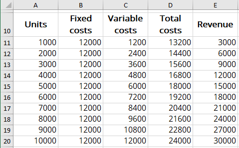
where:
- the Fixed costs values are constant and equal to C3 (= $C$3),
- the Variable costs values = Average variable costs * Units (= $C$4 * A11),
- the Total costs values = Fixed costs + Variable costs (= B11 + C11),
- the Revenue values = Unit sale price * Units (= $C$5 * A11).
2. Select the costs and revenue data range (for this example, A10:E20).
3. On the Insert tab, in the Charts group, click on the Insert Scatter (X, Y) or Bubble Chart dropdown list:

From the Insert Scatter (X, Y) or Bubble Chart dropdown list, select the Scatter chart you prefer, for example, Scatter with Straight Lines:

Excel creates the new chart for the data:
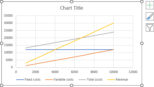
4. Make any other adjustments you desire:

Add the Break-even point
5. Add the new data:
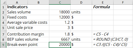
To add the Break-even point to the chart, it is necessary to have both BEP in sales volume and BEP in sales dollars values:
- The Break-even point in sales volume was calculated above (= C8),
- The Break-even point in sales dollars can be calculated using the following formula:

For this example:
6. Add the new data series to the chart:
6.1. Do one of the following:
- On the Chart Design tab, in the Data group, choose Select Data:

- Right-click in the chart area and choose Select Data... in the popup menu:
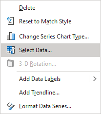
6.2. In the Select Data Source dialog box, click the Add button:
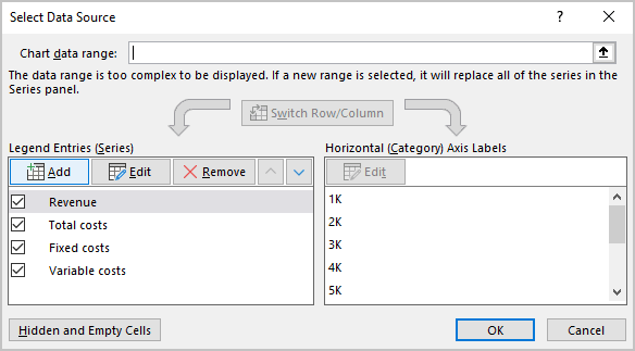
6.3. In the Edit Series dialog box, choose the appropriate values for the Series name and Series values fields:
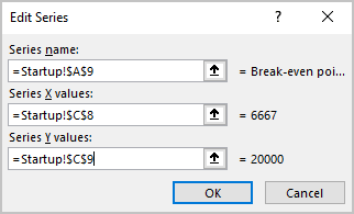
7. Customize the Break-even point:
7.1. Right-click on any data series and select Format Data Series... in the popup menu:
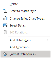
7.2. On the Format Data Series pane:
- If you can't select the data series needed, click the arrow next to Series Options and select the appropriate data series from the drop-down list:

- On the Fill & Line tab, under Marker, in the Marker Options section, select the Built-in option, the appropriate Type and Size:

Note: You can select any Fill and Border type as you wish.
8. Make any other adjustments you want:
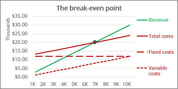
Add the Break-even point lines
9. Select the data series for the Break-even point.
10. Do one of the following:
- Click the Chart Elements button, then choose the Error Bars list:

- On the Chart Design tab, in the Chart Layouts group, click the
Add Chart Element dropdown list:

In the Add Chart Element dropdown list, choose the Error Bars list:

Ensure that both Horizontal and Vertical Error Bars were added for the data series.
11. On the Format Error Bars pane for each error bar:
- On the Error Bars Options tab, in the Vertical Error Bar (or the Horizontal Error Bar) section:
- In the Direction group, select Minus,
- In the End Style group, select No Cap option,
- In the Error Amount group, select the Percentage option and then type 100%:

- On the Fill & Line tab, select the Solid line option, choose the Color and Width, which you prefer:
