How to create irregular polygon charts in Excel
The irregular polygons chart helps to display 360-degree feedback in an easy to interpret form:

The irregular polygons show which traits the employee overestimates and which underestimates. Also, it is very significant when the self-estimation of the employee for different indicators is substantially different from the ratings of other participants in the assessment.
Irregular polygons belong to the family known as radar charts, spider charts, web charts, star plots, polar charts, cobweb charts, or Kiviat diagrams.
To create a chart of irregular polygons in Excel, do the following:
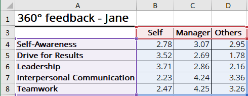
1. Select the chart data.
For example:

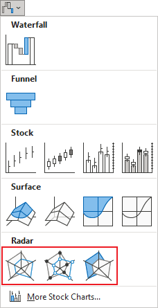
2. On the Insert tab, in the Charts group, click the Insert Waterfall, Funnel, Stock, Surface or Radar Chart dropdown list:

Select the Radar, Radar with Markers, or Filled Radar:

Excel creates the chart from your data:

3. Select the title and change it or remove it.
4. Select the axis and remove it.
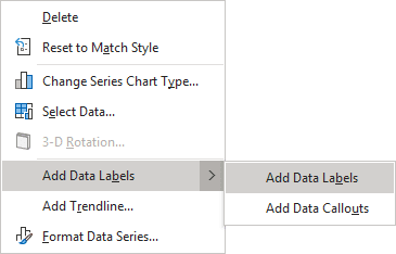
5. Right-click on any of the data point and choose Add Data Labels -> Add Data Labels in the popup menu:

Add any other adjustments you find useful for illustration purposes.
See also this tip in French: Comment créer des graphiques à polygones irréguliers dans Excel.

