Excel 365
How to create a Mosaic plot in Excel
Pie and bar charts greatly simplify the understanding of percentages distribution for one categorical variable but fail to build a meaningful representation of two and more variables. A quite recent innovation in data visualization real is the Mosaic plot, which helps to grasp the correlations within marketing, sales, and other financial data. You will not find this chart among Excel standard charts, but you can build one.
How to add labels to the Marimekko chart
This is the third, last part of the tip How to create a Marimekko or Mekko chart in Excel (the second part is How to add separators to the Marimekko chart). The area chart created in the previous part needs data labels:
How to add separators to the Marimekko chart
This is the second part of the tip How to create a Marimekko or Mekko chart in Excel. In the first part of this tip, a step Area chart was created:
How to create a Marimekko chart or Mekko chart in Excel
The distribution of market shares or stocks of the investment portfolio often is illustrated
by pie or doughnut charts. The illustration of multi-market shares and multiple investment
portfolios calls for different approaches. The Marimekko chart (also known as
Mekko chart, or mosaic plot) comes to the rescue.
Tally chart in Excel
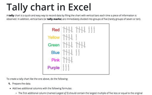
A tally chart is a quick and easy way to record data by filling the chart with vertical bars each time a piece of information is observed. In addition, vertical bars (or tally marks) are immediately divided into groups of five (rarely groups of seven or ten).
Creating pictogram chart with colorful filling
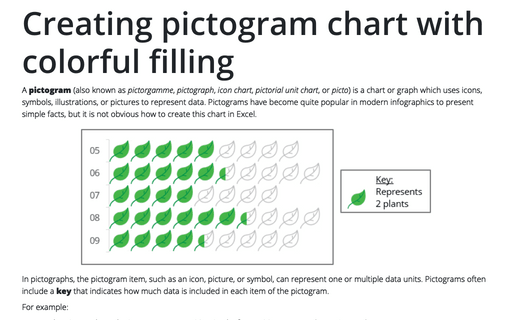
A pictogram (also known as pictorgamme, pictograph, icon chart, pictorial unit chart, or picto) is a chart or graph which uses icons, symbols, illustrations, or pictures to represent data. Pictograms have become quite popular in modern infographics to present simple facts, but it is not obvious how to create this chart in Excel.
Preventing objects from being printed or why objects aren't printing
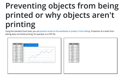
Using the standard Excel tools, you can prevent access to the workbook or protect it from editing. Protection of a sheet from editing does not forbid printing, for example, to a PDF file.
Customize the vertical axis labels
Excel provides very few options for formatting vertical axis labels. All axis labels are a single object - you can change the font size and color or apply effects to all labels at the same time. Even the gradient fill with the color of the axis labels works for us as for the whole item and not for individual objects.
Customize the horizontal axis labels
Excel provides very few options for formatting horizontal axis labels. You cannot format different axis labels with different colors or font sizes. Conditional formatting also only works in some cases. You need to implement some tricks to format the horizontal axis, for example:
How to add an axis pointer
Since our school times, we became familiar with drawing charts with arrows on the axes, but in Excel charts, the axes are just lines. You can customize them differently: change their width, color, and transparency; hide any axis or its labels; add the secondary horizontal or vertical axis; add, hide, or display a part of axes labels; etc.


