How to create a Mosaic plot in Excel
The Mosaic plot, also referenced as Marimekko or Mekko chart, and the market map used to visualize, for example:
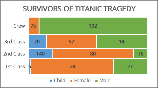
- The percentage of the data for the primary and secondary categories. Such as the ratio of men and women for the crew and each class of passengers:
- Changes in the structure for a closed field, such as a market share of mobile apps (see How to create a Marimekko or Mekko chart in Excel):

The Mosaic chart is a two-dimensional mixture of both a 100% stacked column and a 100% stacked bar chart in Excel. The crucial feature is the variable column width and height that corresponds to the fraction along vertical and horizontal dimensions.
To create a mosaic plot in Excel, you need to follow the below steps (not so easy to guess though):
1. Re-shape the data into simple data series.
2. Create a step area chart (see How to create a step Area chart for the Mosaic plot in Excel).
3. Add labels to the chart (see How to add labels to the mosaic plot).
For example, for the Casualties and survivors of the Titanic tragedy:
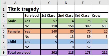
To build a mosaic plot in Excel, you need to re-shape the data into simple data series. The Area chart creates a mosaic effect by varying sub-areas width and heights.
To create an area chart, first, create a table containing widths in the first column of each row and the heights in the following item columns:
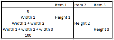
1. Calculate the height for each row of the chart:
The height for the first row of items is:
= C9 / SUM (C9:F9), = 202 / (202 + 118 + 178 + 212) = 28.45%,
The height of all the following rows are:
= D9 / SUM (C9:F9), = 118 / (202 + 118 + 178 + 212) = 16.62%,
= E9 / SUM (C9:F9), = 178 / (202 + 118 + 178 + 212) = 25.07%,
= F9 / SUM (C9:F9), = 212 / (202 + 118 + 178 + 212) = 29.86%.
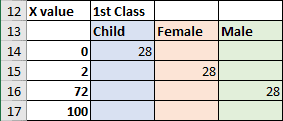
2. Calculate the X values for the first row of the chart, starting from 0:
= C7 / C9 * 100 = 2 - the percent of survived children of all survived in the 1st class,
= (C7 + C5) / C9 * 100 = 72 - the percent of survived children and women of all survived in the 1st class,
= 100 as 100% of survived in the 1st class:
3. Calculate the X values for the second row in the chart:
= D7 / D9 * 100 = 20 - percent of survived children of all survived in the 2nd class,
= (D7 + D5) / D9 * 100 = 88 - percent of survived children and women of all survived in the 2nd class.
4. Calculate the X values for the third row in the chart:
= E7 / E9 * 100 = 15 - percent of survived children of all survived in the 3rd class,
= (E7 + E5) / E9 * 100 = 58 - percent of survived children and women of all survived in the 3rd class.
5. Calculate the X values for the last row in the chart:
= F5 / F9 * 100 = 9 - percent of survived women of survived crew members.
So, for this example, the X values are: 0, 2, 72, 100 and 20, 88 and 15, 88 and 9.
6. Insert the X values in sorted order into the table and add up the appropriate heights:
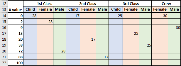
7. To create a step chart, you will need two copies of the same values:
- the start value (previous value)
- the end value (current value).
For this example:
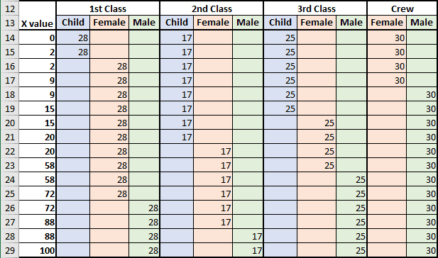
The data for the step Area chart is prepared. For the following step, see How to create a step Area chart for the Mosaic plot in Excel.

