How to add labels to the Marimekko chart
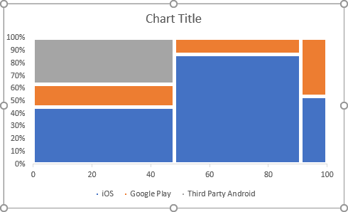
There are at least two types of labels that the chart needs:
- Data labels at the center of the mosaic piece,
- Horizontal axis labels instead of 0-20-***-100.
To add the labels for the mosaic pieces, do the following:
1. Create a new data range to calculate the positions of each label:
For every piece of the chart:
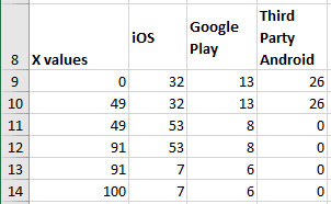
Calculate the X and Y positions for the labels:
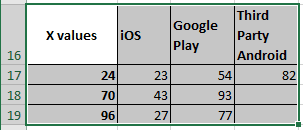
Where:
- X values are calculated as the middle of the width of each column
plus the width of all previous columns:
- A17: = A10 / 2
- A18: = A10 + (A12 - A10) / 2
- A19: = A12 + (A14 - A12) / 2
- Y values are calculated as the middle of the height of each mosaic
piece plus the height of all previous pieces:
- B17: = B4 / E4 / 2 * 100%
- B18: = B5 / E5 / 2 * 100%
- B19: = B6 / E6 / 2 * 100%
- C17: = (B4 / E4 + C4 / E4 / 2) * 100%
- C18: = (B5 / E5 + C5 / E5 / 2) * 100%
- C19: = (B6 / E6 + C6 / E6 / 2) * 100%
- D17: = ((B4 + C4) / E4 + D4 / E4 / 2) * 100%
- D18: = ((B5 + C5) / E5 + D5 / E5 / 2) * 100%
- D19: = ((B6 + C6) / E6 + D6 / E6 / 2) * 100%
2. Add the new data series to the chart:
You can add the data series one-by-one or use the following method to add them all together:
2.1. Copy the new data range to the Clipboard by clicking Ctrl+C.
2.2. Select the chart.
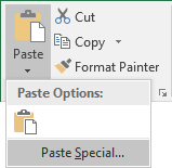
2.3. On the Home tab, in the Clipboard group, select the Paste dropdown list and then choose the Paste Special...:
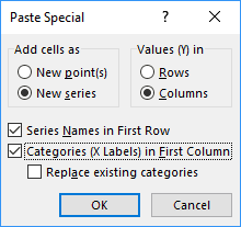
2.4. In the Paste Special dialog box, be sure that selected:
- In the Add cells as group, the New series radio button,
- In the Values (Y) in group, the Columns radio button,
- The Series Names in First Row checkbox,
- The Categories (X Labels) in First Column checkbox:
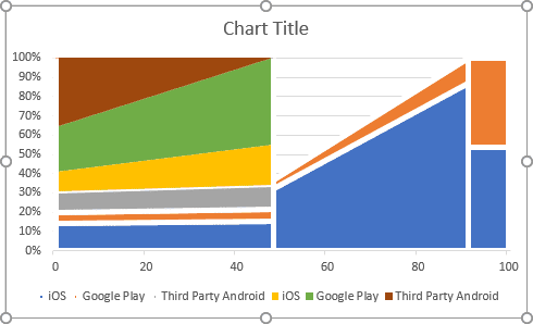
Excel updates the chart after adding the new data series and you need to fix the formatting:
3. Change the chart type:
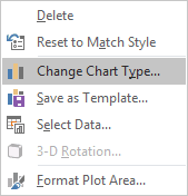
3.1. Right-click on the chart and choose Change Chart Type... in the popup menu:
3.2. In the Change Chart Type dialog box:
- Select the Combo tab,
- Select the Custom Combination chart type,
- Ensure that for the first three data series you selected 100% Stacked Area chart type,
- Choose the Scatter type for the newly added data series (the Secondary Axis checkboxes are automatically selected).
4. Add the data labels:
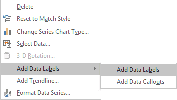
4.1. Right-click on each new data series and choose Add Data Labels -> Add Data Labels in the popup menu:
4.2. Right-click on the new data series and select Format Data Series... in the popup menu.
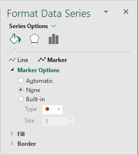
4.3. On the Format Data Series pane, on the Fill & Line tab, in the Marker Options section, select the No Marker radio button:
4.4. Repeat the previous steps of this section for all new data series.
5. Format data labels:
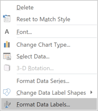
5.1. Right-click on the new data labels and select Format Data Labels... in the popup menu:
5.2. On the Format Data Labels pane, on the Label Options tab, in the Labels Options section:
- Under Label Contains:
- Select the Value From Cells radio button:

- In the Data Labels Range dialog box, select the appropriate data
range:

- Unselect all other checkboxes.
- Select the Value From Cells radio button:
- Under Label Positions, choose the Center option:

5.3. Repeat the previous steps of this section for all data labels.
To add the labels for the horizontal axis, do the following:
6. Add a new data series to show labels:
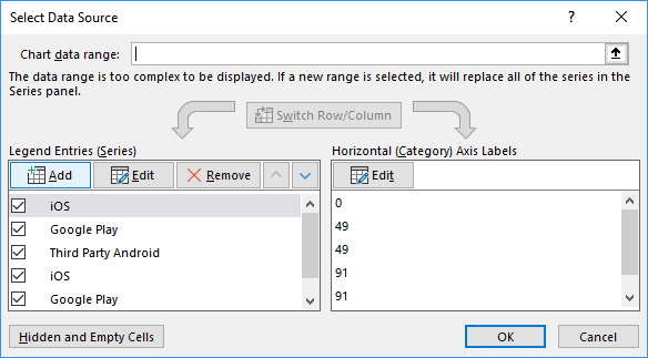
6.1. In the Select Data Source dialog box, under Legend Entries (Series), click the Add button:
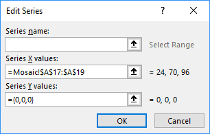
6.2. In the Edit Series dialog box:
- In the Series X values field, select the same data range that was used for other labels,
- In the Series Y values field, type = {0,0,0} (so, the new data series was on the horizontal axis):
7. Add data labels, remove the markers for the new data series like you did for the data labels.
8. On the Format Data Labels pane, on the Label Options tab, in the Labels Options section:
- Under Label Contains, check the Value From Cells radio button and
select the appropriate data range:

- Under Label Positions, choose the Below option.
9. Remove the horizontal axis, the secondary vertical axis, unnecessary labels in the Legend.

