Gantt chart with progress or progress Gantt chart
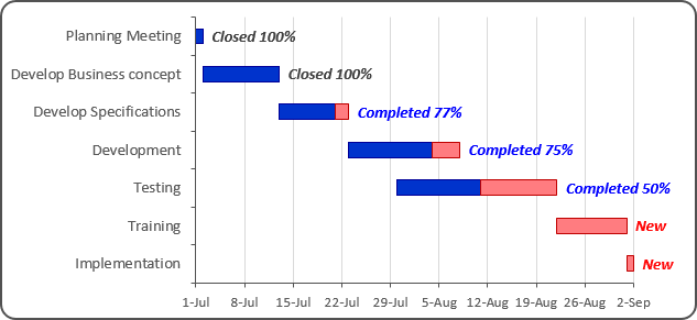
In the classic Gantt chart (see Creating a Gantt chart), the vertical axis lists the tasks to perform, and the horizontal axis represents the total period of the project. The position of the horizontal bar corresponds to the task start date, and the width of the horizontal bar shows the duration of the task. The viewer can quickly find out the order of the stages, the duration of each task, and identify overlapping work. Progress Gantt charts add an additional visual clue – the shading of the bar that is proportional to the degree of the task completion.
To create a Gantt chart with progress or a Progress Gantt chart, follow these steps:
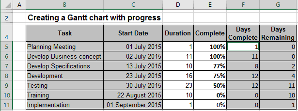
1. Select the data range, for example, B5:C11; F5:G11:
2. On the Insert tab, in the Charts group, select the Column button:

Then choose the Stacked Bar  chart.
3. Remove the Legend and do one of the following:
- Under Chart Tools, on the Design tab, in the Data group, choose Select Data:

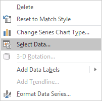
- Right-click in the chart area and choose Select Data... in the popup menu:
In the Select Data Source dialog box:
- Correct data in Horizontal (Category) Axis Labels. Notice that Excel incorrectly uses the first two columns as the Horizontal (Category) Axis Labels.
- In the Legend Entries (Series) group, add a new data series. Then set the chart's series to
the following:
- Series 1: $C$5:$C$11 (start dates per task)
- Series 2: $F$5:$F$11 (days spent per task)
- Series 3: $G$5:$G$11
- Horizontal (Category) Axis Labels: $B$5:$B$11 (days remaining per task):
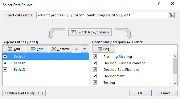
4. Customize vertical and horizontal axes (for more details, see Creating a Gantt chart).
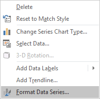
5. Right-click in the every of data series and choose Format Data Series... in the popup menu:
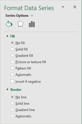
To make the first data series invisible, in the Format Data Series dialog box:
- Set Fill to No fill,
- Set Border to No line:
You can then make any other adjustments to get the expected look.
To add the label to your chart, do the following:
1. Add new data series with data range E5:E11.
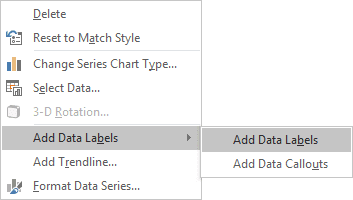
2. Right-click on the added data series and choose Add Data Labels -> Add Data Labels in the popup:
3. Right-click on the added data series labels and choose Format Data Labels... in the popup menu.
4. In the Format Data Labels pane:
- On the Label Options tab:
- In the Label Contains group, select Value,
- In the Label Position group, select Inside Base:

- On the Number tab, in the Category list, select Custom, enter
format that you want in the Format Code field and press Add:

For more details, see Conditional formatting of chart axes.
5. Make the new data series invisible.
If everything is on schedule, the tasks before the current date are all blue (100% complete), the tasks after the current date are partially blue and partially red, or completely red. To simplify the analysis of the Gantt chart schedule, you can add a vertical line for the current date. The vertical line serves as an excellent visual hint for the tasks ahead and behind schedule.
See also this tip in French: Comment créer un diagramme de Gantt avec progrès.
