Creating a chart with dynamic labels
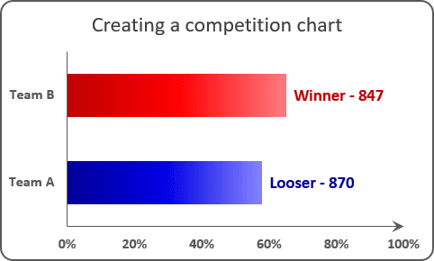
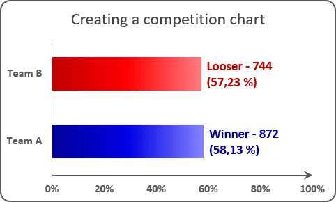
The trick of this chart is to show data from specific cells in the chart labels. For example, if you have to show in one chart two different data bar:
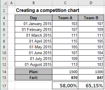
- To compare two different teams, you should create a chart using percent of task completion (in this example, cells C17:D17).
- But it will be more informative to see the real volume for every team (in this example, cells
C15:D15). Or the simple formulas:
Team A: = CONCATENATE (IF ($C15 > $D15, "Winner - ", "Looser - "), TEXT (C13, "#.#0"))
Team B: = CONCATENATE (IF ($C15 < $D15, "Winner - ", "Looser - "), TEXT (D13, "#.#0"))
For the existing chart, do the following:
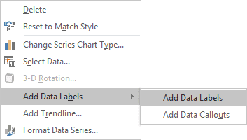
1. Right-click on the chart and in the popup menu, select Add Data Labels and again Add Data Labels:
2. Do one of the following:
- For all labels: on the Format Data Labels pane, in the Label Options, in the
Label Contains group, check Value From Cells and then choose cells:

- For the specific label: double-click on the label value, in the popup menu, select Choose
Cell, and then specify the value:

Make any other adjustments to get the look you desire.
See also this tip in French: Créer un graphique avec des étiquettes dynamiques.

