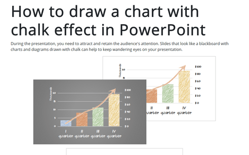
How to draw a chart with chalk effect in PowerPoint
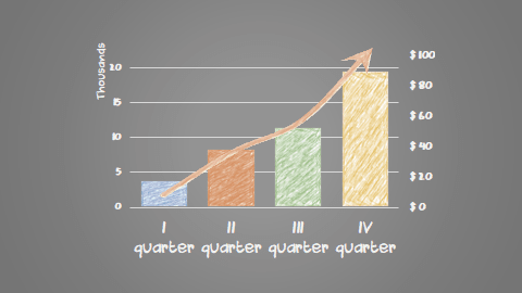
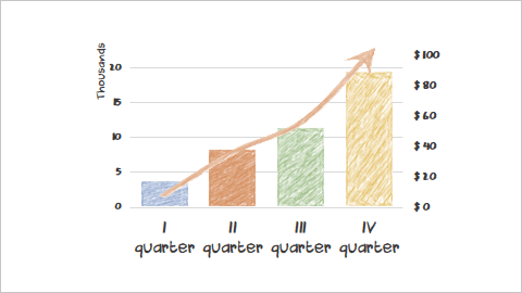
The main point of this tip is to show two different approaches for creating a chalk effect:
I - The columns of the first data series are filled with pictures with a chalk effect.
II - The second data series is inserted into the chart as a picture and also uses a chalk effect.
See also how to create a flowchart with chalk drawing effect and how to draw a pie chart with crayon effect in PowerPoint.
To create a chart like the one above, do the following:
I. Create charts
1. For example, create a simple combination chart (see How to create a combination chart):
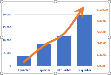
2. Copy this chart to separate the data series.
Sure, it is possible to create two different charts, but it is easier to create one chart and just show the first or the second data series on the same chart area.
We recommend duplicate slides; it will be easier to copy the second data series to the first one after making the corresponding changes.
II. Modify the first data series
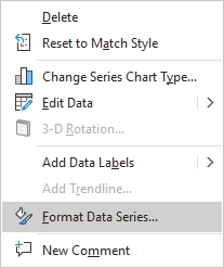
1. Select the second data series, right-click on it, and Format Data Series... in the popup menu:
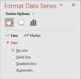
2. On the Format Data Series pane, on the Fill & Line tab, in the Line section, choose No line:
3. Add the new shape to the presentation:
3.1. On the Insert tab, in the Illustrations group, click the Shapes button:

3.2. In the Shapes drop-down list, in the Rectangles group, select Rectangle:

4. Select the new shape and create a picture from it:
4.1. On the Home tab, in the Clipboard group, click the Cut button (or press Ctrl+X):

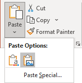
4.2. On the Home tab, in the Clipboard group, click the Paste drop-down list and choose Picture:
5. Make a crayon effect:
5.1. Select the picture.
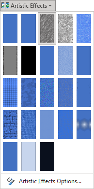
5.2. On the Picture Format tab, in the Adjust group, click the Artistic Effects button:

Select the effect you like from the Artistic Effects drop-down list.
In this example is used the Pencil Grayscale effect:
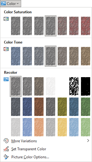
5.3. On the Picture Format tab, in the Adjust group, click the Color button:

Select the color you like from the Color dropdown list under Recolor:
6. Add a crayon effect to the column chart:
6.1. Select the picture with a colored crayon effect.
For example:

6.2. Copy the selected picture to the clipboard: on the Home tab, in the Clipboard group, click the Copy button or press Ctrl+C.
6.3. Select the first column in the chart by double-clicking on it.
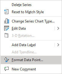
6.4. Right-click in the selection and choose Format Data Point... in the popup menu:
6.5. On the Format Data Point pane, on the Fill & Line tab:
- In the Fill section, choose the Picture or texture fill option and then click on the Clipboard button:
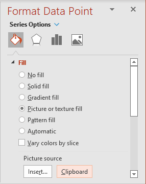
- In the Border section, choose No line.
The first data point is ready:
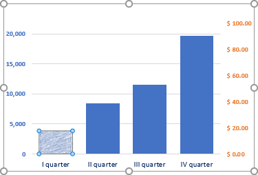
7. Repeat step 5.3. to recolor the picture and steps 6 for all other data points of the first data series:
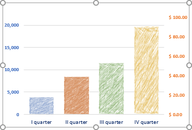
Add any other adjustments you like.
For example, change the font for axes.
III. Modify the second data series
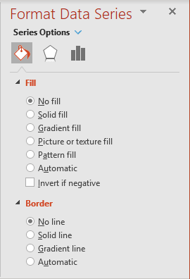
1. Select the second data series, right-click on it and Format Data Series... in the popup menu.
2. On the Format Data Series pane, on the Fill & Line tab:
- In the Fill section, choose No fill.
- In the Border section, choose No line:
3. Select the chart with just one visible data series and create a picture from it:
3.1. On the Home tab, in the Clipboard group, click the Cut button (or press Ctrl+X).
3.2. On the Home tab, in the Clipboard group, click the Paste drop-down list and choose Picture:
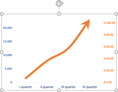
4. Make a crayon effect:
4.1. Select the picture.
4.2. On the Picture Format tab, in the Adjust group:
- Select the effect from the Artistic Effects drop-down list.
- Select the color from the Color dropdown list under Recolor:
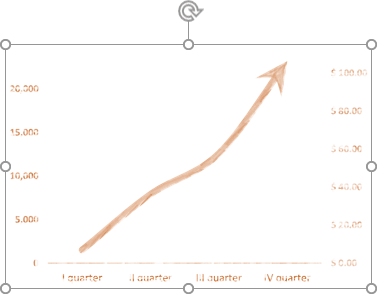
5. Crop the picture to see just a line-arrow and place it to the first chart.
Note: You can customize the background color to mimic a blackboard. See How to create a flowchart with chalk drawing effect.
