How to plot investment opportunity zones in Excel
There are several major investment opportunity zones for the investment project:
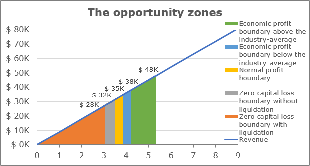
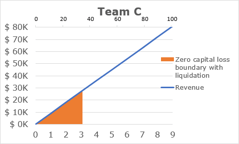
- Zero capital loss zone with liquidation (orange)
- Zero capital loss zone without liquidation (gray)
- Normal profit zone (yellow)
- Economic profit zone below the industry-average (blue)
- Economic profit zone above the industry-average (green)
For example, the investment project has the following parameters (see How to evaluate startup or new business plans):
- The invested amount includes:
- $ 8 000 to purchase the necessary equipment,
- $ 24 000 to cover the variable costs for 1 year:

For the analysis, zone boundaries are the following:
- Zero capital loss boundary with liquidation is a minimum total revenue that the business needs to generate in the pessimistic scenario of the business liquidation. It consists of the total variable costs for 1 year plus half of the amount invested in the purchase of the necessary equipment (in this case, the investor is confident that the equipment is worth at least half of its cost in a worst-case scenario):

- Zero capital loss boundary without liquidation is equal to the initial invested amount of $ 32 000.
- Normal profit boundary is a total amount that can be received from an alternative investment (e.g., index funds, bonds, etc.). For this example, the return of investment of an alternative opportunity is 10%.
- Economic profit boundary below the industry-average is an expected total revenue for a similar business. For this example, the percentage of an industry-average economic profit is 20%.
- Economic profit boundary above the industry-average is an expected total revenue that the investor expects from the competitive advantages of this particular business. For this example, the percentage is 50%.
To create a graph for the opportunity zones in Excel, do the following:
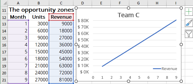
1. Create the revenue chart of the investment project (see How to create a break-even chart in Excel):
2. Prepare the data for the zones:
For this example, create a new data table:
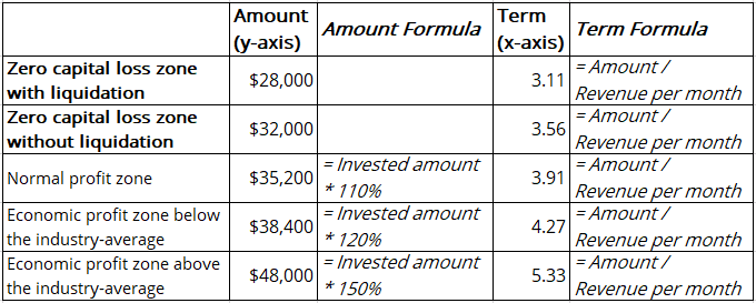
To create the zones chart for the above data, do the following:
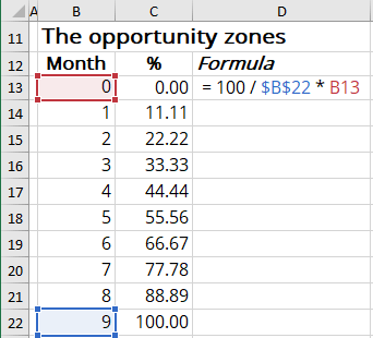
A. Use Area charts to show the zones. Currently, Excel can't show the correct proportions of the float amount on the horizontal axis. To avoid this, you need to create the percentage secondary axis:
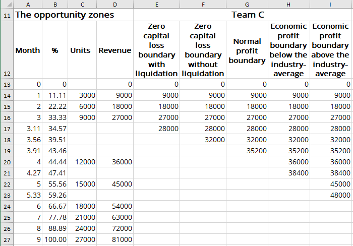
B. To add all the zones to the existing line chart, add the new calculated amounts to the data range:
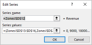
Note: To avoid losing the existing line chart, change the data series by separating continuous intervals with commas. For example:
3. Add the first zone - Zero capital loss zone with liquidation:
3.1. Select the chart and add a new data series:
3.1.1. Do one of the following:
- On the Chart Design tab, in the Data group, choose Select Data:

- Right-click in the chart area and choose Select Data... in the popup menu:
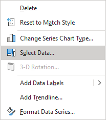
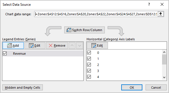
3.1.2. In the Legend Entries (Series) dialog box, click the Add button:
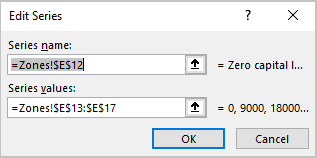
3.1.3. In the Edit Series dialog box, choose the range for the Area chart (in this example, Zero capital loss zone with liquidation):
3.1.4. Click OK twice.
3.2. Change the chart type:
3.2.1. Right-click on the chart and select Change Chart Type... in the popup menu:
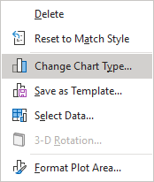
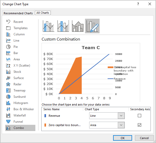
3.2.2. In the Change Chart Type dialog box:
- Select the Combo tab,
- Select the Custom Combination chart type,
- Ensure that for the first data series, the Line chart type is selected,
- Choose the Area type for the newly added data series,
- Select the Secondary Axis checkbox for the added data series:
3.3. Add the secondary horizontal axis:
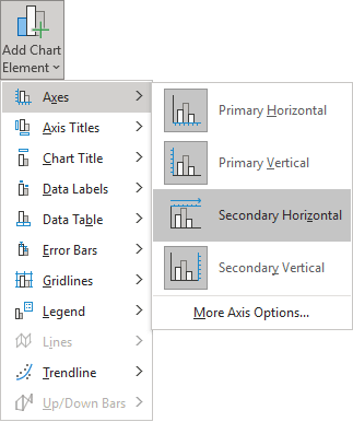
On the Design tab, in the Chart Layouts group, click the Add Chart Element button:

From the Add Chart Element dropdown list, select Axes and then Secondary Horizontal:
3.4. Modify the new data series:
3.4.1. Open the Select Data Source dialog box (see 3.1.1.).
3.4.2. Select the newly added data series.
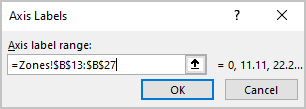
3.4.3. In the Select Data Source dialog box, under Horizontal (Category) Axis Labels, click the Edit button.
3.4.4. In the Axis Labels dialog box, enter the values for the secondary horizontal axis (for this example, the percentage):
3.5. Modify the secondary horizontal axis:
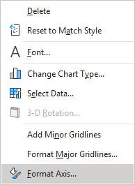
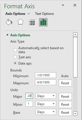
3.5.1. Right-click the secondary horizontal axis and choose Format Axis in the popup menu:
3.5.2. On the Format Axis pane, on the Axis Options tab, in the Axis Options section:
- Under Axis Type, select the Date axis option,
- Under Bounds, be sure that:
- In the Minimum field, the value is the 1st day in Excel:
- 00/01/1900, if you use the date format mm/dd/yyyy,
- 01/00/1900, if you use the date format dd/mm/yyyy,
- In the Maximum field, the value of the 100th day in Excel
(the 4th of September):
- 09/04/1900, if you use the date format mm/dd/yyyy,
- 04/09/1900, if you use the date format dd/mm/yyyy,
Note: Unfortunately, at the moment, there are no other ways in Excel to set the calculated axis from 0 to 100. Thus, this workaround means that you use the calculated amount from 0 to 100 (from the 0 to the 100th day because Excel treats dates as numbers).
- In the Minimum field, the value is the 1st day in Excel:
- Under Units, type 20 days for the Major units:
3.6. Remove the secondary vertical axis:
4. Add other zones:
There are two possibilities of how to add other zones:
- As the first zone, the standard Area charts with different colors and transparency:

Note: To see all zones, on the Select Data Source dialog box, sort them in the necessary order by clicking the Move Up and Move Down buttons:

- As the step Area chart.
Make any other adjustments you like.
