How to highlight a data point
One of the informative methods is highlighting specific data points:
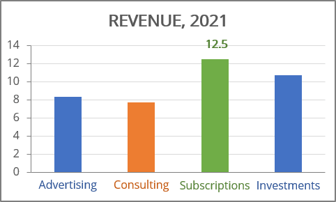
The main idea of how to show this data in different colors is to create separate data series for different colors.
To create a chart like one above, follow the next steps:
1. Split your data by color:
- In red will be shown the minimum value:
= IF (cell = MIN (<data range>), cell, 0)
- In green will be shown the maximum value:
= IF (cell = MAX (<data range>), cell, 0)
- In grey will be shown all the other values.
For example (here <data range> = C3:C6):

2. Select the data cells (in this example, B3:B6, E3:G6).
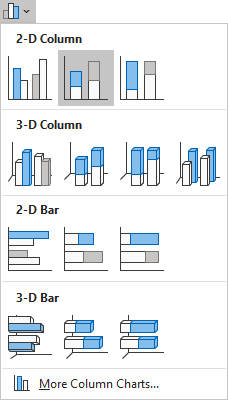
3. On the Insert tab, in the Charts group, click the Insert Bar or Column Chart button:

Choose Stacked Column:
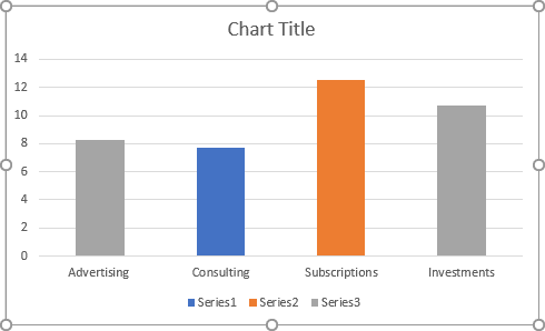
Make any other adjustments to get the look you need:
To add data label for just one data point, do the following:
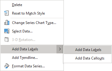
1. Right-click on any data series (in this example, the maximum value) and choose Add Data Labels -> Add Data Labels in the popup menu:
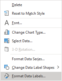
2. Right-click on the added data labels and choose Format Data Labels... in the popup menu:
3. On the Format Data Labels pane, in the Label Options tab, in the Numbers group:
- In the Category drop-down list, select Custom,
- In the Format Code field, type the new format for labels:
<format for the positive value>; <format for the negative value>; <format for the zero>:

To skip the negative values and zero, just leave them empty. For more details, see Conditional formatting of chart axes.
- Click Add.

